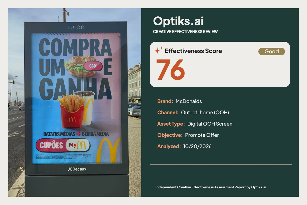
Creative Effectiveness Review
McDonald’s ‘Compra Um E Ganha’ OOH: Street-Level Attention, But Offer Clarity Stalls | Creative Effectiveness Review Optiks.ai | October 20, 2026
Placement and Communication Task
What Works: Commanding Attention and Aggressive Branding Headline dominance: The main ‘COMPRA UM E GANHA’ call to action fills ~45% of the canvas height in bold, dark-teal, instantly surfacing the deal’s core mechanic. This satisfies foundational OOH demands for rapid message intake (see Optiks.ai report ).
Branded appetite trigger: The food photography—a crisp burger, fresh fries, and a condensation-laden drink—anchors desire and primes fast-food expectations. Placement ensures the McDonald’s brand is quickly and strongly encoded through the iconic fry carton and arches adjacent to the product cluster.
Salient CTA: The magenta ‘CUPÕES MyM’ pill (occupying ~30% of frame width) is highly visible and distinct from the background, providing a clear entry point for digital conversion.
The Optiks.ai analysis confirms that these elements work together to reliably disrupt the street environment, securing first fixation and building an effective brand–appetite link. The brand identity is unmistakable in the brief exposure window, with both overt and embedded cues.
What Holds it Back: Unclear Value and Offer Mechanic Obscured value line: ‘BATATAS MÉDIAS + BEBIDA MÉDIA’ (medium fries + medium drink), set in mid-blue against a blue gradient and at only ~35% of the headline's height, falls below comfortable legibility even at optimal sidewalk distances. The analysis notes that this undercutting of scale and contrast means many viewers will leave without realizing what the free item is (“that gap reduces comprehension of the incentive…” from the Optiks.ai report).
Lack of visible price or explicit ‘oferta’ language: While the headline states 'buy one, get', it withholds both a price anchor and an unmissable ‘OFERTA’ or ‘GRÁTIS’ badge. This deprives the viewer of the immediate value calculation essential for a promote-offer objective. The CTA nudges toward app interaction but stops short of succinctly stating the required next step, creating friction—viewers must fill in the gaps or move on.
Minor hierarchy confusion: The product variant ‘CBO®’ label is visually subordinate (about 12–14% of headline cap height), half-submerged into burger photo texture and headline letters. This hinders recall for anyone interested in the precise promoted sandwich. The partial yellow arch, though a powerful McDonald’s code, risks pulling attention from the call to action due to its positioning and brightness.
Fine print collapse: Legal copy at the bottom is effectively invisible at six feet, creating compliance risk and needlessly crowding the critical lower-zone elements.
Behavioral Mechanisms: Rapid Appetitive Processing, Blocked Persuasive Transition The core behavioral strength here is automatic appetite linkage: bold headline, vibrant food images, and trusted brand cues spark recognition and initial interest without conscious deliberation. However, the transition to persuasion—the "should I act now?" moment—relies on clear, quantifiable value and a zero-friction path to redemption. Here, gaps in value signaling (no price, faded secondary offer details) and an ambiguous app handoff compromise effectiveness. Viewers may register a deal is present but lack urgency or clarity on exactly what is free or required of them in their window of attention.
Prioritized Fixes and Concrete Design Alternatives Add a Value Badge Proposed fix: Insert a bold red or dark teal badge directly above the CTA stating ‘OFERTA FRITAS + BEBIDA MÉDIA’ or explicitly list the price. Set type to ~60% of headline height in white for max contrast. This aligns offer value with the audience’s first scan and supports immediate action.
Scale and Isolate Offer Details Proposed fix: Increase ‘BATATAS MÉDIAS + BEBIDA MÉDIA’ copy to at least 50% of headline height, use near-black text on a solid light block, and add vertical whitespace to break it out from the baseline crowd.
Clarify the Call to Action Proposed fix: Tweak the CTA pill to become ‘ATIVA NO APP’ or at minimum, add a subtitle below: ‘Ative no aplicativo’, removing ambiguity about what’s next for the passerby.
Strengthen Hierarchy for Product Variant Proposed fix: Grow the ‘CBO®’ label size 1.6x, place it on a lighter capsule offset from both burger and headline, ensuring immediate product recognition.
Reduce Visual Clutter, Reallocate Baseline Space Proposed fix: Move/resize the golden arch so it’s not competing with the action lane. Condense legal to one readable line and give spacing back to offer and CTA bands.
Implementing even the top two fixes would be expected to notably increase comprehension and likely conversion opportunities under street conditions (full Optiks.ai analysis ).
Editorial Verdict McDonald’s ‘Compra Um E Ganha’ OOH visually commands the street, secures brand and appetite recall instantly, and translates the playful architecture of its restaurants onto the canvas. For pure visibility, the creative delivers. However, its failure to clearly and rapidly communicate the free offer and next step leaves ROI on the table for a promote-offer objective. The missing price or explicit ‘OFERTA’/‘GRÁTIS’ badges and faded reward details are not minor oversights—they are conversion killers in OOH. This is eminently fixable: pair OOH-dominant typography with robust value cues and a crystal-clear call to action, protecting both attention and intention. The base toolkit works—now put offer logic front and center, where the audience is most ready to act.
This is an independent creative effectiveness review based solely on observed design and supplied analysis, not commissioned or endorsed by McDonald’s.
Complete creative analysis This report is an independent Optiks.ai assessment of the supplied creative. Scores and predicted attention describe the model's assessment, not measured audience response or sales. The article above provides editorial interpretation.
Analysis details Asset Type Digital OOH Screen
Analyzed At 2026-10-20T16:53:24.688666+00:00
Effectiveness Score Scale Out of 100. A model-based creative assessment, not measured campaign performance.
Action Steps Reasons 2 high-priority recommendations are outstanding.
The constraint is Persuasion at 69, a high-weighted domain for this objective.
Summary Fix before running. The score clears the bar, but 2 high-priority recommendations are still open.
Constraint Weight 0.10411784399062604
Optimal viewing distance Context At 6 feet, the headline filling ~45% of canvas height reads instantly, and the fries/drink pack shot is recognizable. The magenta CTA pill at ~30% of canvas width remains legible. The secondary line ‘BATATAS MÉDIAS + BEBIDA MÉDIA’ sits at roughly a third of the headline’s size in mid-blue on blue and drops below comfortable legibility at this distance. The fine print collapses entirely and fails to communicate.
Insights At 6 feet, the headline filling ~45% of canvas height reads instantly, and the fries/drink pack shot is recognizable. The magenta CTA pill at ~30% of canvas width remains legible. The secondary line ‘BATATAS MÉDIAS + BEBIDA MÉDIA’ sits at roughly a third of the headline’s size in mid-blue on blue and drops below comfortable legibility at this distance. The fine print collapses entirely and fails to communicate.
Strategic insight This creative is appetite-led with oversized headline type and strong McDonald’s attribution, but the offer lacks a price and the 'CUPÕES MyM' handoff shifts action into the app, which directly undermines a promote-offer objective that needs an immediate, self-contained value cue.
Domain analysis Brand Top Fix Reduce the decorative arch graphic to ~60% of current scale and reposition to avoid conflict with CTA while keeping clear brand memory.
Summary Identity Clarity — Active Brand Compliance Not Applied. Brand signals are unmistakable through packaging, arches, and color language, sustaining attribution even in a fast glance.
What Hurts Partial arch mark functions as decoration and competes with CTA endpoint
‘CBO®’ label lacks visual authority as a branded variant cue
Multiple brand marks in different places slightly fragment attention
What Works Golden arches graphic anchors brand memory
Red fry carton with arches near product hero boosts linkage
CTA co-brands with the MyMcDonald’s identity
Color Top Fix Introduce a solid high-lightness panel behind secondary text elements and slightly darken the immediate background behind the burger by ~15% lightness.
Summary The warm–cool gradient, McDonald’s red/yellow accents, and magenta CTA deliver contrast and energy. A few mid-tone pairings dampen secondary copy clarity.
What Hurts Mid-blue text on blue gradient reduces read certainty for the value line
Yellow arch over light ground risks low separation
Burger sits on mixed hues that reduce edge contrast
What Works Magenta CTA against blue field drives saliency
Warm food tones pop against cooler background
Yellow/red brand accents reinforce recognition
Emotion Top Fix Recompose the burger into a clean field and add subtle condensation/steam cues to strengthen the fresh-serve emotional trigger.
Summary Food photography is appetizing and brand-coded, linking desire to an attainable QSR moment. The gradient palette keeps the tone upbeat.
What Hurts Burger placement over text reduces clean hero moment
No daypart or occasion cue to deepen relevance
Absence of steam/temperature cues slightly reduces ‘fresh-hot’ signal
What Works Crisp textures on burger and fries trigger appetite appeal
Serveware and packaging encode an authentic McDonald’s experience
Warm-to-cool gradient adds energy without overpowering the food
Message Top Fix Add a bold value ribbon stating either a price or ‘OFERTA FRITAS + BEBIDA MÉDIA’ at ~60% of headline height placed directly above the CTA.
Summary “COMPRA UM E GANHA” communicates a deal frame fast; the lack of price and reliance on app coupons blur the value and exact mechanic.
What Hurts No price or explicit ‘GRÁTIS’/‘OFERTA’ callout to quantify value
Mechanic depends on the app without stating the step explicitly
Product specificity (‘CBO®’) is minimized and easy to miss
What Works Direct imperative headline sets a clear promotional context
Visuals of fries and drink convey the reward with minimal text
CTA references the MyMcDonald’s ecosystem, implying access
Attention Top Fix Create a clean window behind the burger (solid light panel ~20% of canvas width) to isolate the hero from the headline letters and increase first-glance impact.
Summary Large dark-teal headline across a pastel gradient and a saturated magenta CTA generate strong street-level saliency. Food photography adds a secondary pull that sustains interest.
What Hurts Burger overlaps headline strokes, creating local clutter that softens impact in that zone
Gradient background reduces punch behind mid-value copy in places
The partial arch mark bottom-right pulls peripheral attention away from the CTA
What Works Oversized headline occupies ~45% of canvas height and commands first fixation
Magenta CTA pill contrasts against blue gradient, creating a high-saliency anchor
Crisp food imagery (burger top-right, fries + drink bottom-center) adds vivid sensory cues
Hierarchy Top Fix Scale the 'CBO®' badge to ~1.6x current and offset it from the headline by ~2% canvas padding to elevate the product cue into the top tier.
Summary The eye path flows from the dominant headline to the fries/drink and into the CTA pill. The product label 'CBO®' under-indexes in size and gets lost against the headline.
What Hurts Product name 'CBO®' is small versus headline and competes with letterforms
Value line 'BATATAS MÉDIAS + BEBIDA MÉDIA' reads as tertiary despite being the offer
Golden arch graphic bottom-right competes with the CTA endpoint
What Works Clear primary dominance: headline set largest with heavy weight
CTA pill sized ~30% of canvas width, entering the lower scan path
Product cluster centered low creates a natural second stop
Persuasion Top Fix Add a prominent value badge (‘OFERTA FRITAS + BEBIDA MÉDIA’ or clear price) sized ~55–60% of headline and place it immediately above or left of the CTA.
Summary The CTA is visible, but the lack of price and absence of an explicit ‘free’/‘oferta’ qualifier weakens the promotional trigger and slows conversion to app action.
What Hurts No price anchor reduces urgency and perceived value
Mechanic requires app without explicit next-step language
Value line is underweighted relative to its role
What Works CTA pill scale and contrast are conversion-friendly
Straightforward verb ‘CUPÕES’ primes the discount frame
Food hero supports desire adjacent to the action
Composition Top Fix Move the CTA to the bottom-right corner at ~60% canvas width centerline and give it a dedicated lane with 3–4% canvas padding on all sides.
Summary A clear Z-path exists, but the burger/text overlap and the decorative arch create minor attention detours. The CTA is well-placed but shares the baseline with multiple elements.
What Hurts Burger intrudes into headline rhythm
Decorative arch competes in the CTA quadrant
Baseline hosts CTA, value line, and legal, increasing local density
What Works Headline top-left to CTA bottom quadrant follows a natural scan
Product cluster centered provides a stable anchor
CTA pill has strong isolation versus surrounding elements
Context fit Top Fix Elevate the value line size/contrast and add a single, explicit next step (‘Ativa no App’) adjacent to the CTA to convert fleeting attention into action.
Summary Designed for fast outdoor consumption: large headline and simple offer frame survive in transit. Fine print and underweighted value line do not survive a 3-second glance.
What Hurts Fine print is non-functional for this medium
Value line requires closer dwell to decode fully
App-dependent CTA mismatches a fast-moving OOH audience
What Works Dominant headline adheres to the 3-second outdoor rule
CTA and product imagery are readable at sidewalk distance
Limited copy supports quick intake
Readability Top Fix Increase the value line to ~50% of headline cap height and place it on a solid light strip spanning ~70% of canvas width to lock in legibility.
Summary The main headline is highly legible at OOH distance; secondary copy falls below comfortable read thresholds and the fine print is non-functional for street viewing.
What Hurts ‘BATATAS MÉDIAS + BEBIDA MÉDIA’ sits at ~35% of headline height and mid-blue on blue, reducing contrast
‘CBO®’ label is small and partially seated on complex background shapes
Fine print is too small to function in this medium
What Works Headline weight and size guarantee fast recognition at 6 feet
CTA word ‘CUPÕES’ in white on magenta is clear at a glance
Short, simple wording across primary elements reduces decoding time
Cognitive load Top Fix Decouple the burger from the headline area by adding ~2-3% canvas whitespace around the product zone to remove the competing micro-focal conflict.
Summary Information is chunked into four digestible blocks (headline, product, value line, CTA). Minor overlaps introduce unnecessary micro-processing.
What Hurts Burger overlapping headline adds a competing focal micro-zone
Partial arch mark introduces a decorative but non-essential cue
Value line visually underweights versus importance, forcing re-read
What Works Four primary chunks respect working-memory limits
Short copy phrases minimize parsing effort
Distinct color blocks help segment tasks
Findings Title Oversized headline and saturated CTA drive first-glance capture
Detail The headline occupies roughly 45% of the canvas height in a heavy dark-teal over a pink–blue gradient, creating a dominant first fixation. The magenta CTA pill spans about 30% of the canvas width and sits in the lower field where the eye lands next. The fries and drink cluster with bright reds and yellows supplies a secondary pull that sustains attention. This combination reliably interrupts passersby and initiates message processing within outdoor glance windows.
Description The headline occupies roughly 45% of the canvas height in a heavy dark-teal over a pink–blue gradient, creating a dominant first fixation. The magenta CTA pill spans about 30% of the canvas width and sits in the lower field where the eye lands next. The fries and drink cluster with bright reds and yellows supplies a secondary pull that sustains attention. This combination reliably interrupts passersby and initiates message processing within outdoor glance windows.
Title Product name underweights versus headline and gets lost
Detail The ‘CBO®’ label is set small and overlaps the dense headline letterforms, which reduces its distinctiveness. Its badge sits at roughly 12–14% of the headline’s cap height and competes with the textured burger image behind it. Because the product cue is not in the top three elements by visual weight, variant recognition lags. This weakens product-specific recall and diminishes the path from interest to a concrete order choice.
Description The ‘CBO®’ label is set small and overlaps the dense headline letterforms, which reduces its distinctiveness. Its badge sits at roughly 12–14% of the headline’s cap height and competes with the textured burger image behind it. Because the product cue is not in the top three elements by visual weight, variant recognition lags. This weakens product-specific recall and diminishes the path from interest to a concrete order choice.
Title Value line lacks contrast and scale to carry the offer
Detail ‘BATATAS MÉDIAS + BEBIDA MÉDIA’ is set in a mid-blue on light blue and sits at approximately 35% of the headline’s height. On the gradient it loses edge contrast and drops below the quick-read threshold at sidewalk distance. As a result, many viewers register the promotion frame but miss exactly what they get. That gap reduces comprehension of the incentive and weakens the promotional pull.
Description ‘BATATAS MÉDIAS + BEBIDA MÉDIA’ is set in a mid-blue on light blue and sits at approximately 35% of the headline’s height. On the gradient it loses edge contrast and drops below the quick-read threshold at sidewalk distance. As a result, many viewers register the promotion frame but miss exactly what they get. That gap reduces comprehension of the incentive and weakens the promotional pull.
Title No price or explicit ‘oferta’ statement reduces conversion
Detail The creative establishes a deal frame with “COMPRA UM E GANHA” but never quantifies it with a price or an explicit ‘OFERTA’/‘GRÁTIS’ cue tied to the fries and drink. The CTA ‘CUPÕES MyM’ redirects to the app without stating the single next step, which increases friction in a fast OOH context. This combination leaves value ambiguous and delays action. For a promote-offer objective, that costs redemptions and lowers ROI.
Description The creative establishes a deal frame with “COMPRA UM E GANHA” but never quantifies it with a price or an explicit ‘OFERTA’/‘GRÁTIS’ cue tied to the fries and drink. The CTA ‘CUPÕES MyM’ redirects to the app without stating the single next step, which increases friction in a fast OOH context. This combination leaves value ambiguous and delays action. For a promote-offer objective, that costs redemptions and lowers ROI.
Title Clean Z-path, but overlapping zones introduce micro-friction
Detail The layout broadly follows a Z-pattern: headline top-left to product center to CTA lower quadrant. However, the burger overlaps the headline strokes, creating a busy contour that competes for micro-fixations. The large yellow arch in the bottom-right also attracts attention away from the CTA lane. These detours extend the eye’s path and marginally delay offer decoding.
Description The layout broadly follows a Z-pattern: headline top-left to product center to CTA lower quadrant. However, the burger overlaps the headline strokes, creating a busy contour that competes for micro-fixations. The large yellow arch in the bottom-right also attracts attention away from the CTA lane. These detours extend the eye’s path and marginally delay offer decoding.
Title Food styling delivers appetite appeal linked to the brand
Detail The burger shows crisp textures and fresh greens, while the fries carton carries the arches near the product cluster. This pairing links sensory desire to the brand through branded serveware, a proven cue in foodservice memory encoding. The drink with visible ice and condensation supports a cold-refresh expectation. The result is a believable, brand-linked appetite trigger that supports intent formation.
Description The burger shows crisp textures and fresh greens, while the fries carton carries the arches near the product cluster. This pairing links sensory desire to the brand through branded serveware, a proven cue in foodservice memory encoding. The drink with visible ice and condensation supports a cold-refresh expectation. The result is a believable, brand-linked appetite trigger that supports intent formation.
Title Fine print is non-functional at OOH distance
Detail The legal block spans the bottom width but sits at a tiny fraction of the headline height, making it unreadable beyond arm’s length. In the intended 6‑foot sidewalk view, it collapses into a grey band with no practical information transfer. This invites reliance on incomplete understanding of conditions. For campaign governance, non-functional legal increases risk without adding clarity.
Description The legal block spans the bottom width but sits at a tiny fraction of the headline height, making it unreadable beyond arm’s length. In the intended 6‑foot sidewalk view, it collapses into a grey band with no practical information transfer. This invites reliance on incomplete understanding of conditions. For campaign governance, non-functional legal increases risk without adding clarity.
Title Identity Clarity: strong attribution via arches and packaging
Detail The red fry carton with arches, the partial yellow arch graphic, and the MyM lockup on the CTA establish unmistakable brand presence. These cues live close to the product and action, creating a tight link between desire and where to get it. Even in brief exposure, viewers will encode the brand with the food moment. This increases brand-linked memory rather than category-generic hunger.
Description The red fry carton with arches, the partial yellow arch graphic, and the MyM lockup on the CTA establish unmistakable brand presence. These cues live close to the product and action, creating a tight link between desire and where to get it. Even in brief exposure, viewers will encode the brand with the food moment. This increases brand-linked memory rather than category-generic hunger.
Recommendations Action Add a bold value badge directly above the CTA reading ‘OFERTA FRITAS + BEBIDA MÉDIA’ or include a clear price. Size it to ~55–60% of headline height and ~40% of canvas width, and use white text on a solid red (#C8102E) or dark teal to guarantee separation.
Impact Without a visible price or explicit free offer, viewers cannot judge value inside the 3-second window, which suppresses redemptions. Clarifying the mechanic on-canvas converts attention into intention and protects ROI on paid OOH media.
Evidence The value line ‘BATATAS MÉDIAS + BEBIDA MÉDIA’ sits at ~35% of the headline height, while the CTA pill spans ~30% of canvas width in magenta (#E4005A) and white. No currency or ‘OFERTA’ appears near the CTA or product cluster.
Observation The creative sets a deal frame but omits a price and lacks an explicit ‘OFERTA’/‘GRÁTIS’ cue connected to the fries and drink. The CTA ‘CUPÕES MyM’ signals the app but does not state the immediate step, increasing friction in an outdoor glance.
Action Increase the value line to ~50% of headline cap height, set it in near-black or very dark navy on a solid light panel spanning ~70% of canvas width, and add ~2% canvas vertical padding above/below to isolate it from the CTA and legal.
Impact When the reward is hard to read, viewers register a promotion but miss what they get, cutting offer comprehension and reducing uptake.
Evidence ‘BATATAS MÉDIAS + BEBIDA MÉDIA’ is ~35% of headline cap height and in mid-blue on a blue gradient. It shares the baseline zone with the CTA and legal, creating local density that further hurts scanability.
Observation The value line underweights relative to its importance and sits on a gradient that reduces edge contrast. In motion or at distance, it fails the quick read.
Action Scale the ‘CBO®’ badge to ~1.6x current size and move it onto a clean light capsule with ~2% canvas padding from adjacent letterforms. Position it so the product and label form a unified hero zone within the top-right quadrant.
Impact Weak variant salience reduces the chance that viewers remember or order the featured product, diluting the campaign’s intended sales mix shift.
Evidence ‘CBO®’ is roughly 12–14% of headline cap height and sits on textured burger and dark letterforms. It is not among the top three elements by visual weight.
Observation The ‘CBO®’ label is visually minor and overlaps the headline strokes, lowering product recognition. It lacks clear separation from complex shapes.
Action Create a clean window for the burger by lightening the background behind it by ~15% and separating it from the headline with ~2–3% canvas whitespace. Reduce the decorative arch to ~60% of current scale and shift it away from the CTA lane.
Impact Competing focal points delay message resolution and reduce the time available to recognize the offer and act in the OOH window.
Evidence Burger edge intersects headline strokes in the upper-right; the yellow arch occupies ~18% width by ~25% height in the bottom-right quadrant near the CTA.
Observation The burger overlaps the headline, and a large decorative arch shares the lower field with the CTA, introducing attention detours.
Action Condense legal to a single concise line and reduce it to the absolute minimum copy count. Allocate the freed ~3–4% canvas height to increase spacing between the value line and CTA for cleaner scanning.
Impact Unread legal adds risk without adding clarity and consumes space that could reinforce the value message at distance.
Evidence Legal lines occupy <10% of the canvas height combined and sit below the CTA and value line, crowding the baseline zone.
Observation Fine print spans the bottom width at a tiny fraction of the headline height, rendering it non-functional in outdoor viewing.
Action Add a subtle darker outline (~1–2% of the arch’s stroke) or place the arch on a slightly darker panel to ensure separation. Move the value line to a solid light panel and set the text in near-black or very dark navy for robust contrast.
Impact Low separation weakens brand icon clarity and contributes to missed secondary copy, which undermines offer comprehension.
Evidence Arch in golden yellow (#FFC300) sits on a pale background; value line uses mid-blue over blue gradient.
Observation Yellow arch over a light ground risks low separation, while mid-blue-on-blue on the value line compounds readability issues.
Predicted attention map Description The dark-teal headline spans most of the upper half with very large letterforms against a pastel gradient. Size dominance and strong value contrast make this the first fixation point.
Label Fries and Drink Cluster
Description Bright reds, yellows, and whites in the central-lower area create a vivid appetite cue. The branded fry carton amplifies salience through color and shape recognition.
Label CTA Pill 'CUPÕES MyM'
Description A magenta-and-white pill in the lower field contrasts with the blue background, pulling the eye into the action area. Text regions and color separation support quick parsing.
Label Burger with 'CBO®' Badge
Description The burger photo with the red ‘CBO®’ badge sits top-right, adding texture and color variation that invites inspection. Overlap with headline strokes creates local competition.
Description The large yellow arch in the bottom-right offers a recognizable brand shape on a light ground. Its brightness risks pulling attention from the CTA endpoint.
Scoring weights Final Weights Emotion 0.05825242718446602
Message 0.12721794442584533
Attention 0.12186139939738867
Hierarchy 0.11382658185470372
Persuasion 0.10411784399062604
Composition 0.0763307666555072
Context fit 0.10378305992634752
Readability 0.10579176431201874
Cognitive load 0.03347840642785403
Accessibility checks Checks Element Headline 'COMPRA UM E GANHA'
Criterion 1.4.3 Contrast (Minimum)
Element Headline 'COMPRA UM E GANHA' (right side)
Criterion 1.4.3 Contrast (Minimum)
Element Value line 'BATATAS MÉDIAS + BEBIDA MÉDIA'
Criterion 1.4.3 Contrast (Minimum)
Criterion 1.4.3 Contrast (Minimum)
Criterion 1.4.3 Contrast (Minimum)
Element Fine print (bottom line)
Criterion 1.4.3 Contrast (Minimum)
Rejected
Compliance review Description The value line ‘BATATAS MÉDIAS + BEBIDA MÉDIA’ is undersized (~35% of headline height) and set in mid-blue on a blue gradient, reducing legibility at typical sidewalk distance.
Description Yellow arch over a light ground risks low separation for color-vision deficiencies; place on a darker field or add a thin outline to secure recognition without relying on hue alone.
Explore more articles and guides