Creative Effectiveness Review
KFC Megabox Creative Effectiveness Review: Appetite Wins, Persuasion Misses Optiks.ai | October 24, 2026
Placement and Communication Task
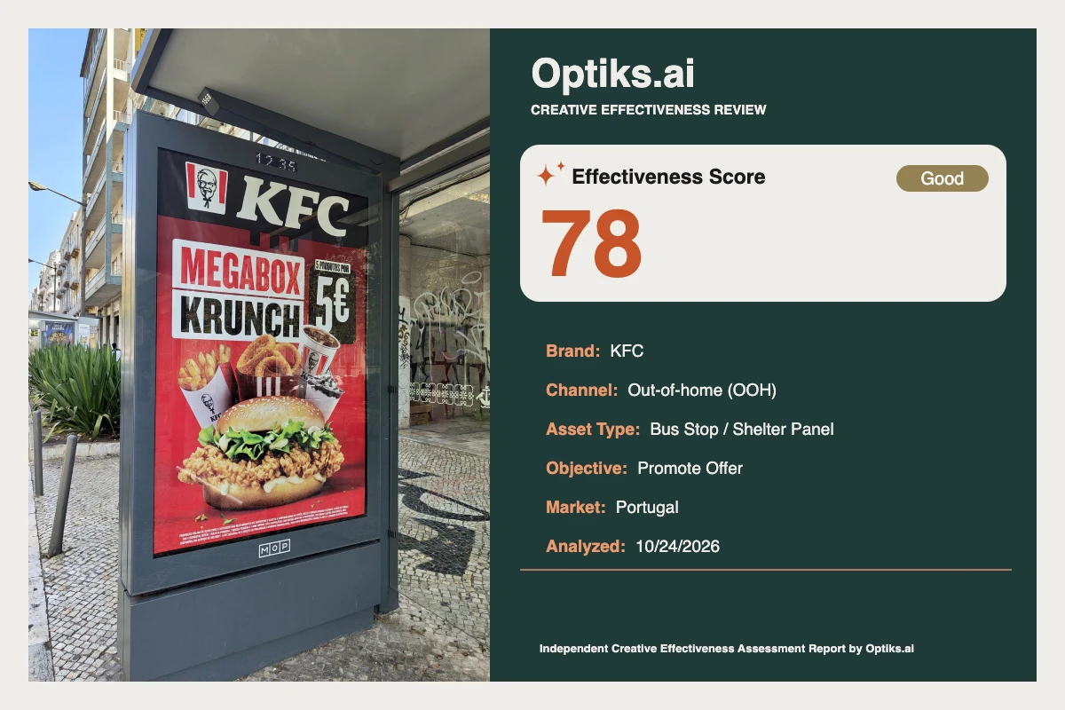
KFC’s Megabox campaign appears on a high-traffic bus shelter panel in Portugal—an environment built for quick, high-impact communication. The objective: drive value perception and immediate interest for a bundled menu offer at a sharp 5€ price point, ideally converting waiting commuters and passersby into restaurant or app visits.
What Works: Arresting Appetite and Fast Brand Recognition Strong Stop Power: The poster leverages a dominant red field occupying about 60% of the canvas (see attention findings ) and a hero burger that fills nearly the entire lower third. These combine with an oversized '5€' price badge to deliver immediate visual arrest.
Instant Brand Identity: The KFC masthead stretches across the top, paired with recognizable bucket stripes and Colonel iconography, ensuring instant encoding (Optiks.ai). Consistent use of KFC’s red, white, and black palette amplifies this effect.
Fast Value Proposition: 'MEGABOX KRUNCH' in uppercase, bold type pairs with the large '5€' numerals, both readable at a distance. Bold product photography aligns tightly to the value promise.
Appetite Cues: The fried chicken and fresh greens are rendered in crisp, saturated tones, triggering immediate sensory motivation. The scale, texture, and color all fulfill quick-service category expectations for indulgent, abundant meals.
These elements, supported by the Optiks.ai analysis, secure the first glance and rapidly communicate KFC's category value and product proposition. The dominant red creates category salience and the overall promise—big food, big value, well-known brand—lands efficiently.
What Holds It Back: Hierarchy Conflicts and Missing Persuasion Devices Conflicting Anchors in the Header: The masthead, headline, and price badge all compete for dominance within the top third. As the Optiks.ai report observes, these three near-equal contrast nodes fragment the reading order, forcing extra fixations and delaying full comprehension of the offer. This weakens the 3-second window that’s critical in OOH (learn why attention allocation matters ).
Underweighted Qualifier: The line '5 PRODUTOS POR' (5 products for...) sits at just 20–25% of the height of the '5€' numerals and is visually separated above the price badge. This disconnect leaves an expectation gap—is the price for the pictured burger, or for a full box? Multiple report sections (message, hierarchy, readability) identify this as a trust and clarity risk. This issue is high-priority for immediate fix.
Absence of CTA or Store Cue: The creative ends at the value statement. There is zero actionable direction—no 'Entra já' (come in now), no app prompt, no geolocation. The Optiks.ai report singles this out as the highest-priority persuasion constraint, noting that without a CTA in or near the price badge, intent fails to convert during the audience's dwell time. This directly undermines campaign impact for a promote-offer objective.
Disconnected Offer and Product: The top-heavy cluster leaves a visual gap between the verbal offer and the appetizing hero image, breaking the flow from awareness to desire to action. Side items add minor distraction rather than clarity.
Readability for Secondary Text: Expansive headline and price elements are legible, but the key qualifying detail and legal print at the bottom fail at normal bus-shelter distances. This affects both offer transparency and legal robustness.
Behavioral Mechanism: From Attention to (Missed) Action This OOH creative achieves its primary goal of instant brand and value recognition, driven by color, size, and sensory appeal. The high-salience elements are well-placed for rapid interception of commuter attention. However, the conflicting anchor points slow message decode, and the missing CTA and store cue mean that while attention and appetite are generated, the behavioral nudge required for conversion—"what do I do now?"—is missing. As identified by the Optiks.ai report, this is a classic breakdown: value is understood, but friction or uncertainty prevents action.
Proposed Practical Fixes Add a Prominent CTA (Highest Priority):
Current layout: '5€' badge stands alone.
Alternative: Insert a pill-shaped black or deep-red CTA immediately below or adjacent to the price, reading 'Entra já', 'Na app', or similar. Minimum 14% of canvas width.
Tradeoff: Slight reduction in whitespace around the cluster, but the gain in actionable persuasion outweighs this.
Unify Offer, Qualifier, and Price Within One Dominant Block:
Current: Qualifier small and offset.
Alternative: Reduce masthead height by at least 25%, move '5 PRODUTOS POR' to sit inside the price badge directly above the numerals at 35–40% cap height. This turns price + context into a single glanceable unit.
Tradeoff: Slightly reduced brand masthead presence, but immediate offer clarity is more valuable for OOH efficiency.
Better Bind Value Message to Appetite Visual:
Current: Offer cluster floats above hero image.
Alternative: Merge headline, qualifier, and price in a single card directly above the burger with a vertical gap ≤4% of canvas height.
Tradeoff: Slight compression of vertical spacing, but creates a tight, logical Z-path from headline to product.
Enhance Burger Edge Definition (Low Priority):
Editorial Verdict The KFC Megabox bus shelter panel demonstrates high craft in appetite appeal, brand presence, and surface-level value communication. Yet for a promote-offer objective, the lack of a consolidated offer hierarchy and—crucially—a visible, action-oriented CTA means that impressive attention is squandered at the moment of potential conversion. Designers should prioritize merging the offer qualifier with the headline/price badge and introduce a CTA device adjacent to the price for the next iteration. The hero food image and brand assets are strengths worth preserving, but should no longer compete with, or distract from, the core offer and call-to-action.
This independent Optiks.ai review has not been commissioned or endorsed by KFC or its agencies. See the full report below for deeper detail and supporting evidence.
Complete creative analysis This report is an independent Optiks.ai assessment of the supplied creative. Scores and predicted attention describe the model's assessment, not measured audience response or sales. The article above provides editorial interpretation.
Analysis details Asset Type Bus Stop / Shelter Panel
Analyzed At 2026-10-24T14:12:45.676908+00:00
Effectiveness Score Scale Out of 100. A model-based creative assessment, not measured campaign performance.
Action Steps Reasons 2 high-priority recommendations are outstanding.
The constraint is Persuasion at 63, a high-weighted domain for this objective.
Summary Fix before running. The score clears the bar, but 2 high-priority recommendations are still open.
Constraint Weight 0.10411784399062604
Optimal viewing distance Context At 10 feet, the 'KFC' masthead and the '5€' numerals read instantly due to strong white-on-black contrast and large forms. 'MEGABOX KRUNCH' in white on red also survives the first glance with clean letter shapes. The hero burger remains identifiable with clear texture across roughly the lower third. The qualifier '5 PRODUTOS POR' and the fine print at the bottom fall below legibility at this distance, which leaves the price decontextualized for many passersby.
Insights At 10 feet, the 'KFC' masthead and the '5€' numerals read instantly due to strong white-on-black contrast and large forms. 'MEGABOX KRUNCH' in white on red also survives the first glance with clean letter shapes. The hero burger remains identifiable with clear texture across roughly the lower third. The qualifier '5 PRODUTOS POR' and the fine print at the bottom fall below legibility at this distance, which leaves the price decontextualized for many passersby.
Strategic insight This creative is appetite-led and price-forward with instant brand recognition, but the absence of a clear CTA or location cue directly undermines the promote‑offer objective by failing to convert attention into a next step.
Domain analysis Brand Top Fix Reduce masthead height by 25–35% and repurpose the saved vertical space to enlarge the stacked offer block.
Summary Identity Clarity — Active Brand Compliance Not Applied. The masthead, buckets and stripes deliver immediate recognition and consistent visual language.
What Hurts Brand masthead scale competes with the offer for first fixation
Portrait icon and wordmark together create redundancy at the expense of offer space
No secondary brand device guiding eye to the price
What Works Large wordmark across the top span
Packaging and stripes reinforce brand codes
Consistent red, white, and black palette
Color Top Fix Introduce a 5–8% height soft light halo behind the hero and a thin white keyline around the price badge to increase isolation via lightness contrast.
Summary The red ground delivers category and brand salience, with white/black text providing strong readability. Food tones pop but could separate more from the red background.
What Hurts Mid-red background can soften burger outline at the bun edge
Multiple red shades between elements slightly dilute cohesion
No neutral break around the offer block to increase isolation
What Works High-contrast white-on-red for headline
Black badge for price creates a clear focal node
Warm golds and greens communicate freshness and crunch
Emotion Top Fix Add a subtle light halo or vignette behind the burger to lift contrast and push appetite appeal without adding clutter.
Summary Appetite appeal is strong; crunchy textures, steam-free but glossy surfaces and vivid greens deliver approach motivation. Brand personality reads as confident and value-driven.
What Hurts Neutral lighting flattens the bun edge against the red field
Sides compete with the burger for indulgence cues
No human element to add social context or time-of-day cue
What Works Crisp fried texture and fresh lettuce drive sensory expectation
Close-up scale signals abundance and indulgence
Value price supports a satisfying-for-less emotional frame
Message Top Fix Elevate '5 PRODUTOS POR' within the price badge so the full value proposition reads as one unit at first glance.
Summary The value message lands in under three seconds: Megabox Krunch for 5€. The small qualifier risks misattribution of the price to a single item.
What Hurts '5 PRODUTOS POR' is underweighted versus the '5€' digits
No timing or availability cue (e.g., lunch only) to set expectations
No quick location or proximity prompt to close the loop
What Works Clear product name and strong value cue
Large, unambiguous price placement
Food-and-beverage cues match product reality and portion expectations
Attention Top Fix Unify the offer by grouping the price and headline into one consolidated block and slightly downweight the masthead to concentrate first fixation on the offer.
Summary The red field, oversized hero burger and large price badge generate strong salience in a cluttered street scene. Competing high-contrast anchors at the top split first fixation time.
What Hurts Brand masthead, headline and price all compete for first read
Side items add additional highlights that pull attention from the price
Top-heavy cluster draws the eye away from the hero in lower half
What Works Dominant red background creates instant standout against urban neutrals
Hero burger fills roughly 30% of canvas height with crisp texture
Large price badge with stark white-on-black numerals
Hierarchy Top Fix Increase '5 PRODUTOS POR' to at least 35–40% of the '5€' cap height and lock it directly above the price inside the same badge to create one dominant offer unit.
Summary Three elements carry near-equal weight: top masthead, 'MEGABOX KRUNCH' and the 5€ badge. The qualifier line '5 PRODUTOS POR' is too small, weakening the read order of the offer.
What Hurts Top bar, headline and price split dominance with similar scale and contrast
Qualifier '5 PRODUTOS POR' sits at a fraction of price size and is easy to miss
Hero food sits visually disconnected from the price and headline cluster
What Works Clear brand presence across the top span
Bold, blocky headline styles that scan fast
Price positioned in a high-attention top-right zone
Persuasion Top Fix Add a high-contrast CTA tag or strip occupying 14–18% of canvas width, placed adjacent to the price, with action language tied to the nearest store or app.
Summary The price sells value but the creative lacks a CTA or location cue, breaking the conversion path for a promote‑offer objective. No prompt to act now or where to go.
What Hurts No CTA such as 'Entra já' or 'Na app' to convert interest
No store proximity or directional cue
CTA is not present; by rule, persuasion is capped
What Works Compelling 5€ price at high salience
Clear product depiction supporting value credibility
Brand trust reduces risk for quick-service decision
Composition Top Fix Group headline + qualifier + price into a single card centered above the hero and trim masthead height to rebalance visual weight.
Summary The layout is vertically stacked but top-heavy, with three strong elements compressed near the header. The hero sits slightly isolated from the value message.
What Hurts Masthead height crowds the headline and price
Offer block and hero lack a physical link, breaking story flow
Side items add peripheral pull near the offer cluster
What Works Clear top-to-bottom reading path from brand to offer to product
Centered hero anchors the lower half
Price in the top-right aligns with common Z-scan behaviors
Context fit Top Fix Raise the size and contrast of '5 produtos por' within the price unit so the full offer survives the 3-second rule.
Summary Optimized for bus-shelter glance: big food, big price, short words. Small qualifiers and legal copy drop out at 10 feet, which is acceptable except for the crucial '5 produtos por' line.
What Hurts Key qualifier is under the legibility threshold at distance
Top clustering compresses the reading window
No location/drive-time cue for path to store
What Works Three-second decode for brand, product and price
No reliance on QR scanning or micro-detail
Bold color blocks that survive glare
Readability Top Fix Scale '5 PRODUTOS POR' to at least a third of headline cap height and maintain black on white or white on black contrast directly attached to the price badge.
Summary Headline, price and brand read cleanly with strong light–dark separation. Fine print and the small qualifier line fail at typical bus-shelter distances.
What Hurts '5 PRODUTOS POR' set too small relative to its importance
Fine print across the bottom is illegible in real conditions
Some mid-red behind food reduces edge definition of item names if present
What Works White text on red/black fields for headline and price
Large numeral forms for '5€' with generous counters
Short, punchy headline words with high legibility at speed
Cognitive load Top Fix Consolidate headline, qualifier and price into one stacked unit and reduce masthead height to 10–12% of canvas to minimize competing anchors.
Summary The concept is simple, but multiple equal-weight anchors force extra glances. The offer qualifier’s small size adds an unnecessary inference step.
What Hurts Three top anchors of similar strength increase decision friction
Qualifier text forces viewers to resolve what '5€' buys
Side items introduce extra highlights that do not add new meaning
What Works Single-sku hero scene avoids menu-level overload
Short headline and prominent price reduce copy processing
Consistent KFC visual language reduces interpretation time
Findings Title Red field and oversized hero deliver fast visual arrest
Detail Roughly 60% of the canvas is a saturated red ground (#E4002B), which spikes saliency against the grey shelter frame and pavement. The hero burger occupies about 30% of canvas height and spans the central width, using warm golds and greens to stand off the red. The price badge in the upper right covers ~18% of width with white numerals on black, adding a second high-contrast node. This triad secures the first glance in a busy streetscape and lifts stopping power.
Description Roughly 60% of the canvas is a saturated red ground (#E4002B), which spikes saliency against the grey shelter frame and pavement. The hero burger occupies about 30% of canvas height and spans the central width, using warm golds and greens to stand off the red. The price badge in the upper right covers ~18% of width with white numerals on black, adding a second high-contrast node. This triad secures the first glance in a busy streetscape and lifts stopping power.
Title Three equal-weight anchors split the first read
Detail The masthead across the top spans roughly 70% of canvas width, the 'MEGABOX KRUNCH' block sits center-left at ~45% width, and the '5€' badge sits top-right at ~18% width. All three use strong light–dark contrast, creating near-equal pull. This distributes first fixation across the header band rather than consolidating it on the value message. The result is a slower decode of the full offer, costing comprehension within the 3-second OOH window.
Description The masthead across the top spans roughly 70% of canvas width, the 'MEGABOX KRUNCH' block sits center-left at ~45% width, and the '5€' badge sits top-right at ~18% width. All three use strong light–dark contrast, creating near-equal pull. This distributes first fixation across the header band rather than consolidating it on the value message. The result is a slower decode of the full offer, costing comprehension within the 3-second OOH window.
Title Value proposition lands fast
Detail The combination of 'MEGABOX KRUNCH' and the large '5€' reads cleanly at distance, with minimal copy and strong separation between text and background. The product name and price are both short and set in bold uppercase, reducing character-level processing. Food imagery behind the message aligns with the offer’s promise of an indulgent bundle. Viewers register the value frame quickly, which supports drive-to-purchase intent.
Description The combination of 'MEGABOX KRUNCH' and the large '5€' reads cleanly at distance, with minimal copy and strong separation between text and background. The product name and price are both short and set in bold uppercase, reducing character-level processing. Food imagery behind the message aligns with the offer’s promise of an indulgent bundle. Viewers register the value frame quickly, which supports drive-to-purchase intent.
Title Qualifier line underweighted against price
Detail The line '5 PRODUTOS POR' sits at roughly 20–25% of the '5€' cap height and is physically separated in a small white strip above the badge. This forces the viewer to infer whether 5€ covers the whole box or a single item. Under the Food & Beverage expectation-accuracy rule, this underweight qualifier risks an expectation gap and follow-up disappointment. That gap weakens trust and suppresses repeat purchase.
Description The line '5 PRODUTOS POR' sits at roughly 20–25% of the '5€' cap height and is physically separated in a small white strip above the badge. This forces the viewer to infer whether 5€ covers the whole box or a single item. Under the Food & Beverage expectation-accuracy rule, this underweight qualifier risks an expectation gap and follow-up disappointment. That gap weakens trust and suppresses repeat purchase.
Title No CTA or location cue to convert intent
Detail The creative presents price and product but provides no actionable next step — no 'Entra já', 'Na app', or store-direction cue. For a promote‑offer objective, this breaks the path from attention to action. Without a CTA occupying at least 12% of canvas width and placed adjacent to the price, passersby register the value but fail to act in the moment. This directly depresses redemptions and in-store lift.
Description The creative presents price and product but provides no actionable next step — no 'Entra já', 'Na app', or store-direction cue. For a promote‑offer objective, this breaks the path from attention to action. Without a CTA occupying at least 12% of canvas width and placed adjacent to the price, passersby register the value but fail to act in the moment. This directly depresses redemptions and in-store lift.
Title Top-heavy stack compresses the offer block
Detail The brand masthead consumes ~12–14% of canvas height, the headline block sits immediately beneath it, and the price badge crowds the same vertical band. The hero occupies the lower third with little structural connection to the price. This creates a gap between product desire and value proof. Tightening the vertical spacing and consolidating the offer would create a cleaner Z-path from brand to price to product.
Description The brand masthead consumes ~12–14% of canvas height, the headline block sits immediately beneath it, and the price badge crowds the same vertical band. The hero occupies the lower third with little structural connection to the price. This creates a gap between product desire and value proof. Tightening the vertical spacing and consolidating the offer would create a cleaner Z-path from brand to price to product.
Title Strong appetite appeal through texture and scale
Detail The fried chicken patty shows crisp, irregular edges and visible crumb detail, while the lettuce delivers saturated greens with wet highlights. The bun fills nearly the full width of the lower third, signaling abundance. These sensory cues trigger pre-attentive processing of texture and warmth, which increases approach motivation. The visual promise matches a typical QSR experience, strengthening credibility.
Description The fried chicken patty shows crisp, irregular edges and visible crumb detail, while the lettuce delivers saturated greens with wet highlights. The bun fills nearly the full width of the lower third, signaling abundance. These sensory cues trigger pre-attentive processing of texture and warmth, which increases approach motivation. The visual promise matches a typical QSR experience, strengthening credibility.
Title Fine print and small qualifier fail at distance
Detail The bottom fine print occupies a thin strip at ~3% of canvas height in small white text on a dark bar and is not legible at 10 feet. The '5 PRODUTOS POR' line is similarly under-scaled relative to the price, reducing its survival in glare or motion. This costs the secondary read and leaves the price decontextualized. The effect is missed details and weaker perceived transparency.
Description The bottom fine print occupies a thin strip at ~3% of canvas height in small white text on a dark bar and is not legible at 10 feet. The '5 PRODUTOS POR' line is similarly under-scaled relative to the price, reducing its survival in glare or motion. This costs the secondary read and leaves the price decontextualized. The effect is missed details and weaker perceived transparency.
Title Brand red drives salience; subtle edge loss around bun
Detail The dominant red (#E4002B) covers most of the background and sets a strong brand code. At the bun’s upper edge, mid-red adjacency softens separation, especially where sesame seeds lighten the tone. A faint light halo or vignette behind the burger would restore edge definition without adding elements. This minor adjustment would strengthen the hero’s pop in variable daylight.
Description The dominant red (#E4002B) covers most of the background and sets a strong brand code. At the bun’s upper edge, mid-red adjacency softens separation, especially where sesame seeds lighten the tone. A faint light halo or vignette behind the burger would restore edge definition without adding elements. This minor adjustment would strengthen the hero’s pop in variable daylight.
Recommendations Action Add a CTA tag adjacent to the price that occupies 14–18% of canvas width, such as a horizontal pill positioned 3–5% below the price badge. Use white text (#FFFFFF) on a black or very dark red field for maximum separation, with action copy like 'Entra já' or 'Na app'. Keep CTA height ~40% of its width and align its left edge to the price badge to create one conversion cluster.
Impact For a promote‑offer objective, the absence of a CTA suppresses redemptions. Commuters will register the 5€ hook and move on without an action nudge, which reduces in-the-moment intent and lowers store visits.
Evidence The '5€' badge occupies ~18% of canvas width in the top-right. No action tag exists within the top third or near the hero. The red background (#E4002B) and black badge (#000000) provide room to add a high-contrast action element without crowding.
Observation There is no CTA or location cue adjacent to the price. The layout currently ends with a value statement but no action language, leaving the viewer without a next step.
Action Reduce masthead height by 25–35% (to ~8–10% of canvas height) and expand the stacked offer block into the freed space. Scale '5 PRODUTOS POR' to 35–40% of the '5€' cap height and place it inside the price badge directly above the numerals, so the entire value statement reads as one consolidated unit.
Impact Equal-weight anchors slow scanning and force extra fixations to understand the offer. The small qualifier weakens comprehension of what the 5€ buys, risking misinterpretation and lost trust.
Evidence Masthead height ~12–14% of canvas, headline block ~10–12%, and price badge ~18% width compete in the same vertical zone. The qualifier line sits at roughly 20–25% of the price numeral height in black on white.
Observation The masthead, headline and price share similar visual weight and sit in close proximity along the top band. The qualifier '5 PRODUTOS POR' is disproportionately small versus the '5€' digits.
Action Bring the qualifier into the price badge and increase its size to at least one-third of the price cap height. If legal copy must remain, increase its height by 50% and keep it in a solid dark band with white text so it remains legible without competing with the headline.
Impact Viewers miss the context that turns a price into a value claim. This reduces perceived transparency and lowers the chance of immediate consideration.
Evidence Qualifier height ~20–25% of price cap height; fine print strip ~3% of canvas height in white on dark. Primary headline and price read; these secondary elements do not survive the quick glance.
Observation Secondary information — the qualifier and fine print — falls below legibility thresholds at bus-shelter distance. The qualifier currently sits outside the main badge and at a small ratio to the price text.
Action Create a single offer card spanning 60–70% of canvas width and 12–15% of height, centered above the hero, that stacks headline, qualifier and price. Reduce vertical spacing between this card and the burger to <=4% of canvas height to visually bind value to product.
Impact This gap breaks the flow from price to product, reducing the immediate link between value and appetite that drives fast decision-making.
Evidence Masthead + headline + price occupy roughly the top 35–38% of height. The hero occupies the lower third with no connective device or shared container.
Observation The layout is top-heavy with three strong elements compressed near the header, while the hero sits visually separate below.
Action Apply a subtle radial vignette behind the hero (5–8% of canvas height radius) or a 1–2% white keyline around the burger’s top arc. This isolates the hero via lightness contrast without changing palette or adding new elements.
Impact Softer edges lower the Von Restorff effect on the hero and dilute food salience in peripheral vision.
Evidence Dominant red background (#E4002B) meets tan bun tones; edge separation weakens at the upper bun arc where both values are mid-lightness.
Observation The burger pops, but the bun edge blends slightly with the red field, softening contour contrast in daylight.
Action Add a compact proximity/app subline directly beneath the new CTA, occupying ~70% of CTA width with high contrast (e.g., #FFFFFF on #000000). Keep copy to 3–4 words, such as 'Na app KFC' or '2 min daqui', to survive the same glance as the price.
Impact Without a location or quick-order cue, the ad drives salience but leaves short-term action untapped during dwell time at the shelter.
Evidence No arrow, distance, or app lockup is present near the price or hero. Top-right price zone remains the highest-attention area and is the right place to carry this cue.
Observation The design wins the 3-second read for brand, product and price, but misses the proximity or app cue that suits a bus-shelter audience.
Predicted attention map Description Large, high-texture food image centered in the lower third with warm golds and greens against the red field. Size dominance and appetizing detail pull immediate fixation and encode the sensory promise.
Description Stark white numerals on a black badge in the top-right create a strong contrast node. The simple shape and large glyphs make the value cue unavoidable in the first glance.
Label Headline 'MEGABOX KRUNCH'
Description Blocky uppercase text in white against red/black blocks across the upper-mid area. Text regions naturally attract reading fixations and reinforce the offer name.
Description Large white wordmark on black spanning the top band. High contrast and scale ensure brand encoding but also compete with the offer for early attention.
Label Side Items (Fries/Onion Rings)
Description Bright golden tones and white packaging flanking the hero create secondary highlights. These elements add appetite cues but pull some attention from the consolidated offer cluster.
Scoring weights Final Weights Emotion 0.05825242718446602
Message 0.12721794442584533
Attention 0.12186139939738867
Hierarchy 0.11382658185470372
Persuasion 0.10411784399062604
Composition 0.0763307666555072
Context fit 0.10378305992634752
Readability 0.10579176431201874
Cognitive load 0.03347840642785403
Accessibility checks Checks Element Headline 'MEGABOX'
Criterion 1.4.3 Contrast (Minimum)
Criterion 1.4.3 Contrast (Minimum)
Criterion 1.4.3 Contrast (Minimum)
Element Qualifier '5 PRODUTOS POR'
Criterion 1.4.3 Contrast (Minimum)
Element Brand masthead 'KFC'
Criterion 1.4.3 Contrast (Minimum)
Element Fine print (bottom strip)
Criterion 1.4.3 Contrast (Minimum)
Rejected
Compliance review Description The qualifier '5 PRODUTOS POR' is under-scaled relative to the '5€' price (about a quarter of the cap height) and sits outside the main badge, reducing legibility at bus-shelter distance and risking misinterpretation of the offer.
Description Fine print across the bottom sits at ~3% of canvas height in white on a dark band and does not remain legible at 10 feet. Primary headline and price maintain strong light–dark separation, but secondary details fail the viewing-distance requirement.
Assessment methodology Industry Food & Beverage CPG
Explore more articles and guides