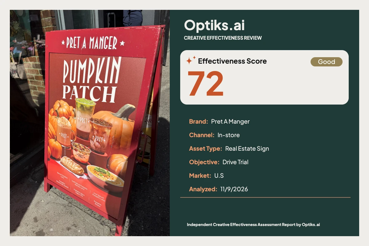
Creative Effectiveness Review
Pret A Manger - Pumpkin Patch Beverages: Appetite Ignites but Persuasion Fizzles at the Door Optiks.ai | November 9, 2026
Placement and Task
The Pret A Manger "Pumpkin Patch Beverages" A-frame sits directly at the store entrance—a high-traffic, short-dwell zone designed to intercept and convert passersby at close range (roughly 5 feet). In this context, the sign’s communication task is urgent but straightforward: spark appetite and tip in-store shoppers toward trying seasonal LTOs, with a priority on immediate conversion rather than mere awareness.
What Works: Visual Hook and Emotional Appetite Headline Dominance: The uppercase ‘PUMPKIN PATCH’ headline, spanning about 70% width and 20% height, commands instant attention. Its white-on-warm red contrast achieves robust figure-ground separation, with Optiks.ai analysis confirming pre-attentive capture in under 200ms and broad seasonal relevance (#analysis-report).
Hero Product Cluster: The central drinks, pastries, and soup grouped amid pumpkins radiate warmth and texture. The food photography is rich with glossy surfaces, foam, and evident steam cues, stacking visual triggers for appetite. As the Optiks.ai report notes, these cues help encode a sensory memory, grounding the offering in a "buy here-now" physicality.
Palette Cohesion: Saturated oranges, coppers, and maroons deliver immediate autumnal association, helping the sign stand out from the grey sidewalk and underlining the offer’s seasonality.
What Holds It Back: The Crosswalk of Conversion No Persuasive Finish—Missing CTA and Price The campaign falls critically short at its narrowest point: Persuasion (score: 58 ), the core constraint identified by the Optiks.ai report. While attention and appetite are successfully triggered, the next behavioral step is absent. Neither an explicit call-to-action nor a price appears on the insert. The bottom item list functions as a passive menu, not an activating offer. The result? Shoppers may pause, admire, then enter undecided—dampening attach rate and undermining the ‘Drive Trial’ objective. In short, the design “stops at desire and fails to direct action” (Optiks.ai report).
Insufficient Readability at Sidewalk Distance Readability (score: 65) suffers at the critical secondary level. The menu list at the base occupies about 90% of sign width but only ~3-4% of height. The combination of small text and a red-to-orange gradient—further disrupted by reflections and copper highlights—means that, at 5–8 feet, letterforms lose clarity and virtually all SKUs other than the familiar latte are missed by the transient glance. Accessibility checks confirm failure of the lower text in meeting even basic WCAG AA contrast references. See Readability in Advertising for more on the cost of microcopy in OOH.
Hierarchy Breaks After the Hero The visual path is headline-first, hero cluster second—and then it dissipates, with no CTA or price anchor to move viewers from consideration to action. This lack of a third, action-oriented element breaks the classic conversion flow, resulting in “high awareness with low directed behavior.”
Cognitive and Compositional Hurdles Crowded Baseline: The item list, pumpkins, and product edges all crowd into the bottom 20% of the canvas, with insufficient whitespace or clear separation for the copy. Multiple micro-elements compete, denying any one item the Von Restorff isolation needed for fast decision making.
Brand Attribution Relies on Vessels: While Pret branding is visible on the hero products (cups, bowls), there is no dedicated logo lockup within the insert. This is a minor issue for loyalists but will slow attribution for unfamiliar passersby if hardware branding is inconsistent.
Emotional Mechanism: Appetite cues are strong, and the abundance of pumpkins and warm hues drives seasonal immersion. However, emotional resonance is mood-focused; no consumption cue or relatable human touchpoint is provided, which could deepen empathy and signal immediacy.
Prioritized Fixes & Trade-Offs Insert a Price-Led CTA Badge : Place a circular or pill-shaped badge (“Try Today – $X.XX”) at eye-path height, aligned near the hero drinks. This achieves persuasion and hierarchy fixes in one, converting attention into action. Example: Current: [no call-out]Proposed: Try Today $4.99
Solid Copy Band for Menu Items: Create a deep maroon panel across the bottom 18–22% of canvas, boost font to at least 6% of canvas height, raise line spacing, and split SKUs into two columns. This ensures menu legibility at sidewalk distance.Example: Current: six tiny items in a single line on a variable backgroundProposed: two columns in a solid dark panel with larger, well-spaced text
Spotlight One Hero SKU: Promote the signature or most profitable beverage in a dedicated, larger type line above the CTA for clear guided hierarchy. Surround with ample whitespace for isolation and impact.
Rebalance Composition: Move the hero cluster up by ~6% canvas height, freeing space for the copy band and reducing crowding along the baseline.
Optional Brand Mark: For maximum at-a-glance recall, add a small Pret wordmark in the top right with a protective margin—though the product cues suffice for loyalists.
Editorial Verdict Pret’s "Pumpkin Patch Beverages" A-frame is compelling at a glance: headline and imagery jointly deliver appetite and seasonality, perfectly tuned for autumn impulse. Yet, the failure to close the conversion path—no clear CTA, price, or read-at-a-glance menu—renders its strongest virtues moot at the decisive moment. Senior marketers and creative directors should treat this as “close, but fix before running.” With straightforward adjustments—badge CTA, solid menu panel, stronger item hierarchy—this good sign can become a great sales driver, safeguarding against both missed opportunities and cognitive overload. The seasonal feeling and appetite triggers are worth keeping; the persuasion block must go.
This independent Optiks.ai Creative Effectiveness Review was not commissioned or endorsed by Pret A Manger.
Complete creative analysis This report is an independent Optiks.ai assessment of the supplied creative. Scores and predicted attention describe the model's assessment, not measured audience response or sales. The article above provides editorial interpretation.
Analysis details Asset Type Real Estate Sign
Analyzed At 2026-11-09T22:12:13.041521+00:00
Effectiveness Score Scale Out of 100. A model-based creative assessment, not measured campaign performance.
Action Steps Reasons An effectiveness score of 72 is below the 75 needed to run as-is.
The constraint is Persuasion at 58, a high-weighted domain for this objective.
Summary Fix before running. At 72 this is close, and Persuasion at 58 is the constraint.
Constraint Weight 0.11332858161083392
Optimal viewing distance Context This A-frame sits at the entrance, so passersby approach within ~5 feet and grant a short pause. At that distance, the 'PUMPKIN PATCH' headline (~20% of canvas height) reads instantly and the hero cluster (~35% height) is identifiable. The PRET marks on vessels remain visible but not as a discrete logo. The bottom item list (~3–4% height) fails at this distance; shoppers register the season but miss the specific SKUs. Adding a price-led CTA in the central-right zone will survive the same glance and convert interest.
Insights This A-frame sits at the entrance, so passersby approach within ~5 feet and grant a short pause. At that distance, the 'PUMPKIN PATCH' headline (~20% of canvas height) reads instantly and the hero cluster (~35% height) is identifiable. The PRET marks on vessels remain visible but not as a discrete logo. The bottom item list (~3–4% height) fails at this distance; shoppers register the season but miss the specific SKUs. Adding a price-led CTA in the central-right zone will survive the same glance and convert interest.
Strategic insight The creative is appetite-led and seasonally distinctive, but the lack of an in-sign CTA or price and an undersized item list directly undermines the drive-trial objective at the door.
Domain analysis Brand Top Fix Add a compact wordmark in the top-right of the insert at ~10–12% of width to ensure brand attribution independent of hardware.
Summary Identity Clarity — Active Brand Compliance Not Applied. PRET vessel branding and typography feel internally consistent even without a discrete logo lockup on the insert.
What Hurts No distinct logo lockup within the insert itself
Reliance on product vessels for attribution at a glance
Top hardware branding is outside the insert boundary and not guaranteed across sites
What Works PRET marks visible on multiple cups in the hero cluster
Typography and star icons match recognizable brand cues
Color palette aligns with established seasonal executions
Color Top Fix Introduce a deep-maroon (#7A1E1E) copy panel behind all small text, spanning the lower 18–22% of canvas height to stabilize contrast.
Summary A unified warm palette communicates seasonality and appetite with strong headline contrast. Bottom gradient reduces micro-text legibility.
What Hurts Lighter orange behind small white text reduces clarity
Copper reflections near glyphs add busy highlights
Lack of a neutral panel for copy forces text over image/gradient areas
What Works White-on-deep-warm-red headline provides strong separation
Pumpkin oranges and copper highlights reinforce flavor cues
Palette coherence supports quick seasonal recognition
Emotion Top Fix Introduce a hand reaching for the hero drink or a spoon entering the soup within the product cluster to add a relatable consumption cue without clutter.
Summary Rich texture, steam, and warm tones trigger appetite and seasonal comfort. Emotional encoding favors the drinks and pastry.
What Hurts Emotion centers on mood without a conversion nudge
Peripheral pumpkins pull attention away from the hero bite
No human touchpoint or moment-of-consumption cue to deepen empathy
What Works Glossy surfaces, latte foam, and steam cues imply indulgence
Warm oranges and coppers evoke autumnal comfort
Abundant pumpkins create seasonal immersion
Message Top Fix Add a 'Limited Time' ribbon and a price point for one hero drink in a badge at 14–18% width to communicate concrete value.
Summary Seasonal story is unmistakable; the functional offer lacks specificity without price or a 'try today' cue.
What Hurts No value proposition or price to close the decision
Item names are present but too small to function as the message
No limited-time or scarcity cue to create urgency
What Works Clear seasonal theme communicated by headline and imagery
Product types (latte, soup, pastry) are visually explicit
Brand vessel cues imply availability here-and-now
Attention Top Fix Introduce a high-contrast CTA badge near the hero products occupying 14–18% of canvas width to capture the final fixation and convert attention into action.
Summary Large white 'PUMPKIN PATCH' headline and saturated orange product visuals grab attention instantly. The warm palette contrasts strongly with the sidewalk environment.
What Hurts Peripheral pumpkins create secondary hotspots that compete with the menu list
Top frame hardware distracts slightly from the insert when viewed obliquely
No distinct CTA zone to capture the final fixation
What Works Headline occupies roughly 20% of canvas height and ~70% width
High-contrast white-on-warm-red text
Cluster of bright pumpkins and drinks centered across ~60% of width
Hierarchy Top Fix Add a clear CTA panel directly right of the hero drinks at ~45% canvas height, sized to 15% of width, to enter the top-three elements.
Summary Hierarchy is headline-first, product-second, with the item list relegated to the bottom. Absence of a CTA means the priority path stops short of action.
What Hurts No CTA within the top three visual elements
Item list at ~4% of canvas height lacks weight and gets skipped
Branding is implicit on cups; no clear brand anchor within the insert
What Works Dominant headline at the upper third
Hero product cluster centered and large
Consistent typographic style reinforces reading order
Persuasion Top Fix Add a price-led CTA badge next to the hero drinks at 14–18% of canvas width with action text (e.g., 'Try Today') to convert interest at the door.
Summary No CTA or price on the insert; the design stops at desire and fails to direct action or communicate value. For drive-trial, this is the primary blocker.
What Hurts No CTA present and therefore not in the top-three elements
No price anchor or offer framing
Item list too small to function as a persuasive cue
What Works High appetite appeal predisposes acceptance
Seasonal limited nature is implied by headline
In-store presence signals immediate availability
Composition Top Fix Carve a dedicated bottom band at 18–22% canvas height for copy and CTA, pulling product edges up by ~6% to restore whitespace.
Summary Centered product cluster balances with the headline; the base gets crowded where copy and product edges meet.
What Hurts Bottom copy sits close to product edge; limited breathing room
Multiple small objects along the baseline read as clutter
No clear CTA anchor breaks the otherwise stable pyramid
What Works Classic top-headline, center-hero, bottom-copy structure
Symmetrical hero arrangement stabilizes the scene
Generous margins left/right keep the field contained
Context fit Top Fix Prioritize a single hero offer with price and CTA large enough to read at 5–8 ft, placed in the central-right scan path at ~60% from the left edge.
Summary The A-frame position at the entrance suits seasonal promotions. Small copy underperforms at typical sidewalk viewing distances and quick glances.
What Hurts Fine item list fails the quick-read requirement
No CTA for quick conversion when customers pause
No pricing discourages impulse decisions before entering
What Works Large headline survives a passing glance at 5–8 ft
Hero imagery remains identifiable in motion
Seasonal relevance is immediate to approaching traffic
Readability Top Fix Increase the item-list text to at least 6% of canvas height and place it on a solid deep-maroon panel spanning 90–100% of width to guarantee clean contrast.
Summary Headline reads cleanly; the bottom item list is too small for a 5–8 ft read and loses utility in real walk-by conditions.
What Hurts Bottom line items sit at ~3–4% of canvas height and collapse at 5 ft
White text over a red-to-orange gradient reduces legibility where the gradient lightens
Copper mug highlights behind text introduce visual noise near glyph edges
What Works Large uppercase headline with strong figure-ground separation
Simple, condensed sans-serif with solid stroke weight
Minimal copy above the fold reduces scanning burden
Cognitive load Top Fix Convert the item list into two tiers: highlight two hero items at 1.5x current text size, with remaining items grouped beneath as a single line to reduce simultaneous choices.
Summary Information is grouped into a clear headline, product cluster, and item list. Visual variety pushes the eye around but remains decodable within a short dwell.
What Hurts Six-plus food items and pumpkins hold similar visual weight at mid-level
Item list uses equal emphasis across options, slowing choice
No price anchor forces extra cognitive steps to check menu in-store
What Works Three clear information chunks reduce decision friction
Consistent color family simplifies parsing
Repeated PRET marks on cups aid recognition
Findings Title Seasonal headline commands first fixation
Detail The uppercase 'PUMPKIN PATCH' headline spans roughly 70% of the canvas width and about 20% of the height, set in white against a deep warm red field. This creates a strong value contrast and a clean figure–ground relationship that arrests the eye on approach. Pre-attentive processing favors this large, high-contrast text within ~200 ms, ensuring the headline lands before other details. This front-loads seasonal relevance and stops passersby long enough to notice the product cluster.
Description The uppercase 'PUMPKIN PATCH' headline spans roughly 70% of the canvas width and about 20% of the height, set in white against a deep warm red field. This creates a strong value contrast and a clean figure–ground relationship that arrests the eye on approach. Pre-attentive processing favors this large, high-contrast text within ~200 ms, ensuring the headline lands before other details. This front-loads seasonal relevance and stops passersby long enough to notice the product cluster.
Title Hero product cluster delivers appetite appeal
Detail The central food-and-beverage cluster occupies ~60% of canvas width and ~35% of height, with glossy surfaces, foam textures, and steam cues. Pumpkins wrap the cluster, reinforcing flavor expectation and warmth. Emotional encoding benefits from these sensory cues, building a stronger memory trace than neutral product shots. The cluster ties desire to the store context through branded vessels, increasing the likelihood of in-door ordering.
Description The central food-and-beverage cluster occupies ~60% of canvas width and ~35% of height, with glossy surfaces, foam textures, and steam cues. Pumpkins wrap the cluster, reinforcing flavor expectation and warmth. Emotional encoding benefits from these sensory cues, building a stronger memory trace than neutral product shots. The cluster ties desire to the store context through branded vessels, increasing the likelihood of in-door ordering.
Title No CTA or price to convert
Detail The insert lacks any explicit call-to-action and shows no price, leaving the persuasive path unfinished. The bottom item list reads as catalog, not an offer, and sits at only ~3–4% of canvas height. Without an action cue or price anchor, shoppers pause, admire, and walk in still undecided about what to order. For a drive-trial objective, this costs immediate upsell and reduces attach rate for seasonal items.
Description The insert lacks any explicit call-to-action and shows no price, leaving the persuasive path unfinished. The bottom item list reads as catalog, not an offer, and sits at only ~3–4% of canvas height. Without an action cue or price anchor, shoppers pause, admire, and walk in still undecided about what to order. For a drive-trial objective, this costs immediate upsell and reduces attach rate for seasonal items.
Title Bottom item list is undersized for sidewalk distance
Detail The multi-item line at the bottom occupies about 90% of width but only ~3–4% of height, with white text over a red-to-orange gradient. At 5–8 feet, the small cap height and gradient variation reduce letterform clarity, especially for longer item names. The F-pattern scan drops off at the fold, so low-contrast small text positioned here receives minimal processing time. This reduces readability at 5 feet and costs the secondary read needed to drive specific trial choices.
Description The multi-item line at the bottom occupies about 90% of width but only ~3–4% of height, with white text over a red-to-orange gradient. At 5–8 feet, the small cap height and gradient variation reduce letterform clarity, especially for longer item names. The F-pattern scan drops off at the fold, so low-contrast small text positioned here receives minimal processing time. This reduces readability at 5 feet and costs the secondary read needed to drive specific trial choices.
Title Brand attribution relies on vessels inside the hero
Detail Within the insert boundary, the most consistent brand cues are the PRET marks on cups rather than a discrete logo lockup. These marks sit inside the hero cluster, roughly mid-canvas, sharing visual weight with product textures. Identity recognition still lands but depends on close inspection rather than a dedicated logo zone. This is acceptable for loyalists but less efficient for casual passersby.
Description Within the insert boundary, the most consistent brand cues are the PRET marks on cups rather than a discrete logo lockup. These marks sit inside the hero cluster, roughly mid-canvas, sharing visual weight with product textures. Identity recognition still lands but depends on close inspection rather than a dedicated logo zone. This is acceptable for loyalists but less efficient for casual passersby.
Title Hierarchy stops at headline and hero
Detail The path runs Headline (top third) → Hero products (center) and then dissipates without a conversion step. The CTA is absent and therefore not in the top three elements, tripping the hierarchy anchor for action-led work. The bottom copy competes with product edges and loses the eye in peripheral scanning. The result is high awareness with low directed behavior.
Description The path runs Headline (top third) → Hero products (center) and then dissipates without a conversion step. The CTA is absent and therefore not in the top three elements, tripping the hierarchy anchor for action-led work. The bottom copy competes with product edges and loses the eye in peripheral scanning. The result is high awareness with low directed behavior.
Title Warm palette unifies but light areas undercut small text
Detail Deep maroon, warm red, orange pumpkins, and copper vessels create a cohesive autumnal palette. White headline over deep red reads strongly, but white micro-copy over lighter orange and reflective coppers near the baseline loses crispness. The palette supports appetite yet complicates legibility where lightness narrows. This slightly lowers effectiveness of the detailed read at the bottom.
Description Deep maroon, warm red, orange pumpkins, and copper vessels create a cohesive autumnal palette. White headline over deep red reads strongly, but white micro-copy over lighter orange and reflective coppers near the baseline loses crispness. The palette supports appetite yet complicates legibility where lightness narrows. This slightly lowers effectiveness of the detailed read at the bottom.
Title Crowded baseline compresses copy
Detail Product edges, pumpkin props, and the item list all converge in the bottom 20% of the canvas. The overlap of textures behind the glyphs and limited breathing room collapse the copy’s visual weight. With multiple micro-elements sharing equal prominence, Von Restorff isolation never occurs for any one line. Decision speed slows, and the list fails to guide selection.
Description Product edges, pumpkin props, and the item list all converge in the bottom 20% of the canvas. The overlap of textures behind the glyphs and limited breathing room collapse the copy’s visual weight. With multiple micro-elements sharing equal prominence, Von Restorff isolation never occurs for any one line. Decision speed slows, and the list fails to guide selection.
Title A-frame placement captures entrance traffic
Detail The insert faces the doorway path at a shallow angle, presenting the headline and center hero within the primary approach cone. At 5 feet, the headline decodes in under a second and the hero products remain identifiable. However, the small copy tier does not survive the same glance window. The setup is right for impulse trial once a price-led CTA is added.
Description The insert faces the doorway path at a shallow angle, presenting the headline and center hero within the primary approach cone. At 5 feet, the headline decodes in under a second and the hero products remain identifiable. However, the small copy tier does not survive the same glance window. The setup is right for impulse trial once a price-led CTA is added.
Recommendations Action Add a circular or pill CTA badge adjacent to the hero drinks at ~55–65% canvas height and 60% from the left edge, sized to 14–18% of canvas width. Include action text (e.g., 'Try Today') and a hero price; set text at ~35–40% of badge height and keep the badge color deep maroon with white text for maximum separation.
Impact Without an action cue, the design generates appetite but not orders. A price-led CTA at the point of fixation converts undecided passersby and speeds the first seasonal purchase choice.
Evidence The hero cluster spans ~60% of width at mid-height; this is where fixations concentrate. The bottom copy sits at ~3–4% of height and under-indexes for attention. A badge at 14–18% of canvas width with white text on deep maroon (#7A1E1E) would isolate through contrast and size.
Observation The insert lacks a call-to-action and shows no price. The eye path stops after the hero cluster, leaving no nudge to act. The bottom item list reads as catalog copy without a conversion cue.
Action Create a solid copy band across the lower 18–22% of canvas height in deep maroon (#7A1E1E). Increase item text to at least 6% of canvas height and raise line spacing by ~30% relative to current; separate items into two columns with a 6–8% gutter to maintain scanability.
Impact At 5–8 feet, the small size and variable background reduce legibility. Shoppers miss specific items, which suppresses trial of less obvious SKUs and shifts orders to default favorites.
Evidence Bottom text height ≈3–4% of canvas; baseline band includes lighter orange tones and copper speculars. The letters sit close to product edges, adding noise at the stroke boundaries.
Observation The item list occupies nearly the full width but only a small fraction of height, and it sits on a variable red-orange gradient with reflective elements nearby.
Action Promote one hero SKU (e.g., the most profitable latte) as a spotlight line 1.5x the size of the other items and place it immediately above the new CTA badge. Maintain a 10–12% whitespace buffer around this tier to ensure it ranks third in the hierarchy.
Impact A clear third step keeps viewers on a guided path and reduces hesitation at the doorway. Without it, interest stalls and the shopper defers the choice until at the till, which depresses attachment.
Evidence Top headline ~20% height, center hero ~35% height; bottom list ~3–4% height with uniform emphasis. No isolated element gains Von Restorff advantage after the hero cluster.
Observation The headline and hero dominate, but the design lacks a distinct third element that directs behavior. The bottom list carries equal weight across items, creating a flat tier.
Action Lift the entire hero cluster upward by ~6% of canvas height to reintroduce breathing room. Reserve a clean copy band in the lower 18–22% height; keep at least a 4–5% vertical buffer between product silhouettes and the copy band for clarity.
Impact Crowding creates decision friction and reduces the speed of the secondary read. Viewers process the scene but fail to extract item-level meaning, lowering seasonal mix penetration.
Evidence Product cluster descends into the lower 20% of canvas, overlapping visually with the line items. No dedicated copy band isolates text from imagery.
Observation The baseline is crowded with product edges and copy occupying the same vertical band. Whitespace around the copy is minimal.
Action Place a compact wordmark in the top-right corner at 10–12% of canvas width, aligned to the inner margin. Keep clear space equal to ~50% of the mark’s height on all sides to avoid competition with the headline.
Impact Relying on embedded marks works for loyalists but weakens brand-memory encoding in a rapid pass. A discrete mark accelerates attribution and guards against hardware variability.
Evidence PRET marks are mid-canvas within the product cluster; no top-right or bottom-right logo within the insert. The hardware wordmark sits outside the insert boundary and is not guaranteed across locations.
Observation Brand attribution is delivered via vessel marks within the hero cluster and not via a dedicated logo lockup on the insert.
Action Standardize the copy background with a deep-maroon panel (#7A1E1E) under all small text. Keep headline contrast as-is, and ensure any future micro-copy sits on solid fields covering 100% of its text area.
Impact Shifts in background lightness erode stroke definition and reduce comprehension speed for the item list. This leads to missed items and weaker SKU distribution during the promotion.
Evidence Bottom band blends red (#B5443F) to orange (#E77C3A) with copper (#B56A43) reflections near glyphs. White text loses edge clarity where local lightness increases.
Observation The warm palette is cohesive, but small white text crosses lighter oranges and copper highlights near the baseline.
Predicted attention map Description The large white 'PUMPKIN PATCH' headline in the upper third commands first fixation through size dominance and high contrast against deep warm red. Its placement and scale anchor the seasonal story immediately.
Label Hero Product Cluster
Description Central drinks, pastry, and soup with glossy textures and warm hues form a dense, high-saliency block. Bright oranges and coppers plus texture detail sustain viewing long enough for recognition.
Description White PRET marks on the copper and glass vessels create small text hotspots within the hero zone. These cues assist brand attribution once attention settles on the products.
Description A long line of small white text sits across the bottom on a red–orange gradient. It attracts a brief read fixation as a text region but loses hold due to size and background variation.
Description Large, saturated pumpkins at the left and right edges create bright color hotspots that can steal early glances before the viewer returns to the hero cluster.
Scoring weights Final Weights Emotion 0.06664290805416964
Message 0.12972202423378473
Attention 0.1076265146115467
Hierarchy 0.10334996436208124
Persuasion 0.11332858161083392
Composition 0.07127583749109052
Context fit 0.10691375623663579
Readability 0.10228082679971488
Cognitive load 0.03563791874554526
Accessibility checks Checks Element Headline 'PUMPKIN PATCH'
Criterion 1.4.3 Contrast (Minimum)
Element Brand header 'PRET A MANGER' on cups (within hero)
Criterion 1.4.3 Contrast (Minimum)
Element Bottom item list (e.g., 'Pumpkin Bisque')
Criterion 1.4.3 Contrast (Minimum)
Rejected
Compliance review Description Bottom item list is set at roughly 3–4% of canvas height with white text over a red–orange gradient and nearby copper highlights; at 5–8 ft the small size and variable background reduce legibility and the secondary read is lost.
Description Headline uses white on deep warm red with generous size (~20% height), providing robust separation by lightness and surviving color-vision deficiencies; small text requires a solid background for consistent clarity.
Explore more articles and guides