Readability in advertising: the science of type, contrast and comprehension
Readable advertising does more than place words on a surface. It gives those words enough visual evidence, time and structure to be recognized and understood under the conditions in which the ad will actually appear. Type size matters, but so do contrast, stroke weight, spacing, background variation, viewing distance, motion, familiarity and the language itself.
Imagine a sunscreen poster at a transit shelter. The headline is set in a refined light typeface over a bright coastal photograph. The product claim sits beneath it in smaller capitals. A legal qualifier appears near the bottom edge. On a designer's monitor, at full size and under careful inspection, every word can be found. From across the pavement, through glass reflections and during a three-second encounter, the same composition may behave very differently.
This is the central problem of readability in advertising: the file is not the experience. Reading happens through a visual system, on a particular display or surface, at a particular distance, for a particular length of time, while other stimuli compete for selection. The same typography can be comfortable in one setting and functionally absent in another.

Readability is a chain, not a font choice
The word readability is often used for several different problems. Separating them makes a creative review more precise.
- Visibility: can the viewer detect that text is present?
- Legibility: can the viewer distinguish the letterforms and words?
- Reading fluency: can the viewer move through the text with reasonable speed and accuracy?
- Comprehension: can the viewer construct the intended meaning?
- Use: can the viewer apply the information to the decision or action the ad asks them to make?
A message can fail at any link. Pale text may never separate from the photograph. Condensed capitals may be detectable but slow to decode. A sentence may be easy to read yet syntactically difficult. A disclaimer may be legible when inspected but unavailable during the actual exposure. Calling all of these a font problem hides the cause.
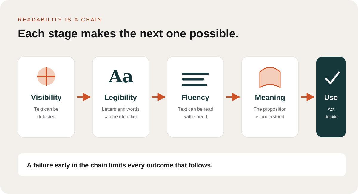
Optiks.ai treats readability as one Creative Fingerprint domain because the chain crosses several others. Attention affects whether text is selected. Hierarchy affects where reading starts. Cognitive load and message structure affect comprehension. Context fit determines whether the physical or digital placement preserves the intended typography.
The eye receives visual angle, not point size
Design software describes text in points or pixels. The visual system receives an angular size determined by both the physical height of the letters and the viewing distance. A 30-pixel label can be comfortable on a phone held close to the face and useless on a menu board several meters away. A 24-point claim printed on a pack can be read in the hand but disappear in a product photograph.
This relationship explains why screenshots are weak evidence of readability. When a large outdoor layout is reduced to a laptop, the designer changes both its scale and the implied viewing distance. Zooming in for review removes the very constraint the design must survive.
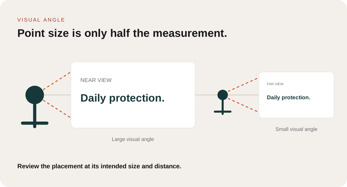
Gordon Legge and colleagues measured reading rate while changing print size, contrast, spatial filtering and presentation rate. Their work showed a characteristic relationship between size and performance: reading rate remains relatively stable above a critical print size, then falls as the letters become smaller. Legge et al., 1985. The practical lesson is not a universal minimum size. It is that performance can change sharply near an observer's threshold, and that the threshold depends on the person and viewing condition.
Readable and comfortably readable are different
The smallest print a person can identify is not necessarily the smallest print they can read fluently. The MNREAD framework distinguishes reading acuity from critical print size, the smallest print that still supports maximum reading speed. This distinction is useful for advertising because a campaign rarely benefits from typography that merely passes an identification test.
Calabrese and colleagues analyzed MNREAD data from 645 normally sighted people aged 8 to 81. Maximum reading speed and critical print size changed with age, especially later in life. Calabrese et al., 2016. The study does not provide an ad-design formula, but it shows why a single threshold cannot describe every audience.
In practice, an ad needs reserve. The headline should not sit just above the point at which a young, fully corrected viewer can decode it under controlled light. It should remain useful after distance, glare, movement, screen scaling and audience variation are introduced. That reserve is especially important for prices, product descriptors, qualifications and calls to action, because those elements often receive less space than the headline but carry the information required for an accurate decision.
Contrast must survive the real background
Contrast is not a property of a text color alone. It is a relationship between the letter and whatever appears immediately behind it. White type may be highly visible over deep blue water and nearly disappear when the same line crosses a cloud. A gradient, shadow or translucent panel can stabilize the relationship, but only if it works across the entire text region.
Legge and colleagues compared reading with luminance contrast and color contrast. For normally sighted observers, high color contrast could support rapid reading, but low-vision participants performed better with luminance contrast in the conditions tested. Legge et al., 1990. This matters because two brand colors can feel strongly different while remaining close in luminance. Hue difference alone is not a dependable substitute for light-dark separation.
Contrast also interacts with weight and size. Thin strokes lose effective contrast sooner than substantial strokes. Small light text over a bright photograph combines several weak conditions: limited angular size, narrow strokes and an unstable background. Adding a shadow may improve local separation, but it can also blur the contours that define the letters. The appropriate correction may be a stronger weight, a quieter region, a shorter line, a panel or a different position.
"Clear and conspicuous is a performance standard, not a font size."
Federal Trade Commission, 2014
The FTC statement concerns advertising disclosures, but the principle applies more widely. A number alone cannot establish whether viewers can notice, read and understand the information in context. Federal Trade Commission, 2014.
The serif versus sans serif argument is too simple
Typeface debates often become categorical: serif for print, sans serif for screens, or a special typeface for a particular audience. Controlled research gives a less dramatic answer.
Arditi and Cho created fonts that differed mainly in serif size while holding other characteristics more carefully than ordinary font comparisons. They found no systematic effect of serif presence on continuous reading speed. A small threshold advantage appeared in one condition, but much of it could be associated with the extra spacing introduced by the serifs. Arditi and Cho, 2005.
This does not mean typeface is irrelevant. Fonts differ in x-height, aperture, stroke contrast, width, spacing, familiar letter skeletons and how easily similar characters can be distinguished. It means broad classifications hide those variables. Comparing Times New Roman with Helvetica changes far more than the presence of serifs.
Familiarity also matters. Research in which readers encountered common and unfamiliar typefaces found that performance with an unfamiliar design improved after exposure. Beier and colleagues, 2021. Distinctive typography can contribute to brand character, but novelty can impose an early recognition cost. The right question is not whether a font is modern or readable in the abstract. It is whether its specific forms, at the intended size and exposure, support the task without making the viewer learn the alphabet again.
Spacing changes crowding and reading rhythm
When letters are too close, neighboring forms interfere with identification. This crowding becomes more severe in peripheral vision and near the size threshold. It is tempting to conclude that more tracking always improves readability. The evidence shows a tradeoff.
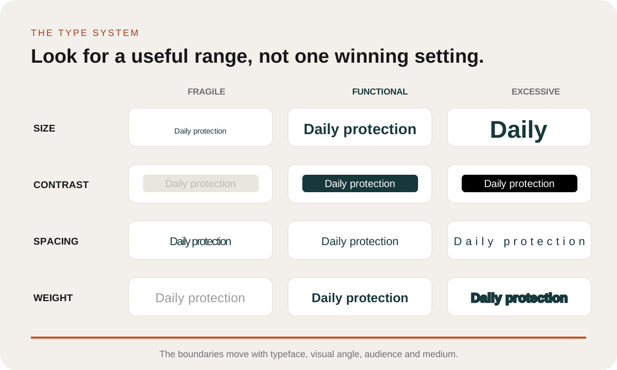
Yu and colleagues measured visual span and reading speed across different letter spacings. Both very tight and expanded spacing could reduce performance, with reading speed tending to peak near conventional spacing in the conditions studied. Yu et al., 2007. Wider spacing can reduce local crowding, but it also spreads the word across more of the visual field and weakens familiar word patterns.
Later eye-tracking work found that wider letter spacing could shorten the processing time for individual words while also creating more fixations and reducing overall reading rate for faster readers. Gagl et al., 2020. In children with dyslexia, extra-large spacing has produced benefits in some studies, while other work has failed to find a general advantage for special letterforms and has shown that letter and word spacing must be considered together.
For advertising, spacing should be treated as a system. Tracking, word spaces, line spacing and line length affect different boundaries. Increasing tracking without increasing word spacing can make the separation between words less distinct. Tight leading can create competition between lines. Very wide tracking can make a short label feel airy while slowing recognition of a longer sentence.
Weight and case have useful ranges
Bolder is not always better, but extremely light strokes are fragile. Bernard, Chung and Legge varied letter-stroke width and found that reading speed in central vision remained stable across a broad middle range, then fell at very thin and very heavy extremes. Bernard, Chung and Legge, 2013. Other research indicates that added boldness can be particularly useful when letters subtend a small visual angle. The implication is a range rather than a winner: enough stroke to survive the placement, without closing counters or merging forms.
Case creates a related tradeoff. All capitals can give short labels a strong visual texture, but long uppercase passages remove the ascender and descender patterns familiar from mixed-case reading and often require more horizontal space. Eye-movement research has found a lowercase advantage during sentence reading. Perea et al., 2017. Use capitals where their graphic role and brevity support recognition. Avoid asking them to carry dense explanatory copy.
Time, motion and placement set the reading budget
Reading requires time. An outdoor warning study tested what observers could read under typical driving conditions. Participants read the full warning on 46 percent of street billboards and only 5 percent of highway billboards, while brands and prominent imagery were recognized on more than 95 percent. The authors identified small letters, long warnings, viewing distance and movement as contributing factors. Fischer et al., 1989.
The exact percentages belong to those advertisements, roads and observers. They should not be generalized into a universal outdoor rule. The pattern is still instructive: information can exist in the artwork while remaining unavailable in the encounter.
Video creates a temporal version of the same problem. A super may have adequate contrast and size but appear for less time than the sentence requires. Animation can improve separation or direct attention, yet it can also move the reading target, introduce competition or replace one line before processing is complete. The reading budget is set by word count, linguistic difficulty, visual conditions and duration together.
For a digital display, the budget also includes device scaling and interface obstruction. For packaging, it includes curvature, glare and viewing angle. For foodservice menus, it includes search among multiple items and prices. Readability is therefore a placement property, not simply an artwork property.
The audience changes the threshold
Visual acuity, contrast sensitivity, reading experience and language proficiency vary across audiences. A design that is comfortable for its creative team may be difficult for older viewers, readers with low vision, people reading in a second language or viewers using a low-quality screen in bright light.
Vigilante and Wogalter compared medication labels that varied in print size, white space and format. Older adults acquired significantly more information from medium and large print than from small print; performance in the small-print condition was no better than the control without a back label. Both younger and older groups preferred larger print and more white space, although the performance effects were not identical to the preferences. Vigilante and Wogalter, 2003.
This distinction between preference and performance matters. People may describe a layout as clean, premium or easy without successfully finding and understanding the information. Subjective ratings are useful, but they should be paired with behavioral tasks when the message is important.
Legible words can still be difficult to understand
Typography opens access to the message; it does not simplify the message itself. Sentence length, syntax, vocabulary, implied references and numerical framing affect comprehension after the letters have been recognized.
A product claim such as "helps protect against everyday UVA and UVB exposure" asks the reader to integrate a verb, qualification and two unfamiliar abbreviations. If the intended takeaway is "broad spectrum SPF 50 for daily wear," better typography cannot resolve the strategic choice between those formulations. Copy and visual presentation must be reviewed together.
The FTC's exploratory research on paid search and native advertising changed disclosure language, position, size, color, borders and background treatment. The combined modifications improved the likelihood that participants recognized advertising as advertising. Federal Trade Commission, 2017. The result is a reminder that readability has an associative component: viewers must not only read a label but connect it to the content it qualifies.
A worked example: the SOLA poster
Consider the fictional SOLA sunscreen campaign. The communication task is to establish daily mineral sun protection for sensitive skin. The poster needs to connect four elements: brand, promise, product proof and action.
The fragile version uses a light display face over a variable sky. The product descriptor is small and widely tracked. Supporting copy crosses bright cloud detail, and the action sits close to the lower edge. Each choice can look refined at full size, but the combination gives the typography little reserve.
The revised version does not simply make everything larger. It creates a stable text region, uses a substantial mixed-case headline, shortens the line length, keeps the proof close to the promise and gives the action a clear boundary. The product retains enough space to carry brand character.
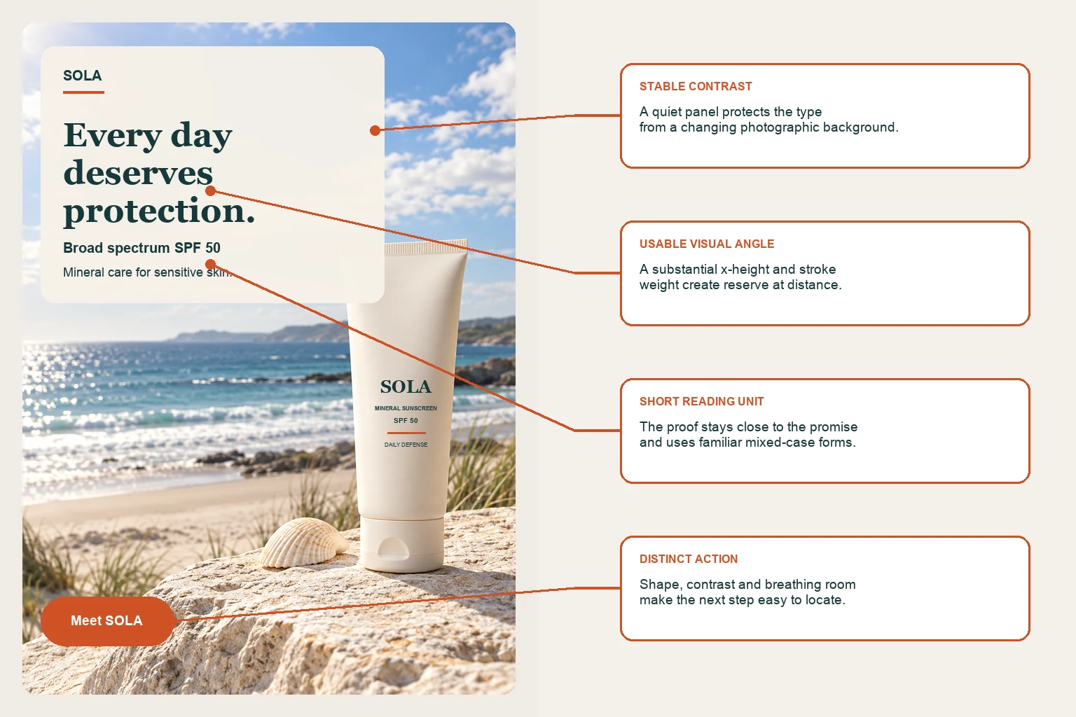
A useful comparison would recreate the intended shelter size and distance, add realistic reflections, and limit exposure to the likely encounter. Ask participants to report the product category, brand, main promise and action. Record accuracy and response time. If the qualifier is material, test whether it is understood and associated with the claim it limits. The evaluation should include the intended audience rather than only design professionals.
Accessibility thresholds are a floor
WCAG specifies a contrast ratio of at least 4.5:1 for normal-sized text and 3:1 for large text under its Level AA success criterion, with defined exceptions. W3C Web Accessibility Initiative. These thresholds are essential for digital accessibility review, but passing them does not prove that an advertisement is readable in every placement.
A compliant text color can still be too small, too brief, hidden by an interface, broken by compression or placed over a moving background. Printed and outdoor media introduce different measurements. Compliance and effectiveness answer different questions, and both deserve attention.
Use accessibility standards as a minimum constraint. Then test the full experience: the real device, scale, duration, lighting, motion and audience. A creative system should also avoid encoding essential meaning through color alone and should preserve text when users enlarge or reflow digital content.
How to test readability before launch
A research-informed review can be practical and fast when it starts with the placement.
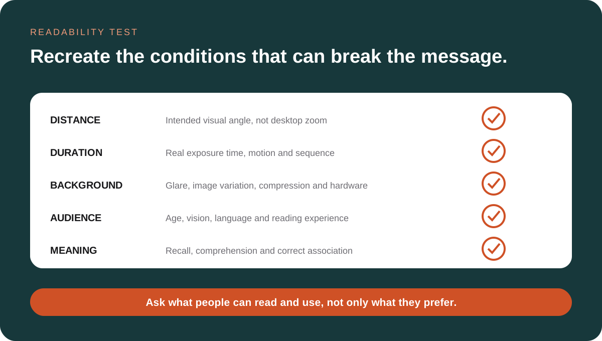
- Define the reading task. Identify which words must be detected, read and understood.
- Recreate visual angle. Review at the intended physical size and distance rather than at a convenient zoom level.
- Set a realistic exposure. Include movement, screen duration or scrolling where relevant.
- Inspect local contrast. Measure and visually inspect every part of the text against the actual background.
- Check the type system. Review size, x-height, stroke width, case, tracking, word spacing, leading and line length as a connected system.
- Include audience variation. Test readers whose age, vision and language reflect the campaign audience.
- Measure more than preference. Capture reading accuracy, response time, comprehension and correct association with the claim or action.
- Test the final export. Compression, printing, display hardware and installation can change the result.
Common questions about advertising readability
What is the most readable font?
There is no universal winner. Performance depends on the typeface's specific letterforms, size, spacing, weight, familiarity and the viewing condition. Choose a defensible candidate, then test it at the intended visual angle.
Are sans serif fonts always better on screens?
No. Modern screens can render both serif and sans serif type well. At ordinary reading sizes, controlled studies often find little difference attributable to serifs alone. Specific font construction and implementation matter more than the category label.
Does more contrast always improve readability?
Adequate contrast is essential, but once text has a strong stable separation from its background, other constraints can dominate. Size, stroke width, spacing, duration and language may become the limiting factors.
Should letter spacing be increased for accessibility?
Readers should be able to adjust digital spacing without content breaking. As a default design choice, wider tracking is not a universal readability improvement. It can reduce crowding in some conditions and disrupt familiar word processing in others.
Can eye tracking prove that text is readable?
No. A fixation shows where gaze was directed under a defined task. Longer looking can mean interest, effort or confusion. Pair eye movement data with reading accuracy, comprehension and response time.
Is a legal disclaimer readable if it meets the required type size?
That depends on the applicable rules and the experience. A nominal size does not establish sufficient contrast, duration, position or comprehension. Regulatory guidance often treats clarity and conspicuousness as a performance question.
The strategic value of readability
Readability is the point at which a written strategy becomes available to the audience. When it fails, the message may appear weak, confusing or unpersuasive even though the underlying proposition is sound. The viewer cannot respond to information that never becomes usable.
The science replaces broad typography preferences with better questions. What is the visual angle? Is the contrast stable across the full background? Is the typeface familiar enough for the exposure? Do size, weight and spacing preserve recognizable forms? How much time does the copy require? Which audience is being asked to read it? Can viewers explain what the words mean and what they qualify?
These questions do not make every ad look the same. They give creative character a functional boundary. A delicate typeface can still be used where it has enough scale and contrast. A dense information layout can work where the audience has time and intent. A short outdoor message can be bold without becoming blunt. The task is to make the intended reading behavior plausible.
Read the science of visual hierarchy in advertising to see how typographic levels influence which information becomes available first.
For a placement-specific application, use the billboard design best-practices guide to connect visual angle, type size, message length and viewing distance.
Research referenced
These sources support the discussion of visual angle, print size, contrast, type construction, spacing, age, placement and disclosure design. The SOLA campaign is an editorial example. It has not been tested and does not represent a predicted campaign outcome.
- Legge, G. E., Pelli, D. G., Rubin, G. S., & Schleske, M. M. (1985). Psychophysics of reading. I. Normal vision. Vision Research, 25(2), 239-252. DOI: 10.1016/0042-6989(85)90117-8.
- Legge, G. E., Parish, D. H., Luebker, A., & Wurm, L. H. (1990). Psychophysics of reading. XI. Comparing color contrast and luminance contrast. Journal of the Optical Society of America A, 7(10), 2002-2010. DOI: 10.1364/JOSAA.7.002002.
- Arditi, A., & Cho, J. (2005). Serifs and font legibility. Vision Research, 45(23), 2926-2933. DOI: 10.1016/j.visres.2005.06.013.
- Yu, D., Cheung, S. H., Legge, G. E., & Chung, S. T. L. (2007). Effect of letter spacing on visual span and reading speed. Journal of Vision, 7(2), 2. DOI: 10.1167/7.2.2.
- Bernard, J. B., Chung, S. T. L., & Legge, G. E. (2013). The effect of letter-stroke boldness on reading speed in central and peripheral vision. Vision Research, 84, 33-42. DOI: 10.1016/j.visres.2013.03.005.
- Calabrese, A., Cheong, A. M. Y., Cheung, S. H., He, Y., Kwon, M., Mansfield, J. S., Subramanian, A., Yu, D., & Legge, G. E. (2016). Baseline MNREAD measures for normally sighted subjects from childhood to old age. Investigative Ophthalmology & Visual Science, 57(8), 3836-3843. DOI: 10.1167/iovs.16-19580.
- Perea, M., Rosa, E., & Marcet, A. (2017). Where is the locus of the lowercase advantage during sentence reading? Acta Psychologica, 177, 30-35. DOI: 10.1016/j.actpsy.2017.04.007.
- Gagl, B., Gawel, A., & Hawelka, S. (2020). Wider letter-spacing facilitates word processing but impairs reading rates of fast readers. Frontiers in Psychology, 11, 444. DOI: 10.3389/fpsyg.2020.00444.
- Beier, S., Chopping, J., Day, B., Lonsdale, M. S., & Dyson, M. C. (2021). You read best what you read most: an eye tracking study. Frontiers in Psychology, 12, 628675. DOI: 10.3389/fpsyg.2021.628675.
- Vigilante, W. J., & Wogalter, M. S. (2003). Effects of label format on knowledge acquisition and perceived readability by younger and older adults. Ergonomics, 46(4), 327-344. DOI: 10.1080/0014013021000048006.
- Fischer, P. M., Richards, J. W., Berman, E. J., & Krugman, D. M. (1989). The Surgeon General's warnings in outdoor cigarette advertising. Are they readable? JAMA, 261(1), 90-94. DOI: 10.1001/jama.1989.03420010100041.
- Federal Trade Commission. (2017). Blurred lines: an exploration of consumers' advertising recognition in the contexts of search engines and native advertising.
- W3C Web Accessibility Initiative. Understanding Success Criterion 1.4.3: Contrast (Minimum).