Compal Vital OOH – Creative Effectiveness Review: Strong Impact, Brand Recall at Risk
Placement context and communication task
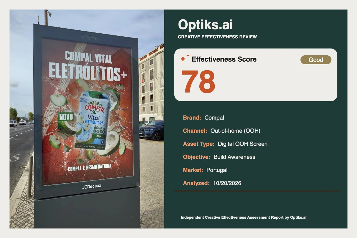
Compal’s Vital Electrolitos launch appears here in a large-format digital OOH screen at a busy sidewalk road edge, targeting quick-moving pedestrian and vehicle audiences. The communication task is classic build awareness: rapidly introduce a new electrolyte-boosted variant with coconut water, driving mental availability and (ideally) planting a seed for store search as a new product.
What works: Instant impact and category clarity
The ad delivers a high-contrast, kinetic impression on first glance. The headline—white uppercase type spanning about 22% of canvas height in the upper third—blazes against a saturated red background. The dynamic splash and fruit shards reinforce refreshment and sensory appeal, while the cool blue cap on the pack prevents the color scheme from feeling one-note. The green NOVO (new) badge clearly signals launch status and is isolated enough to stand alone as a tertiary cue (Optiks.ai report).
Headline and color: The ad leverages white-on-red for maximum separation, supporting rapid scanning and message delivery (see #analysis-report).
Single-minded message: The core claim—Compal Vital electrolytes—is explicit, quickly conveying category, benefit, and newness. This is reinforced by the fruit and water imagery which matches the product reality, raising believability and appetite appeal.
Readability and chunking: Clear separation of roles by color (white = text, green = freshness, blue = pack highlight) aids chunking and keeps cognitive load low in a fast-paced OOH context.
The Optiks.ai report identifies the combination of high-contrast, energetic visuals and a large, benefit-led headline as reliable drivers of initial fixation and aided message carry-through.
What holds it back: Brand takes a back seat to benefit
The most critical gap is brand salience. The headline stacks “COMPAL VITAL” above “ELETRÓLITOS+”, but the benefit word is much larger—about 60% wider and taller—drawing attention to the category before the brand. In effect, the ad risks cementing “electrolyte drink” in memory, instead of “Compal Vital electrolyte drink.” The only free-standing Compal logo is on the pack, which is smaller and less dominant than the headline. This positioning dilutes brand attribution in the crucial flash of early awareness, a finding directly supported by the supplied analysis.
Additionally, on-pack microcopy (e.g., “FONTE DE MAGNÉSIO E POTÁSSIO”) is illegible at typical viewing distances. Decorative fruit fragments and splash highlights near the headline’s edge erode the clean whitespace needed for fast word recognition, introducing micro-clutter that delays message decoding. The lower slogan (“COMPAL. É MESMO NATURAL”) is small and competes with textured red, making it prone to being skipped in motion or glare.
One major behavioral shortfall: there is no explicit action cue. The Optiks.ai report notes that while “NOVO” nudges toward consideration, lack of a call-to-action or point-of-sale signal leaves potential store trial untapped.
Behavioral mechanisms and hypotheses
The layout’s strong headline, dynamic splash, and clear color block chunking work together to ensure the ad’s message enters long-term memory via simple, high-contrast pattern recognition. However, lacking standalone brand prominence and call-to-action, viewers are more likely to encode the category and novelty, but not reliably link it to Compal when shopping later. The absence of a dwell-time mechanism (like a QR code or value message) further limits its capacity to convert slower viewers into active searchers.
Top-priority practical fixes
Boost brand strength:
Proposed: Scale “COMPAL VITAL” to at least 90-100% the width of “ELETRÓLITOS+” and 60%+ of its height. Introduce a standalone Compal logo in the top-right, 10–12% width, baseline-aligned with the headline, and buffer with a clear safe zone.
Tradeoff: May require reducing headline scale or tightening overall vertical spacing, but this is justifiable. This fix addresses the principal risk: spectators recall the benefit, but not the brand.Clear edge clutter for the headline:
Proposed: Fade or remove about 25% of splash/fruit fragments within 10% of the headline edge and guarantee a 4–5% canvas-height whitespace zone surrounding the text. This helps accelerate word recognition under movement.Action cue for persuasion and trial:
Proposed: Insert a bold white call-to-action like “Procura no teu supermercado” (Find it in your supermarket) in the lower-right, on a solid chip 14–16% canvas width, raised ~6–8% above the bottom edge.
Tradeoff: Slight shift or compression of slogan and product image, offset by improved next-step clarity.Minimize ineffective detail:
Proposed: Eliminate most on-pack microcopy or replace it with a single large proof icon (e.g., “Fonte de Magnésio + Potássio”) at OOH-readable scale. This prevents wasted attentional effort and redirects focus to the headline and pack silhouette.
See also this review of visual hierarchy for deeper discussion of stacking brand and benefit in OOH environments.
Editorial verdict
Compal’s Vital Electrolitos OOH creative is a case study in attention mechanics and clear, appetite-building benefit messaging. However, by letting the product claim outshine the brand, it risks delivering reach without depth—awareness that doesn’t translate to recall when it counts. The lack of a direct action invitation further limits launch momentum. The rapid, kinetic layout and color choices are worth preserving, but fundamental adjustments to brand salience, whitespace management, and call-to-action are required to fulfill the awareness objective.
This is an independent review prepared for the Optiks.ai Creative Effectiveness Review series and is not commissioned or endorsed by Compal.