The science of visual hierarchy in advertising: how design signals what matters first
Visual hierarchy is the system of differences that tells a viewer what deserves priority. Size is part of that system, but hierarchy is not a contest to make one element enormous. It emerges from the relationship between elements: their scale, contrast, position, spacing, grouping and meaning. In advertising, a useful hierarchy helps the right information win early processing, then makes the next relevant information easier to find.
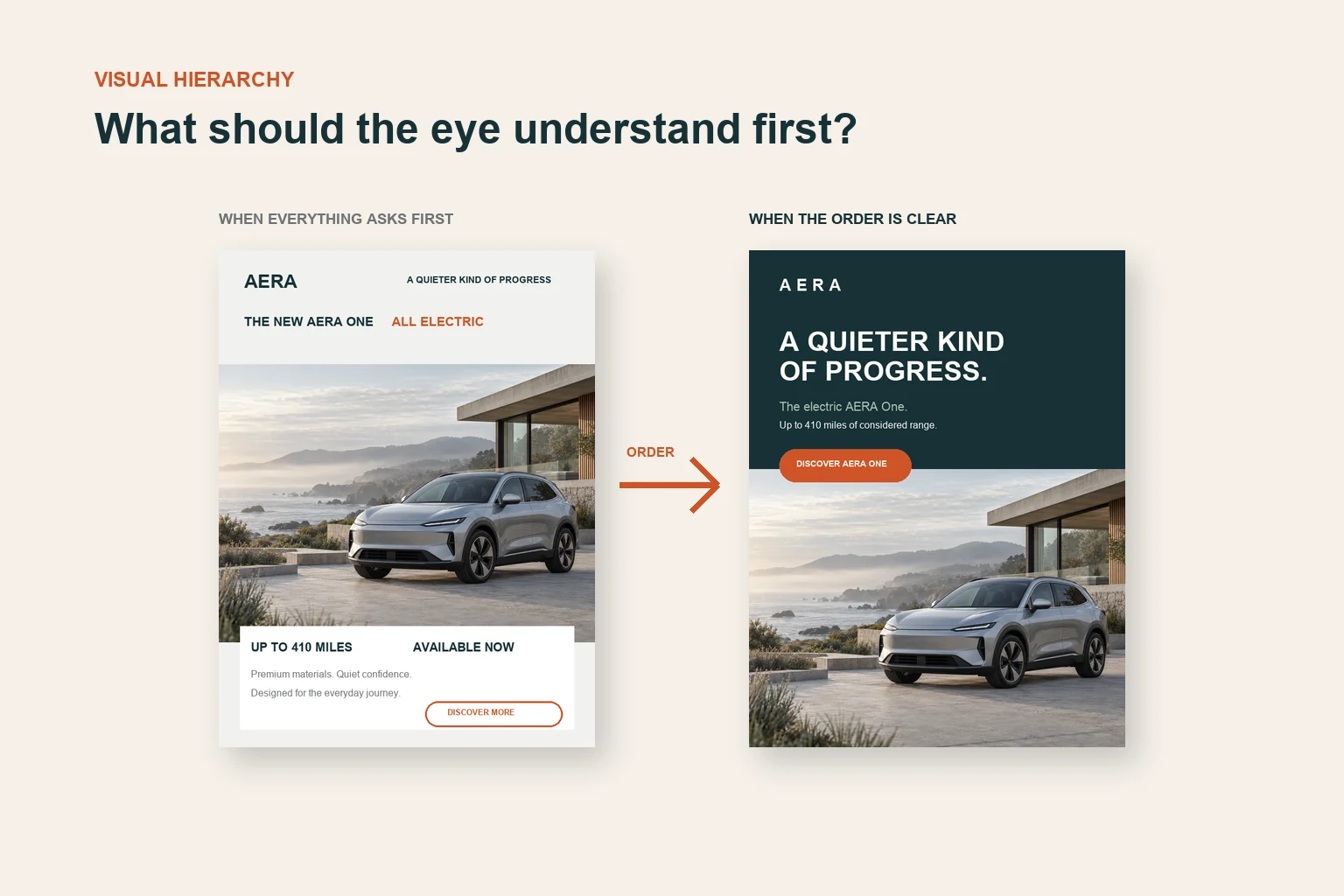
Imagine an electric vehicle poster at a transit stop. It contains a brand name, a headline, a vehicle, a range claim, a financing line and a call to action. Every item matters to somebody on the project. If all six receive similar weight, the layout may satisfy the stakeholder list while leaving the viewer to decide where the message begins.
That decision is not made by the eyes alone. The visual system groups some elements, separates others and assigns priority through an interaction between the display and the viewer's current goal. A commuter who already recognizes the vehicle may look for the range. A person encountering the brand for the first time may need the product category before the financing detail has any value.
This is why hierarchy should be treated as a behavioral hypothesis. The design proposes an order. The audience, task and placement determine whether that order is useful.
Hierarchy is a priority structure
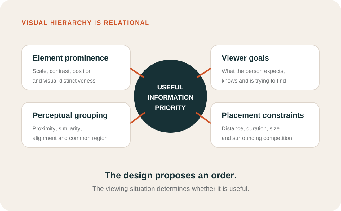
A visual hierarchy gives unequal prominence to information. That inequality is useful because people cannot process every element with equal depth at the same moment. The design therefore needs to reflect the communication task. If the first job is to establish the category, the product may need priority. If the brand is unfamiliar, attribution may need to happen sooner. If the viewer has already decided what to buy, price or availability may become the target.
The word hierarchy sometimes implies a rigid ladder: first the headline, then the picture, then the logo, then the action. Human viewing is less orderly. People arrive with different goals, prior knowledge and positions. They also use peripheral vision to select where to look next. A hierarchy does not dictate a universal sequence. It changes the probability that some information will be selected before other information under particular conditions.
For a creative team, that distinction matters. The practical question is not "What will everyone look at first?" It is "Which information must be easy to select, and does the layout give it a defensible advantage?"
Salience, order and grouping are different
Three ideas are often collapsed into the word hierarchy.
- Salience describes how much an element differs from its surroundings through properties such as color, luminance, orientation, size or motion.
- Priority describes how likely information is to be selected given both visual evidence and the viewer's current goal.
- Grouping describes which elements are perceived as belonging together.
A bright price flash may be salient without being the most important message. A product and its descriptor may be grouped by proximity even when the descriptor is small. A familiar logo may be found quickly because the viewer knows what to look for, even if it is not the largest object.
This gives designers more options than simple enlargement. A supporting statement can become easier to interpret when it is placed close to the claim it supports. A call to action can become easier to find when it occupies a distinct region. A product can gain priority when nearby decorative competition is reduced. Hierarchy comes from coordinated differences, not from applying maximum contrast to every item.
How the visual system builds groups
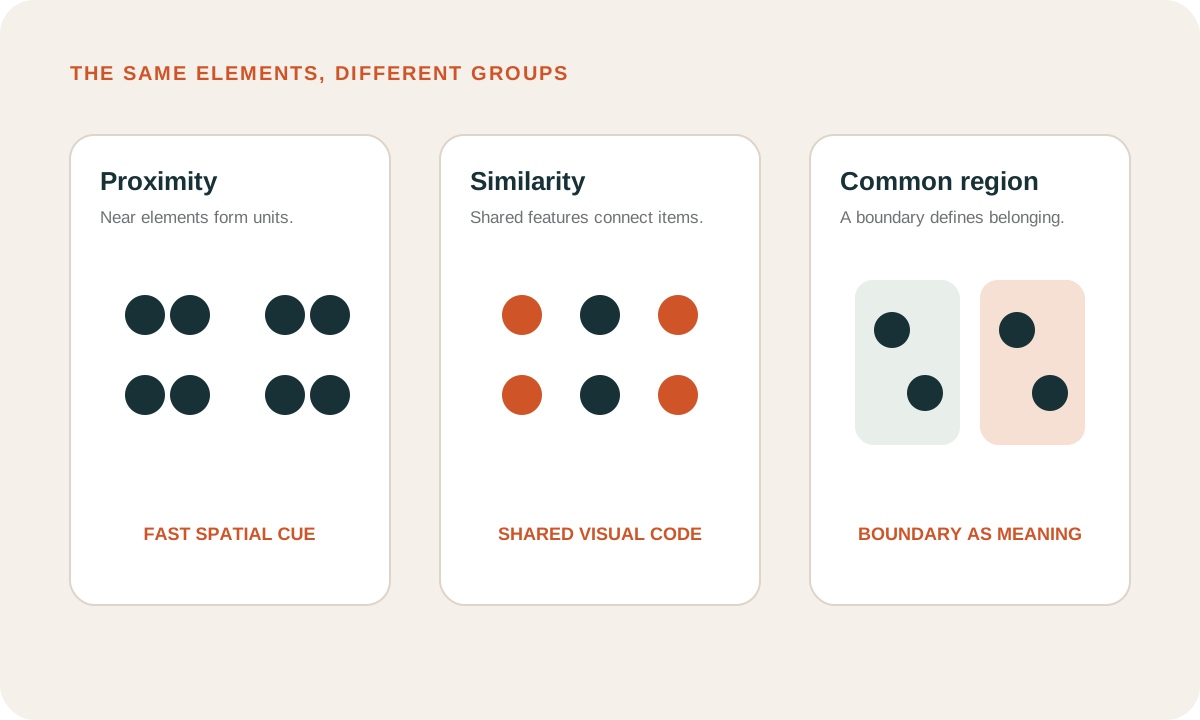
Before a viewer can understand an advertisement as a proposition, the visual system must organize its parts. Research on perceptual grouping shows that proximity, similarity, connectedness and common regions can change which elements are experienced as units.
Stephen Palmer tested what he called common region: elements inside the same bounded area tend to be grouped. His experiments showed that a shared region could overcome other grouping cues, including proximity and similarity. Palmer, 1992. In a layout, a pale panel behind a price and product name does more than decorate the page. It can tell perception that these details belong to one offer.
Mordechai Ben-Av and Dov Sagi placed proximity and similarity in conflict. Participants judged grouping orientation while exposure time varied. Proximity grouping was perceived faster, while similarity became more influential with additional processing time. Ben-Av and Sagi, 1995. The marketing implication should be stated carefully: close spacing may provide a rapid grouping cue, but grouping is not determined by spacing alone.
Diane Beck and Stephen Palmer also found that expectations could influence grouping when enough time was available for feedback. Observers were faster to discriminate adjacent objects within the same perceived group, and the probability of a target appearing within a group changed the size of that advantage. Beck and Palmer, 2002.
Together, these studies argue against treating layout as neutral storage. Spacing and boundaries help define units. Learned expectations and task demands can then alter how those units are used.
What advertising research says about element roles
Hierarchy decisions often begin with an argument about size. Research on print advertising suggests that the relationship between size and attention depends on the element being changed.
Rik Pieters and Michel Wedel analyzed eye movements across 1,363 print advertisements shown to more than 3,600 consumers. They separated brand, pictorial and text elements rather than treating the page as one stimulus. The pictorial was particularly effective at capturing attention independent of its surface size. Attention to text increased with text size. The brand element was especially effective at transferring attention to other elements. Pieters and Wedel, 2004.
The result is more useful than a universal size rule. Different elements can perform different jobs. A picture may provide an entry point. Text may clarify the proposition. Brand information may connect the experience to memory and help move processing through the advertisement. A hierarchy can use those functions rather than forcing every element to compete on the same dimension.
Rayner and colleagues recorded eye movements while people viewed print ads and were asked to pay special attention to either car or skin-care advertising. Viewers tended to read large print, then smaller print, then inspect the picture, although some began with a brief picture scan. They also spent more time on the ad category they had been instructed to monitor. Rayner et al., 2001.
The finding is not a recipe for always placing large print first. It shows that typographic levels can support an order while viewer instructions continue to matter. The design offers a route; the person brings a destination.
Viewer goals can change the order
An advertisement does not have one reading order independent of its audience. The order emerges from the display and the task.
Pieters and Wedel tested four processing goals and a free-viewing condition during brief, self-paced exposure to ads. A memorization goal increased attention to body text, pictorial and brand objects. A brand-learning goal increased attention to body text while reducing attention to the pictorial. The authors concluded that ad informativeness is goal contingent. Pieters and Wedel, 2007.
A separate print-ad experiment asked participants to judge either how much they liked an ad or how effective they thought it was. Viewers looked at pictures earlier and longer than text in that task. The researchers contrasted this with earlier work using purchase-oriented instructions, where text received earlier and more frequent looks. Rayner, Miller and Rotello, 2008.
This is a direct warning against presenting a scanpath as the natural reading order of a design. Change the task and the pattern can change. A shopper checking specifications, a commuter passing a poster and a creative director evaluating craft are not the same viewer.
Time and placement change the hierarchy
Hierarchy also depends on the time available and the geometry of the placement. Information that works in a full-page magazine ad may fail when compressed into a mobile unit. A sequence that develops across a television commercial may disappear when viewers skip through it.
Brasel and Gips studied fast-forwarded television commercials with eye tracking. Under severe time compression, attention became heavily concentrated near the center of the screen. Brand information positioned centrally could still support memory, while branding elsewhere contributed little under those conditions. Brasel and Gips, 2008.
That does not prove that the center is always best. The study concerns fast-forwarded commercials, a particular task and technology. Its broader lesson is that a hierarchy must survive the viewing behavior created by the medium. When exposure changes, spatial priority may need to change too.
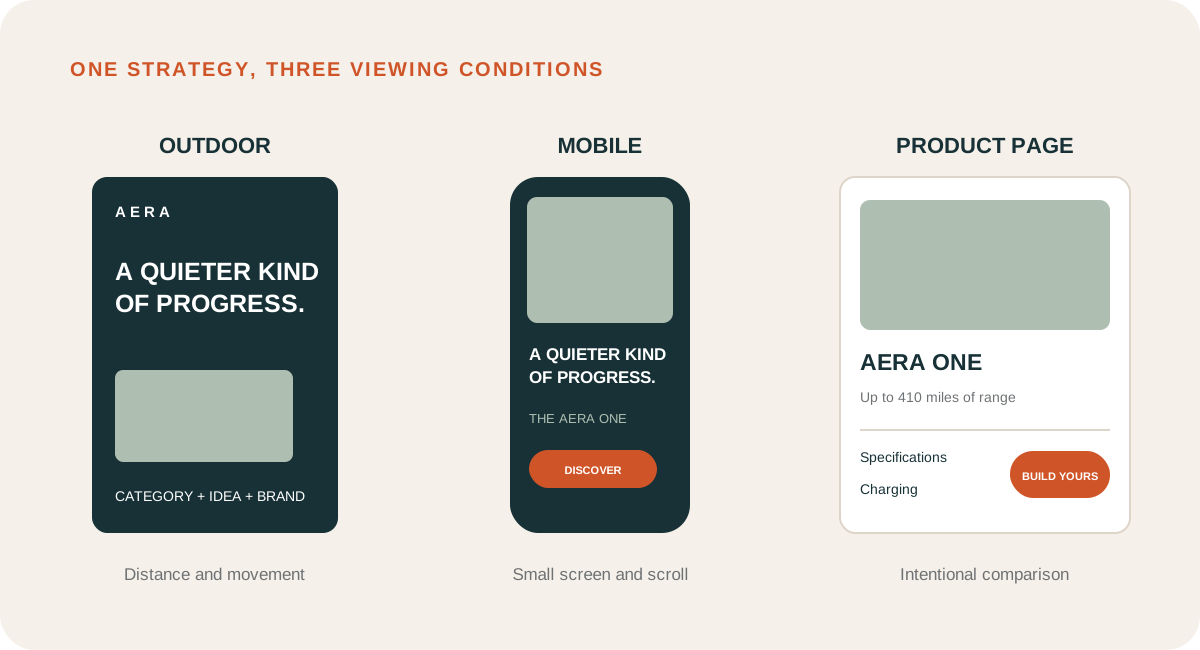
For an outdoor poster, the first level may need to work at distance and in peripheral vision. For a menu board, the hierarchy may need to support deliberate price and product search. For a social video, the opening frame must establish useful structure before motion adds another layer of competition.
Complexity is not the opposite of hierarchy
Teams often respond to hierarchy problems with a general instruction to simplify. That can help, but the science supports a more precise distinction.
Pieters, Wedel and Batra analyzed 249 advertisements with eye-tracking data and separated feature complexity from design complexity. Feature complexity refers to dense variation in basic visual features. Design complexity refers to an elaborate but organized creative structure. In their analysis, feature complexity reduced attention to the brand and lowered attitudes toward the ad. Design complexity increased attention to the pictorial and the ad as a whole, and was associated with better comprehension and attitude. Pieters, Wedel and Batra, 2010.
The distinction matters because rich is not the same as disorganized. An advertisement can contain detail, layers and visual interest while preserving a clear structure. It can also be minimal yet ambiguous, with no obvious relationship between the claim, product and action.
The practical goal is not the fewest possible elements. It is an interpretable allocation of emphasis. Remove detail that creates competition without adding meaning. Keep detail that supports category, evidence, emotion or brand character, and give it an appropriate level.
A worked example: the AERA poster
Consider the fictional AERA electric vehicle campaign. Its communication objective is to position the vehicle as a calm, considered form of progress. The action is to explore the AERA One. The product proof is a claimed range of up to 410 miles.
The flat version gives similar emphasis to the model name, electric category, range, availability and supporting language. The information is present, but the relationships are weak. The viewer must assemble the proposition.
The revised version proposes four levels.
- Brand: the AERA wordmark creates early attribution without competing with the proposition.
- Proposition: "A quieter kind of progress" receives the strongest typographic contrast.
- Proof: model and range information are grouped beneath the claim at a quieter level.
- Action: the button is distinct through shape and color, but it does not overpower the reason to care.
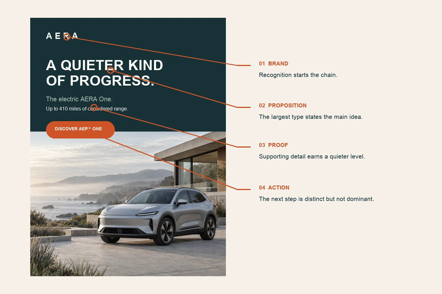
This is still a hypothesis. The revised poster may make the proposition and proof easier to separate, but it has not established stronger comprehension, brand memory or purchase intent. Those outcomes require evidence matched to the campaign objective.
A useful test would expose both versions under realistic viewing time and distance. Ask viewers what is being advertised, what the main promise is, which brand they remember and what they would do next. Eye tracking could add process evidence, but it should not replace comprehension and attribution measures.
A hierarchy is not a fixed scanpath
Design presentations often draw numbered arrows across a layout: 1, 2, 3, 4. This can be useful as an expression of intent. It becomes misleading when treated as a prediction that every viewer will follow the same path.
Eye movements are influenced by peripheral information, prior fixations, scene expectations and the viewer's goal. Some people may recognize the vehicle before reading the headline. Others may begin with the brand. A repeat viewer may skip information already learned. A person actively comparing range may go straight to the number.
Hierarchy should therefore support multiple useful entry points while preserving relationships. If the product is selected first, can the viewer connect it to the proposition and brand? If the range claim is selected first, is it clear which vehicle and advertiser it belongs to? If the headline is read first, does the imagery explain what kind of progress is being offered?
The stronger standard is not one perfect path. It is resilient transfer between the elements that carry the communication.
Adapting hierarchy across formats
A master layout can establish the strategic order, but each placement needs its own hierarchy decision.
| Placement | Likely viewing condition | Hierarchy implication |
|---|---|---|
| Outdoor poster | Distance, movement and surrounding competition | Prioritize category, proposition and brand; limit proof to what survives the encounter. |
| Mobile feed | Small screen, scrolling and variable sound | Establish the subject and promise early; keep essential text away from interface overlays. |
| Product page | Intentional exploration and comparison | Support scanning between benefits, specifications, evidence and action. |
| Retail display | Goal-directed search among competing products | Connect familiar product cues, price and variant information without weakening identification. |
| Video | Hierarchy changes over time | Plan the order of reveals and ensure brand, product and proposition overlap long enough to connect. |
Responsive design should not be treated as shrinking. When the available area changes, the relative scale, grouping and order may need to change. A side-by-side relationship on desktop may become a sequence on mobile. A supporting claim may move closer to the product it explains. A secondary proof point may be removed because keeping it would collapse the distinction between levels.
What neuromarketing can and cannot establish
Hierarchy is sometimes described with neuroscientific language that exceeds the evidence. A heatmap may be presented as proof that the brain followed the intended order. A larger pupil may be labeled engagement. A prominent element may be called neurologically optimized.
The responsible interpretation is narrower. Eye tracking can estimate where participants looked under a defined task. Fixation order can describe observed transitions. EEG and fMRI measure different physiological signals with different temporal and spatial trade-offs. Computational saliency models estimate priority from represented image features. None reads a complete hierarchy directly from the brain.
Even when a viewer follows the proposed sequence, that does not establish comprehension or persuasion. They may look at the headline because it is difficult. They may fixate on the price because it is surprising. They may inspect the brand and still attribute the message incorrectly later.
Method-specific claims are more useful: "Participants identified the proposition faster," "Brand recognition improved after a brief exposure," or "The range claim was found with fewer fixations." Each connects a hierarchy decision to an observable outcome.
A research-informed hierarchy review
A good review turns visual preference into explicit questions.
- Define the communication task. State what a viewer must know, feel or do after the realistic exposure.
- Name the first useful information. This may be the category, product, proposition, offer or brand. Choose based on the brief rather than convention.
- List the supporting levels. Separate evidence, qualification, navigation and mandatory information from the main proposition.
- Inspect grouping. Check whether proximity, alignment, similarity and common regions connect information that belongs together.
- Inspect competition. Identify elements with similar size, contrast or position that may claim the same level.
- Check transfer. Make sure an entry point can lead to the product, message, brand and action needed for the objective.
- Recreate the placement. Review at the intended size, distance, duration and surrounding context.
- Use more than one outcome. Combine process measures with comprehension, recognition or behavior when the decision warrants it.
Optiks.ai treats hierarchy as one domain within the Creative Fingerprint because its effects cross attention, message, readability, cognitive load, composition, brand and context fit. A hierarchy finding should identify the competing elements, the intended order and the behavioral outcome the change is meant to support.
Common questions about visual hierarchy
Should the headline always be the largest element?
No. The first level should reflect the communication task. A recognizable product, face, price or brand asset may deserve greater prominence. The headline should be large when reading it is the most useful entry into the message.
Does a bigger logo improve brand memory?
Not automatically. Visibility matters, but so do timing, location, distinctive assets and the relationship between brand and message. Research on print ads found a distinctive role for brand elements in transferring attention, not a universal instruction to maximize logo size.
Can whitespace create hierarchy?
Whitespace can separate levels, reduce nearby competition and strengthen grouping. It is not valuable as an empty quota. Its effect depends on which relationships it clarifies.
Is an F-pattern or Z-pattern a scientific rule for ads?
No fixed letter-shaped scanpath describes every ad. Viewing changes with layout, language direction, task, content and device. Use patterns as rough design prompts, then test the actual creative under the actual conditions.
Can a hierarchy have more than one entry point?
Yes. Resilient creative can support different first selections while keeping the necessary relationships clear. The product, headline or brand may each provide an entry, provided the viewer can connect them to the same proposition.
The strategic value of hierarchy
Visual hierarchy is where a communication strategy becomes visible. It records the team's decision about what matters most, what supports it and what can wait.
The science does not offer a universal reading order. It shows why relationships matter. Elements are grouped before they are fully interpreted. Size affects different ad elements in different ways. Viewer goals alter attention. Time pressure and placement change which positions are useful. Organized complexity can support attention, while feature clutter can weaken it.
For marketers, the review becomes more disciplined: Which information needs priority? Which visual cues create that advantage? Which elements should be perceived as one unit? Does the structure survive the placement? What evidence would show that the audience understood the intended order?
Read the science of attention in advertising to see how hierarchy operates within the wider competition for visual processing.
For OOH execution, the billboard design best-practices guide shows how hierarchy changes with distance, movement and short exposure.
Research referenced
These studies support the explanations of visual attention, grouping, task effects and advertising complexity. The AERA campaign and proposed hierarchy are editorial applications. They are not stimuli from the studies and do not constitute a validated prediction of campaign performance.
- Palmer, S. E. (1992). Common region: A new principle of perceptual grouping. Cognitive Psychology, 24(3), 436-447. DOI: 10.1016/0010-0285(92)90014-S.
- Ben-Av, M., & Sagi, D. (1995). Perceptual grouping by similarity and proximity: experimental results can be predicted by intensity autocorrelations. Vision Research, 35(6), 853-866. DOI: 10.1016/0042-6989(94)00173-J.
- Beck, D. M., & Palmer, S. E. (2002). Top-down influences on perceptual grouping. Journal of Experimental Psychology: Human Perception and Performance, 28(5), 1071-1084. DOI: 10.1037/0096-1523.28.5.1071.
- Pieters, R., & Wedel, M. (2004). Attention capture and transfer in advertising: brand, pictorial, and text-size effects. Journal of Marketing, 68(2), 36-50. DOI: 10.1509/jmkg.68.2.36.27794.
- Rayner, K., Rotello, C. M., Stewart, A. J., Keir, J., & Duffy, S. A. (2001). Integrating text and pictorial information: eye movements when looking at print advertisements. Journal of Experimental Psychology: Applied, 7(3), 219-226. DOI: 10.1037/1076-898X.7.3.219.
- Pieters, R., & Wedel, M. (2007). Goal control of attention to advertising: the Yarbus implication. Journal of Consumer Research, 34(2), 224-233. DOI: 10.1086/519150.
- Rayner, K., Miller, B., & Rotello, C. M. (2008). Eye movements when looking at print advertisements: the goal of the viewer matters. Applied Cognitive Psychology, 22(5), 697-707. DOI: 10.1002/acp.1389.
- Brasel, S. A., & Gips, J. (2008). Breaking through fast-forwarding: brand information and visual attention. Journal of Marketing, 72(6), 31-48. DOI: 10.1509/jmkg.72.6.031.
- Pieters, R., Wedel, M., & Batra, R. (2010). The stopping power of advertising: measures and effects of visual complexity. Journal of Marketing, 74(5), 48-60. DOI: 10.1509/jmkg.74.5.048.