Creative Effectiveness Review: McDonald's Big Arch Bacon Burger OOH – Appetite Wins, Persuasion Missing
Placement & Communication Task
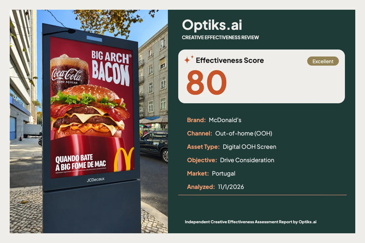
This digital citylight screen for McDonald’s Big Arch Bacon Burger campaign is located on a sidewalk, targeting pedestrians at an optimal 8-foot read distance. The likely communication objective is drive consideration: turn appetite arousal into a tangible next step, such as a visit, app order, or store drive-through.
What Works: Arresting Appetite and Brand Clarity
Instant Brand Recognition: The cropped golden arches in the lower-right, paired with the dominant red background and bold white headline, anchor the creative unmistakably to McDonald’s. The Optiks.ai report identifies that even with the arches partially cropped, brand linkage is strong and immediate (see #analysis-report).
Appetite-Driven Visuals: The hero burger occupies roughly 45% of the canvas, with glossy bacon, melty cheese, and a seeded bun capturing hungry glances. The Coca-Cola Zero Açúcar glass adds refreshment cues—together, they amplify the meal proposition.
Text Legibility: The all-caps, heavy white headline on saturated red is set in the upper-right, reading in under a second. Color contrast ratios far exceed WCAG AA and even AAA for primary copy fields, ensuring visibility under variable daylight.
These choices create pre-attentive salience and rapid comprehension. Four coherent elements—headline, burger, beverage, and brand anchor—respect working-memory limits, minimizing cognitive load (per Optiks.ai report).
What Holds It Back: Missing the Persuasion Hand-off
No CTA or Action Prompt: The poster allocates 0% of canvas to a call-to-action, location, or price cue. The Optiks.ai report finds that this omission directly undermines the drive-consideration task: attention and hunger exit as passive brand recall instead of sparking action. The eye naturally travels from headline and hero image to arches, but the journey ends there—without a bridge from appetite to intent.
Beverage Competes with Headline: The upper-left Coca-Cola glass, with its high micro-contrast (bubbles, ice), briefly competes with the headline, slightly delaying name capture and splitting initial fixations by about 0.5 seconds. While pairing is clear, it marginally taxes early processing and could be simplified.
Subline Underweighted and Fine Print Ineffective: The hunger-context subline, set in white on deeper red, is about one-third the height of the headline and is easily missed in motion. Below it, fine print drops below legibility thresholds, creating unnecessary visual density without delivering information—this space could serve a more functional role.
The central behavioral mechanism—move from appetite to action—is interrupted. The OOH placement reads quickly, but without an immediate value proposition or directive (e.g., “Order in App,” “McDrive”), most passersby won’t convert fleeting attention into intent (see report).
Editorial Hypothesis: Audience Response
For a hungry audience on the street, the creative effectively triggers appetite and brand memory. However, in the absence of a direct prompt or sense of urgency, many will simply note the offer and move on, instead of taking action or altering planned behavior. The opportunity cost: lost visits and orders that a strong CTA could activate.
Prioritized Fixes and Practical Alternatives
Add a Persuasive CTA Block (Highest Priority)
Proposed Example: Place a high-contrast horizontal bar reading “Peça no McDrive” or “No App McDonald’s” directly above the arches, occupying 18–22% of canvas width and ~7–9% of height. Use white text on darker red, type size at half the headline cap height, inset 3–4% from the edges. This delivers a top-three hierarchy action cue in under a second. [Optiks.ai report: top persuasion constraint]Optimize Subline for Visibility
Alternative: Increase subline to 50% headline height and extend to 50-55% of width. Flatten or lighten the pedestal background slightly, or add a thin white keyline for separation. Optionally integrate the subline with the CTA for a more intentional secondary message.Simplify or Soften Beverage Image
Alternative: Reduce the glass’s visual size by 20–25% and/or add a slight blur vignette contained within the cup. This minimizes competition for top-band attention, encouraging the headline to dominate first fixation.Replace Fine Print with Value Cue
Alternative: Substitute the fine print below the subline with a chip reading “Menu Big Arch” or price. Keep the chip background a slightly darker red than primary, maintain white type, and nestle it near the new CTA.
Tradeoffs to Consider
Clutter vs. Functionality: Adding an action bar and offer chip introduces new elements, risking noise—but these can be managed with scale, spacing, and color discipline. The clarity of intent is more critical for a drive-consideration OOH than one-off logo repetition.
Hierarchy Balance: De-emphasizing the beverage may reduce perceived meal completeness but strengthens the immediate invitation to act. Moderate reduction in competing hero imagery is advised, not removal.
Editorial Verdict
Appetite and brand identity are delivered flawlessly, setting a high baseline for recognition and desire. However, this OOH stumbles precisely where it matters most for consideration: it fails to prompt any next step in a fleeting glance. The absence of a CTA, actionable message, or even a simple prompt squanders the persuasive leverage created by bold visuals and instant readability.
The creative’s strengths—visual impact, appetite appeal, and unmistakable McDonald’s coding—should be maintained. However, it cannot be run as-is for a consideration task without a clear, prominent CTA. Marketing leadership must prioritize this adjustment before deployment. For deeper exploration of attention, visual hierarchy, and readability best practices, see Optiks.ai on Visual Hierarchy.
This independent review is not commissioned or endorsed by McDonald’s. The full Optiks.ai analysis report appears below for reference.