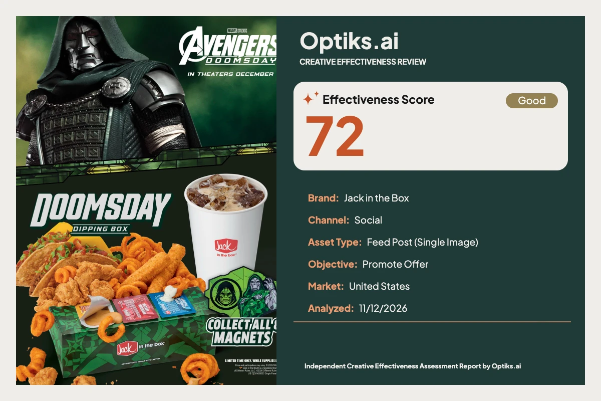
Creative Effectiveness Review
Jack in the Box Doomsday Dipping Box CRE: Appetite Wins, Action Loses Optiks.ai | November 12, 2026
Placement & Task: This social feed post promotes Jack in the Box’s limited-time “Doomsday Dipping Box,” leveraging Marvel’s Avengers: Doomsday and eight collectible magnets to spark urgency and purchase intent. In a fast-scrolling, mobile-first environment, the post’s job is straightforward: hook attention, trigger desire, then drive immediate action—ideally a click or order.
What Works: Visual Appetite, Brand Memory, and Pop Culture Hook Food Hero Dominance: The food cluster (tacos, curly fries, tenders, sauces) dominates ~65% of the width and 35% of the height. Rich, warm hues leap off the deep green backdrop, anchoring first fixation and firing appetite, as identified in the Optiks.ai report.
Legible, Clear Messaging: The headline “DOOMSDAY” is set in bold, high-contrast text, instantly readable in-feed. The subline and “Collect all 8 magnets” badge are also legible at mobile viewing distances, per report findings.
Brand Tie-in Reinforced: The Jack in the Box logo is visibly encoded twice (cup and box) within the primary food scene, binding hunger to brand even in a quick skim. The report highlights this as supporting brand attribution.
Entertainment Synergy: Marvel’s Doomsday character and the “In Theaters December 18” line leverage entertainment context for scroll-stopping novelty. The top-band containment prevents direct brand confusion.
What Holds It Back: Missing Action Cues and Cluttered Focal Points No Call-to-Action: The fatal omission. There is no “Order Now,” “Get the Box,” or any directive that turns curiosity into an actionable step. Optiks.ai flags this as the strongest performance constraint: persuasion is suppressed at the moment of intent. In a paid feed, this squanders paid impressions and user interest (see report ).
No Price or Value Cue: Users see the product and collectible tie-in, but there’s no price, promo, or value proposition beneath the headline. This lack of “reason to buy now” keeps engagement at curiosity, not commitment.
Four Competing Hotspots: Visual weight is split between the Doomsday character, food hero, headline, and collectible badge, with each vying for top-tier attention. This layout burdens working memory and makes it harder for users to locate the next step, as described in the Optiks.ai review of cognitive load.
Promotional Real Estate Spent on Secondary Details: The “In Theaters December 18” line enhances theme but does not drive action in a social context. It currently absorbs valuable space where a CTA or price would have more persuasive utility.
Overlapping Identity Elements: Cup, badge, and collectible motif cluster in the lower-right, creating brand dilution and further fragmenting the decision path.
Behavioral Mechanism: Appetite, Novelty, and Friction Visually, users are pulled in by bold food imagery and the recognizable entertainment partner. Appetite and novelty are encoded quickly, making the audience receptive. However, as Optiks.ai finds, the absence of a clear conversion path (CTA and price) halts progress just as intent peaks. Instead of a frictionless journey from interest to action, users are left to infer what to do, costing the brand orders in real time. This is a classic attention-without-comprehension trap—solving for intrigue but not for closing the loop (learn more about attention in advertising ).
Prioritized Fixes with Practical Examples Add a Branded CTA Button (Highest Priority) “Order Doomsday Box” (white on #E31C24, resting above or beside the cup with brand logo for triangle focus).
Insert Price or Value Line Below Headline “Only $8.99 – While Supplies Last!” in white on dark green or an overlay bar, sized at 60–70% of headline height to signal both urgency and value.
Reduce Collectible Badge Scale, Elevate Headline
Consolidate Entertainment Lockup see more on cognitive load ).
Increase ‘DIPPING BOX’ Readability WCAG AA for contrast guidance.
Editorial Verdict: Appetite Wins, Action Loses—Fix the Conversion Path This is a visually compelling and on-brand entertainment tie-in from Jack in the Box. The bold food hero and Marvel integration earn attention and evoke appetite exceptionally well, ticking most visual and emotional boxes for a modern QSR limited-time offer. However, the absence of a clear CTA and pricing mechanism breaks the action path—users arrive hungry but have nowhere to click. Fixing for persuasion and hierarchy will transform a high-cost curiosity generator into a true order driver.
Editorially, keep the food hero and brand integration; streamline visual hierarchy, cut distractions, and—above all—close the loop with a strong, unmistakable CTA and value cue. The opportunity is within reach but not yet realized.
This is an independent review informed by Optiks.ai data and is not commissioned or endorsed by Jack in the Box.
Complete creative analysis This report is an independent Optiks.ai assessment of the supplied creative. Scores and predicted attention describe the model's assessment, not measured audience response or sales. The article above provides editorial interpretation.
Analysis details Asset Type Feed Post (Single Image)
Analyzed At 2026-11-12T08:05:53.632275+00:00
Effectiveness Score Scale Out of 100. A model-based creative assessment, not measured campaign performance.
Action Steps Reasons An effectiveness score of 72 is below the 75 needed to run as-is.
The constraint is Persuasion at 58, a high-weighted domain for this objective.
Summary Fix before running. At 72 this is close, and Persuasion at 58 is the constraint.
Constraint Weight 0.11228668941979521
Optimal viewing distance Context At 18 inches in a mobile feed, 'DOOMSDAY' reads instantly and the food cluster is identifiable in under a second. The 'Collect all 8 magnets' badge remains legible due to white text and dark outline. The small legal line at the bottom (~2% of canvas height) fails at this distance and timeframe and will not be read. The 'In Theaters December 18' line is discernible but secondary within the 3‑second window.
Insights At 18 inches in a mobile feed, 'DOOMSDAY' reads instantly and the food cluster is identifiable in under a second. The 'Collect all 8 magnets' badge remains legible due to white text and dark outline. The small legal line at the bottom (~2% of canvas height) fails at this distance and timeframe and will not be read. The 'In Theaters December 18' line is discernible but secondary within the 3‑second window.
Strategic insight This creative is visually arresting with strong appetite appeal and a clear entertainment tie‑in, but the absence of a CTA and price leaves the Doomsday Dipping Box unshoppable in‑feed and directly undermines the promote‑offer objective.
Domain analysis Brand Top Fix Place a branded CTA adjacent to the cup so the action carries the restaurant’s identity at the point of decision.
Summary Identity Clarity — Active Brand Compliance Not Applied. Jack in the Box is clearly present via cup and box; the entertainment partner is cleanly contained in the top band.
What Hurts Brand memory risks splitting between partner and restaurant
Magnet artwork introduces a third visual identity in the lower-right
No brand-led CTA to bind appetite to the restaurant action
What Works Cup logo and box branding sit within the consumption scene
Packaging pattern extends the theme consistently
Partner lockup visually separated from the product zone
Color Top Fix Use a solid dark patch or 15–20% overlay behind small secondary lines to stabilize contrast where gradients run light.
Summary Deep greens unify the tie‑in and make the warm food tones pop. Light text on dark backgrounds supports legibility across the primary lines.
What Hurts Gradient areas behind small copy introduce softer separation
Multiple green shades in lower-right add minor noise
Badge outline treatment increases edge busyness
What Works Warm–cool contrast draws the eye to the food
Consistent green motif bridges partner and packaging
White type over dark ground provides strong separation
Emotion Top Fix Keep the collectible callout but subordinate it by ~15% and reclaim emotional focus for the hero food and headline.
Summary Appetite appeal and the blockbuster tie‑in create arousal and novelty, strengthening memory encoding. The food photography looks indulgent and abundant.
What Hurts Collectible badge steals emotional energy from the food moment
No human touch or steam cues to heighten sensory immediacy
No social proof or scarcity on the purchase action
What Works Warm tones and textures (curly fries, tacos, tenders) trigger hunger
Licensed character injects excitement and novelty
Abundance cue through overflowing composition
Message Top Fix Add a price or value cue directly under the headline at ~60–70% of the headline height to complete the offer story.
Summary Product name and collectible mechanic are clear, but the value story is unfinished without price or ordering cue. For a promote‑offer goal, users lack the reason-to-buy-now.
What Hurts No price or value anchor
No ordering direction for social (app, site, store)
Entertainment date competes with the purchase message
What Works Product name is prominent and unambiguous
Collectible mechanic 'Collect all 8 magnets' is direct
Food imagery communicates portion and variety
Attention Top Fix Introduce a high-contrast CTA button in the lower-right quadrant at 18–22% of canvas width to convert attention into action without adding clutter.
Summary High-contrast food photography and the licensed character at the top stop the scroll quickly. The visual intensity holds the thumb for a beat long enough to register the hero name.
What Hurts Two co-equal heroes (character and food) compete for first fixation
Magnet badge adds a third hotspot in the lower-right
No CTA to convert captured attention into action
What Works Large, saturated food cluster occupying ~35% of canvas height with warm hues against dark green
Licensed character art in the top band with strong contrast and shape
Bold 'DOOMSDAY' headline in light tone over deep green
Hierarchy Top Fix Add a CTA adjacent to the cup/food cluster and scale it to at least a third of the headline’s cap height so it ranks within the top three visual elements.
Summary Primary elements are strong but compete; the CTA is absent, so the action path never rises into the top tier. The eye oscillates between character, food and headline before landing on the magnets badge.
What Hurts No CTA within the top three elements
Magnet badge pulls equal weight with the offer headline
The theatrical line adds a second message stream
What Works Clear separation between top entertainment band and bottom product zone
Headline positioned near the food to establish product identity
Brand marks visible on both cup and box
Persuasion Top Fix Add a high-contrast 'Order Now' or 'Get the Box' CTA at 18–22% canvas width near the cup, and pair it with a single-line price/value just under the headline.
Summary There is no CTA and no price, so intent has nowhere to land. For a promote‑offer goal, this halts conversion at the point of attention.
What Hurts No CTA present (violates anchoring, action not in hierarchy)
No price/value cue to justify an immediate order
Collectible mechanic absorbs space needed for action
What Works Strong appetite appeal creates desire
Product naming is distinct and memorable
Brand is present at the decision zone (cup/box)
Composition Top Fix Consolidate the lower-right by aligning cup and CTA, and scale the collectible badge down ~15% to remove tri-polar competition.
Summary The diagonal banding and bottom-left food mass create a dynamic structure, but three hotspots split attention. The lower-right cluster carries too many competing elements.
What Hurts Lower-right stacks cup, badge, and copy in one zone
Top character competes as a co-hero without driving action
No focal anchor for the next step
What Works Clear band separation between story worlds
Food hero anchors the lower field with weight and scale
Headline sits close to the product for fast association
Context fit Top Fix Add a platform-relevant CTA ('Order in App') in the lower-right and suppress the theatrical line to a small top lockup.
Summary For social, the hero visuals and short copy fit the fast-scroll context. Missing price and CTA reduce the utility of paid reach in feed.
What Hurts Theatrical date is contextually secondary to ordering
No explicit app/site/store cue suited to social behavior
Fine print carries non-actionable legal at the expense of value cues
What Works Short headline and bold visuals suit 3-second attention windows
Square-ish layout compresses well in most feeds
Brand marks survive at mobile distance
Readability Top Fix Increase the 'DIPPING BOX' subline to ~40% of the 'DOOMSDAY' cap height and strengthen its weight to match the viewing context.
Summary All primary copy uses light text on a dark ground and reads quickly at feed distance. Only the legal line drops below a scannable threshold.
What Hurts Fine print in the footer sits at ~2% of canvas height and collapses at a glance
The 'In Theaters December 18' line is small relative to surrounding art
The 'DIPPING BOX' subline is thinner than the hero wordmark
What Works High contrast for 'DOOMSDAY' on deep green
Short, high-impact words reduce reading effort
Distinctive letterforms aid rapid recognition
Cognitive load Top Fix Group the entertainment lockup within a defined top strip (~18% canvas height) and reserve the lower zone for product, headline, price and CTA only.
Summary The layout presents four strong stimuli (character, food, headline, magnets) which pushes working memory near capacity. The absence of a clear next step adds unnecessary decision friction.
What Hurts Entertainment lockup, product offer, premium tie-in and collectible all compete
No CTA forces users to infer the next action
Badge and cup form parallel sub-messages in the same quadrant
What Works Top/bottom banding chunks information into two zones
Short copy keeps the number of verbal chunks low
Food hero acts as a single gestalt element
Findings Title Appetite-forward food hero anchors first fixation
Detail The food cluster spans roughly 65% of the canvas width and ~35% of its height, with saturated oranges and golds against a deep green field. This warm–cool contrast snaps attention in the first second and keeps the gaze in the lower half. The overflow styling (curly fries and tenders breaking the box edge) adds motion cues that feel energetic. The result is a strong first-impression hook that stops the scroll and frames the rest of the message.
Description The food cluster spans roughly 65% of the canvas width and ~35% of its height, with saturated oranges and golds against a deep green field. This warm–cool contrast snaps attention in the first second and keeps the gaze in the lower half. The overflow styling (curly fries and tenders breaking the box edge) adds motion cues that feel energetic. The result is a strong first-impression hook that stops the scroll and frames the rest of the message.
Title No CTA in the top tier of the layout
Detail The design’s top three elements by visual weight are the character art (top third), the food cluster (lower-left), and the 'DOOMSDAY' headline (center-lower). There is no call-to-action anywhere on the canvas. This breaks the attention path at the exact moment intent forms, forcing users to guess the next step. For a promote‑offer goal, that guess costs immediate clicks and orders.
Description The design’s top three elements by visual weight are the character art (top third), the food cluster (lower-left), and the 'DOOMSDAY' headline (center-lower). There is no call-to-action anywhere on the canvas. This breaks the attention path at the exact moment intent forms, forcing users to guess the next step. For a promote‑offer goal, that guess costs immediate clicks and orders.
Title Primary lines are short and high-contrast
Detail ‘DOOMSDAY’ occupies ~28% of the canvas width and sits as light lettering on a very dark green, reading instantly on mobile. ‘DIPPING BOX’ is smaller but still adjacent to the hero, which helps recognition. The 'Collect all 8 magnets' line uses all-caps, white lettering with a dark outline in the lower-right, which remains legible at a glance. Users register the core nouns quickly without effort.
Description ‘DOOMSDAY’ occupies ~28% of the canvas width and sits as light lettering on a very dark green, reading instantly on mobile. ‘DIPPING BOX’ is smaller but still adjacent to the hero, which helps recognition. The 'Collect all 8 magnets' line uses all-caps, white lettering with a dark outline in the lower-right, which remains legible at a glance. Users register the core nouns quickly without effort.
Title Four co-equal hotspots push working memory to its limit
Detail The top character art, the 'Avengers' lockup, the hero food cluster, and the magnets badge each demand attention. These sit at similar visual weights across the top and bottom bands and in the lower-right quadrant. With four concurrent chunks, users hit working memory capacity, slowing the decision. Without a CTA to resolve the choice, the layout increases friction instead of speeding the action.
Description The top character art, the 'Avengers' lockup, the hero food cluster, and the magnets badge each demand attention. These sit at similar visual weights across the top and bottom bands and in the lower-right quadrant. With four concurrent chunks, users hit working memory capacity, slowing the decision. Without a CTA to resolve the choice, the layout increases friction instead of speeding the action.
Title Offer lacks price/value and ordering direction
Detail The name 'Doomsday Dipping Box' is clear, but there is no price or value statement under it, and no instruction to order via app, site, or store. The collectible mechanic takes the secondary line, not the value cue. In a social feed where users decide in ~3 seconds, this omission keeps intent at curiosity rather than commitment. The campaign pays for reach but leaves revenue on the table.
Description The name 'Doomsday Dipping Box' is clear, but there is no price or value statement under it, and no instruction to order via app, site, or store. The collectible mechanic takes the secondary line, not the value cue. In a social feed where users decide in ~3 seconds, this omission keeps intent at curiosity rather than commitment. The campaign pays for reach but leaves revenue on the table.
Title Brand presence encoded with the consumption moment
Detail The Jack in the Box logo appears on both the cup (right-center) and the meal box (lower-center), each within the same focal zone as the food. Placing branded serveware next to the hero product links appetite directly to the restaurant in memory. The entertainment partner stays in a separate top band, which reduces identity confusion. This supports brand attribution even in a brief skim.
Description The Jack in the Box logo appears on both the cup (right-center) and the meal box (lower-center), each within the same focal zone as the food. Placing branded serveware next to the hero product links appetite directly to the restaurant in memory. The entertainment partner stays in a separate top band, which reduces identity confusion. This supports brand attribution even in a brief skim.
Title Green motif unifies the tie‑in while warming the food
Detail A deep green background and patterned box create a consistent thematic field, while the warm orange/yellow food tones sit forward. White type and light green lettering over the dark ground keep primary lines legible. In the lower-right, multiple green shades plus the outlined badge introduce extra edge contrast that feels busy. Cleaning that zone would keep the focus on action elements.
Description A deep green background and patterned box create a consistent thematic field, while the warm orange/yellow food tones sit forward. White type and light green lettering over the dark ground keep primary lines legible. In the lower-right, multiple green shades plus the outlined badge introduce extra edge contrast that feels busy. Cleaning that zone would keep the focus on action elements.
Title No conversion element to capture ready demand
Detail There is no button, badge, or directive such as 'Order Now' or 'Get the Box' anywhere on the canvas. The lower-right quadrant currently carries the cup, a collectible badge, and copy, but nothing actionable. Per the Attention Without Comprehension trade-off, you successfully earn the glance but provide no bridge to an action. This single gap caps conversion regardless of media quality.
Description There is no button, badge, or directive such as 'Order Now' or 'Get the Box' anywhere on the canvas. The lower-right quadrant currently carries the cup, a collectible badge, and copy, but nothing actionable. Per the Attention Without Comprehension trade-off, you successfully earn the glance but provide no bridge to an action. This single gap caps conversion regardless of media quality.
Title Entertainment date adds interest but not action for social
Detail The upper band includes an 'Avengers' lockup and 'In Theaters December 18' line occupying ~20% of canvas height. This adds cultural relevance and pulls the first look upward, which is useful for stopping power. However, in a feed environment, that line consumes space without advancing an order. Consolidating it as a compact top lockup frees room below for price and CTA without hurting relevance.
Description The upper band includes an 'Avengers' lockup and 'In Theaters December 18' line occupying ~20% of canvas height. This adds cultural relevance and pulls the first look upward, which is useful for stopping power. However, in a feed environment, that line consumes space without advancing an order. Consolidating it as a compact top lockup frees room below for price and CTA without hurting relevance.
Recommendations Action Add a branded CTA button near the cup at 18–22% of canvas width and ~8–10% of canvas height, positioned 60–65% from the left and 60–70% from the top. Use white text on Jack red (#E31C24) with a thin white outline (~3% of button height) to separate from green fields. Keep CTA text at ~35–40% of the 'DOOMSDAY' cap height to rank within the top three elements.
Impact This breaks the decision path at the moment of intent and suppresses click-through and orders in paid social. Users who are ready to act receive no affordance and return to the feed.
Evidence The 'DOOMSDAY' headline spans ~28% of width, the food cluster dominates ~35% of height, and the badge sits at ~18% of width in the lower-right. White copy on deep green throughout provides room for a high-contrast control without redesigning the palette.
Observation There is no CTA present. The lower-right quadrant currently hosts the cup with logo, the collectible badge, and supporting copy, but no action element. The eye lands here after the food and headline and then exits with no instruction.
Action Introduce a one-line price/value directly under the headline at 60–70% of the headline’s cap height and limit to one line spanning 45–55% of canvas width. Keep it white on the same dark green field or place on a solid dark patch for stable contrast.
Impact Without a price/value statement, the promote‑offer goal stalls at interest. A clear price lifts conversion and reduces hesitation in fast-scroll contexts.
Evidence The 'DOOMSDAY' wordmark consumes ~28% of width; the 'DIPPING BOX' subline is thin and sits at roughly ~25–30% of the headline’s cap height. There is visual space directly below it across ~40–50% of the width.
Observation The offer lacks a price or value anchor under the product name. The collectible mechanic occupies the secondary line instead of the value cue.
Action Reduce the collectible badge scale by ~15% and shift it 5–7% closer to the bottom edge to subordinate it. Scale the headline up by ~20–25% and move it ~5% higher so CTA and price can stack below within one gaze sweep.
Impact Competing hotspots slow comprehension and bury the action path. Reducing one secondary element lifts the CTA into the top tier and accelerates decisions.
Evidence The badge occupies ~18% of canvas width and sits within 5% proximity of the cup and food, forming a dense cluster. The top character fills ~30% of canvas height as a standalone magnet for attention.
Observation Four co-equal hotspots (character, food, headline, collectible badge) split focus, and the badge currently equals the headline’s pull in the lower-right.
Action Contain the entertainment lockup inside a defined top strip at ~16–18% of canvas height with a consistent dark value. Keep all purchase elements (headline, price, CTA, collectible) in the lower band to create a clean Z-path.
Impact Parallel stories increase cognitive load and slow the offer decision. Clear chunking lets the viewer process brand tie‑in, then the purchase message without back-and-forth scanning.
Evidence The top band holds the character and the 'Avengers' lockup across ~20% of canvas height, with the date line set small on a variable green gradient.
Observation The entertainment lockup and date run across an open gradient band and compete with the product area below as a separate storyline.
Action Increase 'DIPPING BOX' to ~40% of the headline cap height and use a heavier weight. Place the date on a solid dark patch or apply a 15–20% dark overlay behind it to stabilize legibility.
Impact Thin weights and variable grounds cost decoding time and risk a missed secondary read in the 3‑second window.
Evidence ‘DIPPING BOX’ currently reads at roughly 25–30% of the ‘DOOMSDAY’ cap height. The date line occupies ~20% of the top band’s height and crosses tonal shifts.
Observation The 'DIPPING BOX' subline is thinner than the hero wordmark, and the small 'In Theaters December 18' line sits over a lighter patch of gradient.
Action Align the CTA directly with the cup so the logo, CTA, and food sit within one focal triangle. Maintain 4–6% spacing between CTA and cup logo to avoid collisions while strengthening association.
Impact Extra identity elements dilute brand encoding at the point of action. Tight brand-to-food association increases recall and order intent.
Evidence The cup logo occupies ~6% of canvas width and sits within 10% proximity of the badge. The box logo appears on the front panel within the food cluster.
Observation Brand marks are present on cup and box but sit adjacent to the collectible badge, which adds a third identity device in the same quadrant.
Predicted attention map Description The overflowing tacos, curly fries, tenders and sauces dominate the lower-left with warm saturation and texture against a dark green field. Size dominance and warm–cool contrast make this the first fixation and the primary appetite driver.
Label Character and Entertainment Lockup
Description The masked character fills the top band with strong shape contrast, and the 'AVENGERS DOOMSDAY' lockup sits nearby in high contrast. Face-like structure and brand iconography magnetize gaze upward, competing with the product for first look.
Description A large, light-toned wordmark centered above the food reads instantly on the dark ground. Text saliency and proximity to the product reinforce recognition of the offer name.
Description The lower-right badge with outlined type and icon cluster forms a high-contrast island adjacent to the cup. Isolation and outline treatment draw attention but pull energy away from action elements.
Description The white cup and red logo sit in the mid-right with high luminance contrast against the green, providing a clean brand cue tied to the consumption moment. Its simplicity earns a brief confirming glance.
Scoring weights Final Weights Emotion 0.06177474402730374
Message 0.13378839590443684
Attention 0.11672354948805459
Hierarchy 0.10921501706484639
Persuasion 0.11228668941979521
Composition 0.07781569965870305
Context fit 0.10921501706484642
Readability 0.0955631399317406
Cognitive load 0.0341296928327645
Accessibility checks Checks Element Headline 'DOOMSDAY'
Criterion 1.4.3 Contrast (Minimum)
Element Subline 'DIPPING BOX'
Criterion 1.4.3 Contrast (Minimum)
Element Lockup 'AVENGERS DOOMSDAY'
Criterion 1.4.3 Contrast (Minimum)
Element Line 'IN THEATERS DECEMBER 18'
Criterion 1.4.3 Contrast (Minimum)
Element Badge 'COLLECT ALL 8 MAGNETS'
Criterion 1.4.3 Contrast (Minimum)
Element Fine print 'LIMITED TIME ONLY. WHILE SUPPLIES LAST.'
Criterion 1.4.3 Contrast (Minimum)
Rejected
Compliance review Description Footer legal text sits at roughly 2% of canvas height on a dark green ground, which collapses at typical mobile viewing distance; this line is not functionally legible in-feed.
Description Primary headlines use light lettering on a consistently dark green field; key lines occupy generous width and separate by lightness as well as hue, supporting fast recognition without reliance on color alone.
Explore more articles and guides