Creative Effectiveness Review
Buffalo Wild Wings – Creative Effectiveness Review: Appetite Wins, Action Lags for Pickle Menu Social Launch Optiks.ai | November 12, 2026
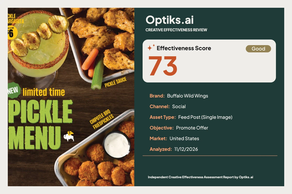
This placement—an in-feed single image social post—launches Buffalo Wild Wings’ limited-time Pickle Menu to a U.S. audience. Its core communication task: drive trial by signaling novelty and value (“Try it for $6”), and nudge action now while the menu lasts. The creative leans heavily into appetite and urgency, pairing oversized food photography with a bold, pickle-green headline and a sharp yellow price burst. But does this arrest attention and, crucially, convert interest into foot traffic or clicks?
What Works: Immediate Appetite and Visual Impact Headline grabs first glance: The Optiks.ai report identifies the oversized, textured 'PICKLE MENU' headline (25–30% canvas height, #78C257 on #3A2A1F) as the fixation driver—its contrast and scale secure instant decode of the pickle-theme.
Appetite through sensory cues: Hero photography of sauced wings, fried pickles, and the pickle-garnished margarita delivers crispness, gloss, and condensation—visceral, taste-driven triggers engineered for emotional appeal.
Palette balances stop-the-scroll and believability: Greens, yellows, warm browns, natural light—these reinforce the LTO and refresh the brand without veering into artificiality. The yellow price burst demands attention, and overall, accessibility benchmarks (even WCAG AAA) are well observed as design references.
Urgency is present, in headline copy: The dual cue of “NEW” and “limited time” threads a subtle temporal tension, a motivator for the menu’s promotional window.
What Holds It Back: Conversion Friction and Fragmented Messaging No primary CTA = no action path: Nowhere does the frame command, "Order now" or "Try today." The only behavioral nudge—a yellow '$6' price burst—is for a margarita, not the hero food items, and sits isolated in the upper left. The Optiks.ai report calls out the high risk here: without a directive adjacent to the primary headline or food, conversion drops and behavioral activation stalls.
Food pricing and offer structure missing: Both wings and fried pickles are visually elevated but left unpriced. This forces a mental leap: viewers must infer or search for the deal. For a “promote offer” objective, the lack of fast, clustered price anchors undercuts value communication and likely hinders order intent.
Fragmented layout increases cognitive load: Key information is scattered—headline, the price burst, urgency, secondary product labels, and the small white buffalo icon are all dispersed. The viewer’s eye travels through a zig-zag path, with decision-critical elements often outside the strongest early attention zones (#analysis-report).
Secondary labels lack legibility and cause crowding: Diagonal descriptors (“CHIPOTLE BBQ FRIEDPICKLES”, “PICKLE SAUCE”) are under 3% canvas height and often missed, per the report. They add visual clutter while failing to clarify flavor specifics on first glance—a classic cognitive cost tradeoff (see cognitive load in advertising ).
Brand encoding is secondary: While the visual language is consistent, the small buffalo icon is out-prioritized by food and headline, risking category-only memory versus strong brand linkage.
How These Choices Shape Audience Response The design lands attention and appetite—size dominance and high contrast mean even a 3-second scroll makes the "Pickle Menu" theme clear. Emotional arousal peaks around the food imagery. But when readiness to act is highest, the absence of explicit action language, clear pricing on core items, and a unified CTA block interrupts momentum. The behavioral mechanism here: interest turns into friction due to missing decision cues.
Without a centrally located, high-contrast action button and visible price anchors for all headline foods, users must infer or search for value and next steps. The scattered component locations force extra saccades, which—per the Optiks.ai attention map—risks attrition before the commercial offer can be fully processed.
Prioritized Fixes and Rationale Add a primary CTA ("Try the Pickle Menu" / "Order Now") under the main headline Example: Place a bold badge, 14–18% canvas width, 6–8% padded, in #111111 with white text or #F7C600 with black text, directly beneath “PICKLE MENU.” Proximity here will enable high-intent viewers to convert immediately.
Price the hero food items, not just the drink Example: Beneath the headline, stack:
Set this at 35–45% of headline cap height for rapid legibility and link to the CTA.
Cluster all offer info—headline, prices, CTA, brand icon—within one left-hand block Example: Group elements so the commercial offer is processed as a single unit (headline->item->price->CTA->logo), reducing fixation hops and decision friction.
Remove or re-set angled micro-labels horizontally, enlarging if flavor clarity is essential
Slightly enlarge ‘limited time’ and stabilize color edges for resilience against wood knots Reference: See readability guidance for rapid mobile processing.
Scale and lock the logo to the headline/offer stack for brand linkage
Editorial Verdict Buffalo Wild Wings’ Pickle Menu creative is distinctive and appetite-led, with textural food focus and a headline that commands social feed attention. However, it leaves conversion potential untapped by fragmenting key decision elements and omitting a clear, context-appropriate action step and pricing for hero foods. Urgency is present, but not sufficiently weighted, and the reward is scattered across quadrants. Unifying the value proposition, pricing, and action into a single left-side decision block would unlock the frame’s commercial velocity.
What deserves to remain: the bold green headline, real-food textures, and authentic palette—all of which position the LTO with energy. But for a truly effective promotional post, every appetite spike needs a turn-key route to action.
This is an independent Optiks.ai review and is not commissioned or endorsed by Buffalo Wild Wings or its agencies.
Complete creative analysis This report is an independent Optiks.ai assessment of the supplied creative. Scores and predicted attention describe the model's assessment, not measured audience response or sales. The article above provides editorial interpretation.
Analysis details Asset Type Feed Post (Single Image)
Analyzed At 2026-11-12T08:14:54.903853+00:00
Effectiveness Score Scale Out of 100. A model-based creative assessment, not measured campaign performance.
Action Steps Reasons An effectiveness score of 73 is below the 75 needed to run as-is.
The constraint is Persuasion at 60, a high-weighted domain for this objective.
Summary Fix before running. At 73 this is close, and Persuasion at 60 is the constraint.
Constraint Weight 0.11228668941979521
Optimal viewing distance Context At 18 inches on a phone, the 'PICKLE MENU' headline reads instantly due to its ~25–30% canvas height and strong color separation. The '$6' price in the yellow burst is also readable but sits away from the headline, reducing integration at a 3‑second glance. 'limited time' is legible yet underweighted versus the headline and risks being skimmed. The small angled labels ('PICKLE SAUCE', 'CHIPOTLE BBQ FRIEDPICKLES') fall below effortless legibility at this distance and are frequently missed. The small winged-buffalo icon is identifiable but not guaranteed to register in the initial scan.
Insights At 18 inches on a phone, the 'PICKLE MENU' headline reads instantly due to its ~25–30% canvas height and strong color separation. The '$6' price in the yellow burst is also readable but sits away from the headline, reducing integration at a 3‑second glance. 'limited time' is legible yet underweighted versus the headline and risks being skimmed. The small angled labels ('PICKLE SAUCE', 'CHIPOTLE BBQ FRIEDPICKLES') fall below effortless legibility at this distance and are frequently missed. The small winged-buffalo icon is identifiable but not guaranteed to register in the initial scan.
Strategic insight This creative is appetite-led and instantly communicates a limited‑time pickle range, but the absence of a primary CTA and pricing on the hero foods directly undermines the promoteoffer objective.
Domain analysis Brand Top Fix Scale the brand mark to ~6–7% of canvas width and lock it with the headline/CTA stack to encode brand with desire.
Summary Identity Clarity — Active Brand Compliance Not Applied. Visual style, color accents, and the winged buffalo icon feel internally consistent, though the mark is small.
What Hurts Logo occupies a small footprint relative to headline and food
Brand mark sits in mid-field and competes with text texture
No brand-colour block or lockup uniting brand and CTA
What Works Consistent wood background and warm food tones
Winged buffalo icon present near the headline
Yellow accenting aligns with the internal visual language
Color Top Fix Introduce a solid high-contrast CTA badge (e.g., #111111 with white text or #F7C600 with black text) directly under the headline.
Summary Green, yellow and warm food tones against dark wood deliver strong contrast and appetite cues.
What Hurts Yellow micro-labels on mid-dark wood reduce crispness at a glance
Textured green headline loses edge definition in darker knots
No dedicated high-contrast field behind a CTA
What Works Green headline stands apart from the brown background with shading
Yellow accent hits high saliency for the price burst
Food colors stay natural and appetizing
Emotion Top Fix Integrate a vivid CTA adjacent to the headline so emotional desire connects immediately to a branded action.
Summary Appetite appeal is strong—crispy textures, spice cues, and condensation signal taste and freshness.
What Hurts Emotional energy doesn’t link to an action moment
Limited-time tension lacks a visible next step to channel arousal
Brand mark is small, weakening emotion-to-brand linkage
What Works Crisp fried textures and sauced wings trigger sensory desire
Pickle garnish and salted rim telegraph flavour clearly
Warm lighting enhances golden-brown cues for crunch
Message Top Fix Add a two-line offer block beneath the headline listing at least two item prices and a CTA, grouped within a 20–25% canvas-height stack.
Summary “NEW limited time PICKLE MENU” lands immediately, but the offer lacks food pricing and action language to close interest.
What Hurts No price shown for wings or fried pickles
No explicit action language ('Order now', 'Try today')
Offer details live in disparate spots rather than a single message block
What Works Strong 'NEW' and 'limited time' urgency framing
Clear category proposition: a pickle-themed range
One concrete price callout for the margarita
Attention Top Fix Pair the primary headline with a high-contrast CTA badge (12-15% canvas width) directly below it to capture and channel early attention into action.
Summary Bold green headline and large, high-texture food photography stop the scroll. The yellow price burst adds a strong secondary hook.
What Hurts CTA-equivalent '$6' burst competes with the drink rather than the headline
Secondary angled labels add micro hot-spots that siphon early fixations
Brand icon lacks saliency relative to food and headline
What Works Oversized 'PICKLE MENU' wordmark (~25-30% of canvas height) in saturated green against dark wood
Large, glossy food shots (margarita, wings, fried pickles) with crisp textures and specular highlights
Yellow price burst for '$6' adds a high-saliency accent in the top-left
Hierarchy Top Fix Introduce a single CTA lockup under the headline at 60% canvas width position and 14-16% canvas width size so it ranks in the top-three elements.
Summary Primary hierarchy is clear—headline then food—but the CTA-equivalent and pricing sit outside the top-three elements, triggering the anchoring cap.
What Hurts Price burst is isolated top-left and smaller than 10% of width, falling below primary scan path
No primary CTA; the call to act doesn’t rank in the visual stack
Angled micro-labels scatter the eye and dilute the message ladder
What Works Dominant headline establishes the theme fast
Triangular placement of drink, wings and fried pickles guides a natural Z-path
'NEW limited time' qualifier sits adjacent to the headline
Persuasion Top Fix Add a bold CTA ('Order now'/'Try the Pickle Menu') at 14–18% canvas width under the headline and add prices for two food items.
Summary No primary CTA and only one priced item cap conversion. The offer lacks a clear next step and price anchors for the hero foods.
What Hurts No explicit CTA; action is unspecified
Food items lack price anchors
CTA-equivalent element is under 12% width and outside the main eye path
What Works Urgency via 'limited time' primes action
Concrete $6 price for margarita
Appetite visuals create motivation
Composition Top Fix Create a single offer block (headline, two prices, CTA, brand) as a unified cluster spanning 35–40% of canvas height on the left half.
Summary The triangular layout balances headline and food, though scattered labels and the isolated price badge reduce cohesion.
What Hurts Price burst floats away from the headline, fragmenting the offer
Angled labels clip attention at the edges of trays
Brand mark sits orphaned rather than in a lockup
What Works Triangle of drink–wings–fried pickles frames the headline
Headline anchors lower-left and feels stable
Ample negative space left of the drink for copy
Context fit Top Fix Cluster headline, item pricing and CTA in one left-side block so the feed thumbnail communicates value in under 3 seconds.
Summary Built for social: square aspect, big headline, strong imagery. Small angled labels underperform at thumbnail size.
What Hurts Peripheral labels underperform on small screens
Offer components are split across the canvas, weakening quick decode
Logo scale is low for fast brand encoding on scroll
What Works Square composition fills feed space effectively
Large headline remains legible at phone distance
Price burst stays recognizable as a circle-mark
Readability Top Fix Increase 'limited time' to at least 40-45% of headline cap height and set the two angled labels horizontal or remove them to concentrate readable content.
Summary Core copy reads cleanly at mobile distance; small angled descriptors are legible only on a second pass.
What Hurts Angled 'CHIPOTLE BBQ FRIEDPICKLES' is small relative to canvas and competes with textured background
Angled 'PICKLE SAUCE' label is thin and peripheral
‘limited time’ line is materially smaller than the headline and loses some punch at a quick scroll
What Works High-contrast green headline with dark shadowing on dark wood
'NEW' badge in white on green reads at glance
Black-on-yellow price text is crisp
Cognitive load Top Fix Consolidate pricing and CTA into one block under the headline, and remove non-essential angled labels to reduce micro-decisions.
Summary Information remains digestible, but decorative labels add avoidable cognitive steps.
What Hurts Two angled micro-labels add extra decoding with low payoff
Price is decoupled from food items, forcing inference
No consolidated offer block to anchor decision-making
What Works One clear theme—pickle range—anchors comprehension
Three hero visuals map directly to the menu idea
Short, punchy copy chunks
Findings Title Oversized green headline drives first fixation
Detail The 'PICKLE MENU' headline occupies roughly 25–30% of the canvas height with chunky, textured letterforms in bright green (#78C257) over dark wood (#3A2A1F). This creates a strong value contrast and size dominance that captures the first glance within the scroll window. The wood grain remains subdued behind the letters, so the headline forms a clean shape. This first impression delivers the theme instantly and sets up the rest of the frame.
Description The 'PICKLE MENU' headline occupies roughly 25–30% of the canvas height with chunky, textured letterforms in bright green (#78C257) over dark wood (#3A2A1F). This creates a strong value contrast and size dominance that captures the first glance within the scroll window. The wood grain remains subdued behind the letters, so the headline forms a clean shape. This first impression delivers the theme instantly and sets up the rest of the frame.
Title CTA-equivalent price burst sits outside the main path
Detail The '$6' price burst for the margarita sits in the top-left corner at approximately 8–10% of canvas width, isolated from the headline and hero foods. The primary eye path moves from the headline to the drink and into the bottom-right tray, leaving this badge as a peripheral stop. According to F/Z-pattern scanning, elements outside this path receive materially less processing time. This placement costs the offer its role as a decision anchor and reduces ‘promoteoffer’ effectiveness.
Description The '$6' price burst for the margarita sits in the top-left corner at approximately 8–10% of canvas width, isolated from the headline and hero foods. The primary eye path moves from the headline to the drink and into the bottom-right tray, leaving this badge as a peripheral stop. According to F/Z-pattern scanning, elements outside this path receive materially less processing time. This placement costs the offer its role as a decision anchor and reduces ‘promoteoffer’ effectiveness.
Title Secondary angled labels are micro-legible only
Detail The angled 'CHIPOTLE BBQ FRIEDPICKLES' and 'PICKLE SAUCE' labels sit in yellow (#F7C600) over mid-dark wood. Each line is thin, set on a diagonal, and occupies less than 3% of the canvas height, making them legible only after a focused second look. On a mobile feed viewed at 18 inches for ~3 seconds, these lines under-deliver. Viewers register the food but miss the descriptors, which costs flavor clarity.
Description The angled 'CHIPOTLE BBQ FRIEDPICKLES' and 'PICKLE SAUCE' labels sit in yellow (#F7C600) over mid-dark wood. Each line is thin, set on a diagonal, and occupies less than 3% of the canvas height, making them legible only after a focused second look. On a mobile feed viewed at 18 inches for ~3 seconds, these lines under-deliver. Viewers register the food but miss the descriptors, which costs flavor clarity.
Title Offer lacks food pricing and an explicit next step
Detail The creative declares 'NEW limited time PICKLE MENU' clearly, yet only the margarita carries a price and no explicit CTA is present. The wings in 'PICKLE SAUCE' and the fried pickles are heroized without a visible value cue. That gap forces users to infer price and path, increasing friction right when intent peaks. For a promoteoffer objective, this leaves conversion on the table.
Description The creative declares 'NEW limited time PICKLE MENU' clearly, yet only the margarita carries a price and no explicit CTA is present. The wings in 'PICKLE SAUCE' and the fried pickles are heroized without a visible value cue. That gap forces users to infer price and path, increasing friction right when intent peaks. For a promoteoffer objective, this leaves conversion on the table.
Title High appetite appeal via texture, color and temperature cues
Detail The fried pickles show a crisp crumb with warm orange-brown tones, and the wings carry glossy sauce highlights that signal heat and flavour. The margarita presents condensation, ice geometry and a salted rim with pickle garnish that cues freshness and novelty. These sensory elements trigger pre-attentive emotional encoding, making the food look desirable. Desire is present; it needs a fast route to action.
Description The fried pickles show a crisp crumb with warm orange-brown tones, and the wings carry glossy sauce highlights that signal heat and flavour. The margarita presents condensation, ice geometry and a salted rim with pickle garnish that cues freshness and novelty. These sensory elements trigger pre-attentive emotional encoding, making the food look desirable. Desire is present; it needs a fast route to action.
Title Identity present but lightly encoded
Detail A small winged-buffalo icon sits near the headline at roughly 3–4% of canvas width in white (#FFFFFF). The wood background and yellow accents align with the internal visual language, creating internal consistency. However, the mark’s scale and mid-field placement make it a fourth- or fifth-priority element. Memory skews to the category if the brand isn’t bound to the appetite moment.
Description A small winged-buffalo icon sits near the headline at roughly 3–4% of canvas width in white (#FFFFFF). The wood background and yellow accents align with the internal visual language, creating internal consistency. However, the mark’s scale and mid-field placement make it a fourth- or fifth-priority element. Memory skews to the category if the brand isn’t bound to the appetite moment.
Title Offer elements are fragmented across the frame
Detail The message components—'NEW limited time', headline, price burst, and small labels—sit in separate quadrants with uneven proximity. The eye bounces from the big headline to the drink, then to the lower-right tray, with the price living alone in the upper-left. This fragmentation forces extra saccades and slows decision-making. A single clustered offer block would reduce hops and increase conversion velocity.
Description The message components—'NEW limited time', headline, price burst, and small labels—sit in separate quadrants with uneven proximity. The eye bounces from the big headline to the drink, then to the lower-right tray, with the price living alone in the upper-left. This fragmentation forces extra saccades and slows decision-making. A single clustered offer block would reduce hops and increase conversion velocity.
Title Palette drives saliency and appetite without artificiality
Detail Green headline (#78C257) over dark wood (#3A2A1F) establishes immediate distinctiveness, and the yellow accents (#F7C600) provide strong attention cues. Food tones stay natural—golden browns and warm highlights—supporting trust in product reality. The only softness occurs where the green headline overlaps darker wood knots, slightly reducing edge clarity. Overall the palette supports both appetite and recognition.
Description Green headline (#78C257) over dark wood (#3A2A1F) establishes immediate distinctiveness, and the yellow accents (#F7C600) provide strong attention cues. Food tones stay natural—golden browns and warm highlights—supporting trust in product reality. The only softness occurs where the green headline overlaps darker wood knots, slightly reducing edge clarity. Overall the palette supports both appetite and recognition.
Title Absent primary CTA suppresses conversion
Detail There is no explicit CTA near the headline or the hero food cluster. The '$6' badge functions as a price signal for the drink only and occupies less than 12% of canvas width, failing to act as the primary action cue. Without a clear directive such as 'Order now' or 'Try the Pickle Menu', motivated users receive no instruction at the decision peak. This directly reduces click-through and in-store action.
Description There is no explicit CTA near the headline or the hero food cluster. The '$6' badge functions as a price signal for the drink only and occupies less than 12% of canvas width, failing to act as the primary action cue. Without a clear directive such as 'Order now' or 'Try the Pickle Menu', motivated users receive no instruction at the decision peak. This directly reduces click-through and in-store action.
Recommendations Action Add a high-contrast CTA badge reading 'Try the Pickle Menu' or 'Order Now' directly under the headline. Size the badge to 14–18% of canvas width and place it ~55–65% from the left edge, ~60–70% from the top, using either #111111 background with #FFFFFF text or #F7C600 background with #111111 text. Maintain at least 6–8% of canvas width padding around the CTA for isolation.
Impact This suppresses conversion because motivated users do not get a clear next step. A dedicated CTA near the headline converts emotional desire into action within the same fixation window.
Evidence Headline 'PICKLE MENU' spans ~25–30% of canvas height on the left; the price burst sits ~5% from the top and ~8% from the left edge. Colors: headline #78C257 on #3A2A1F, burst text #111111 on #F7C600. No CTA button or directive exists within the headline cluster.
Observation The creative lacks a primary CTA. The only action-related element is the small top-left '$6' burst for the margarita, which sits away from the headline and hero foods and measures under 12% of canvas width.
Action Add a two-line price stack under the headline listing 'Wings in Pickle Sauce – $X' and 'Fried Pickles – $Y'. Set each price line at 35–45% of the headline cap height and the block at 20–25% of canvas height. Keep lines horizontal and within the headline/CTA cluster with 3–4% canvas height spacing.
Impact Lack of food pricing weakens value perception and reduces order intent. A consolidated offer stack gives the user a fast price anchor and improves selection confidence.
Evidence Food visuals occupy the right two quadrants; 'PICKLE SAUCE' and 'CHIPOTLE BBQ FRIEDPICKLES' labels are small, angled, and unpriced. The '$6' burst is top-left, detached from the hero food cluster.
Observation Hero foods (wings in pickle sauce, fried pickles) are unpriced while only the margarita shows $6. Offer components are split across corners, forcing users to assemble the value story.
Action Remove both angled labels or re-set them horizontally inside the offer block. If retained, increase each to ~30–35% of headline cap height and keep total micro-copy to one line per item. Maintain a left-column stack where the CTA and prices rank among the top-three elements.
Impact This disperses attention and delays comprehension, reducing the chance the viewer reads the commercial offer in the 3-second window.
Evidence Angled 'CHIPOTLE BBQ FRIEDPICKLES' (yellow #F7C600) runs along the tray lip at ~30°; 'PICKLE SAUCE' sits mid-right. Both lines are <3% of canvas height and peripheral to the headline.
Observation Secondary labels are angled and small, creating extra micro-stops while the key offer lacks a unified block. The price burst sits outside the main Z-path.
Action Increase 'limited time' to 40–45% of headline cap height and add 8–10% letter-spacing relative to current. Add a subtle dark stroke or shadow around the headline at ~3–4% of letter height to stabilize edges across wood texture.
Impact Urgency is underweighted despite its role in driving immediate action. Softer edges slow recognition and lower recall.
Evidence ‘limited time’ in mustard yellow (#FFC72C) sits above 'PICKLE MENU' at ~20–25% of the headline’s cap height. The headline in #78C257 overlaps variable wood tones (#3A2A1F to #5A3B25).
Observation The 'limited time' line is materially smaller than the headline and loses emphasis at a quick scroll. The green headline loses edge clarity over darker wood knots.
Action Increase the logo to 6–7% of canvas width and lock it to the new headline/CTA stack. Keep 2–3% canvas width spacing from the CTA and set on a stable field (solid #111111 or #F7C600) for consistent legibility.
Impact Brand memory decays faster when the mark is not encoded with the appetite and action moments. This weakens attribution on rapid scrolls.
Evidence Logo in white (#FFFFFF) sits near the lower-left of center at roughly 3–4% of canvas width, positioned between 'PICKLE' and the fried pickles tray.
Observation The winged-buffalo icon is small and floats mid-field, separated from the core offer elements.
Action Relocate the $6 burst to sit adjacent to the price stack beneath the headline. Target a burst size of 12–14% canvas width and maintain 3–4% spacing from the CTA to create a single, glanceable offer cluster.
Impact On a fast scroll, users process one cluster. Dispersed pricing and action dilute recognition and reduce tap-through.
Evidence The burst sits ~5% from the top and ~8% from the left edge; headline and food fill the lower-left and right halves. The cluster separation exceeds 40% of canvas width.
Observation The $6 burst is distant from the headline cluster and risks being cropped or ignored in-feed, while the core value story lives across multiple corners.
Predicted attention map Description Large green 'PICKLE MENU' text dominates the lower-left, contrasting strongly with the dark wood background. Its size and blocky forms create a clear shape that commands the first fixation.
Description The bright, translucent green drink with salted rim and pickle skewer sits left-center and carries high texture and color contrast. Its novelty pulls significant attention after the headline.
Description Warm orange-brown fried pickles with a white sauce cup form a high-contrast cluster in the bottom-right. The sauce cup acts as a white anchor point against darker tones.
Label Wings in Pickle Sauce
Description Glossy, sauced wings in the upper-right create specular highlights and texture that attract attention as a secondary food hero.
Description Small yellow circular burst with black text in the top-left creates a distinct shape and strong color contrast. Its isolation limits its role in the main eye path.
Scoring weights Final Weights Emotion 0.06177474402730374
Message 0.13378839590443684
Attention 0.11672354948805459
Hierarchy 0.10921501706484639
Persuasion 0.11228668941979521
Composition 0.07781569965870305
Context fit 0.10921501706484642
Readability 0.0955631399317406
Cognitive load 0.0341296928327645
Accessibility checks Checks Element Headline 'PICKLE MENU'
Criterion 1.4.3 Contrast (Minimum)
Element Qualifier 'limited time'
Criterion 1.4.3 Contrast (Minimum)
Criterion 1.4.3 Contrast (Minimum)
Element Top-left 'PICKLE MARGARITA'
Criterion 1.4.3 Contrast (Minimum)
Element Top-left 'TRY IT FOR $6'
Criterion 1.4.3 Contrast (Minimum)
Element Diagonal label 'CHIPOTLE BBQ FRIEDPICKLES'
Criterion 1.4.3 Contrast (Minimum)
Element Diagonal label 'PICKLE SAUCE'
Criterion 1.4.3 Contrast (Minimum)
Rejected
Compliance review Description Angled secondary labels ('PICKLE SAUCE', 'CHIPOTLE BBQ FRIEDPICKLES') are thin, diagonal, and occupy <3% of canvas height. At a typical mobile viewing distance they are frequently missed, costing flavor clarity.
Description Primary headline uses light green text on a dark wood field with dark edging, producing strong separation by lightness and hue. The black-on-yellow price burst provides robust figure/ground. No critical meaning relies on color alone; however, the small 'limited time' line carries urgency with a smaller size than ideal for rapid decoding.
Explore more articles and guides