Composition in advertising: how visual structure guides perception and meaning
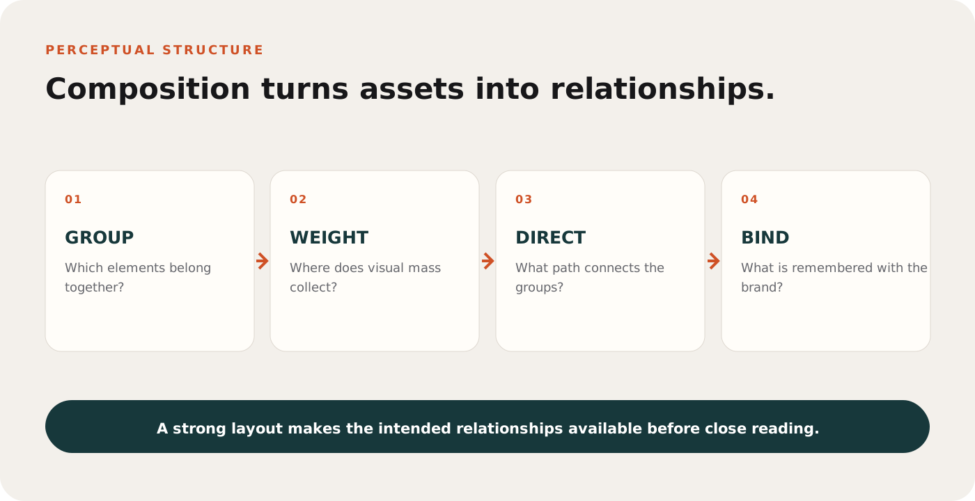
Composition is the set of spatial relationships through which separate elements become one interpretable scene. It influences what appears connected, which regions feel stable or tense, how the eye moves, and whether the product, promise, brand and action can be understood as parts of the same message.
A layout can contain every required asset and still fail as a composition. The logo may be visible but detached from the product. The headline may be large but pull attention away from the proof. Empty space may create calm or simply create distance between ideas that need to bind. Composition is not decoration around content; it is part of how content becomes meaningful. It works with visual hierarchy, but it answers a wider question about how every part relates.
The visual system organizes before it interprets
Perception is not a pixel-by-pixel reading. The visual system groups elements through relationships such as proximity, similarity, common region, continuity and connectedness. The modern review of Gestalt research by Wagemans and colleagues shows that these principles remain central to understanding perceptual organization, while also emphasizing that grouping depends on interactions among cues and tasks.
In an advertisement, grouping determines which caption belongs to which product, whether a price is read as part of an offer, and whether a testimonial is attributed to the brand. Designers can create these relationships with distance, alignment, shared backgrounds and repeated form. When several cues agree, the group feels immediate. When they conflict, the viewer must resolve the structure.
Figure-ground assignment decides what becomes an object
Before a viewer can compare elements, the visual system must separate figures from background. Edge contrast, enclosure, size, symmetry and familiar shape all contribute to that assignment. A pale product on a pale surface may be aesthetically coherent yet fail to separate. A headline crossing a detailed image may alternate between figure and texture, increasing the work required to read it.
Designers often repair weak figure-ground separation by adding shadows or outlines. Those devices can help, but they also change material quality and brand tone. A stronger solution may be to simplify the local field, move the object across an edge or introduce a shared panel that groups related content while preserving the larger composition.
"The whole is different from the sum of its parts" is useful only when the relationships that create the whole are made explicit.
For a contemporary review, see Wagemans et al., A century of Gestalt psychology in visual perception, 2012

Balance and tension are relational
Balance concerns the distribution of visual weight around an implied center. Size, contrast, detail, color and position can all add weight. Symmetry is one way to create balance, but not the only one. Asymmetry can feel stable when a large quiet object is countered by a smaller high-contrast element or when negative space provides a deliberate field.
Symmetry often increases ease of processing and aesthetic preference, yet its effect depends on content and task. A perfectly centered product can communicate order, precision or ceremony. It can also remove motion and reduce room for a reading path. Composition should express the intended character rather than follow a universal formula.
Negative space is active structure
Empty regions separate groups, protect focal elements and establish rhythm. They also affect the implied relationship between objects. A headline placed too far from the product may no longer describe it. A call to action isolated at the bottom may feel like a footer rather than the conclusion of the argument.
Useful negative space has a job: it clarifies hierarchy, creates a pause, preserves recognition or accommodates a format. It should not be evaluated by percentage alone. The question is what perceptual relationship the space creates.
Visual weight is not physical size
A small high-contrast word near an edge can counter a much larger low-contrast photograph. Faces, readable type and isolated saturated color often acquire weight because they are behaviorally relevant or locally distinctive. Balance therefore cannot be measured by dividing the canvas into equal areas. It has to be judged from the distribution of perceptual pull.
Edge position matters because an object near the boundary can imply exit, cropping or tension. Central placement can feel stable but may also create static competition when several objects share the axis. The useful question is whether the distribution supports the intended reading and emotional character.
Processing fluency supports pleasure and comprehension
Reber, Schwarz and Winkielman proposed that perceptual fluency can contribute to aesthetic pleasure. Symmetry, contrast, repetition and familiarity can make an object easier to process, and that ease can influence evaluation when it is not attributed elsewhere. Advertising research has also linked subjective fluency with ad attitude, brand attitude and purchase intention through attention and processing depth.
Fluency is not a command to make everything simple. Disfluency can create interest, encourage inspection or express a distinctive position. The distinction is between productive complexity and avoidable confusion. A visual metaphor may require resolution because the resolution carries meaning. A misaligned price, product and qualifier creates work without adding value.
Composition and hierarchy are connected but different
Hierarchy describes relative priority: what should be encountered first, second and third. Composition describes the complete spatial system through which those priorities and relationships are expressed. A layout can have a dominant headline yet poor composition if the remaining elements do not form coherent groups or lead toward action.
There is no guaranteed eye path
Design presentations often draw a single line through a layout and describe it as the viewer's journey. Actual scan paths vary with task, prior knowledge, device, starting position and individual strategy. Directional cues can change probabilities, but they do not program a fixed sequence.
Critical meaning should therefore remain robust across plausible entry points. A viewer who notices the product first should still reach the claim and brand. A viewer who reads the headline first should be able to identify what it describes. Composition creates several short, reliable connections rather than one fragile choreography.
Composition binds product, message and brand
Advertising succeeds when attention to an image becomes memory for the correct source and proposition. Composition helps that binding. Product, claim and logo placed within a shared region are more likely to be interpreted as related than the same elements scattered across unrelated zones. Directional cues, gaze, perspective and edge alignment can reinforce the connection.
Originality also depends on structure. Pieters, Warlop and Wedel found that originality and familiarity can support brand attention and memory in clutter. Novel composition may help a creative break through, but novelty should not sever the route from focal image to brand. The execution needs both perceptual distinction and attribution.
Responsive formats require recomposition
A square crop, vertical story and wide display do not preserve the same spatial relationships. Mechanical cropping can remove the counterweight that made an asymmetrical design stable, separate proof from claim or place the brand outside the focal region. Scaling every element equally can preserve geometry while destroying readable size.
A campaign system should define relationships that can be rebuilt: which elements form a group, the minimum separation around the product, how close the brand must remain to the promise, and which component can disappear at short exposure. This produces consistent meaning across formats without demanding identical coordinates.
A worked example: SONDER headphones
SONDER is a fictional headphone brand positioned around focused listening. The composition uses a large product on the right, a quiet cream field on the left, a dark green vertical plane and one coral diagonal. The system should convey calm control with a small signal of energy.
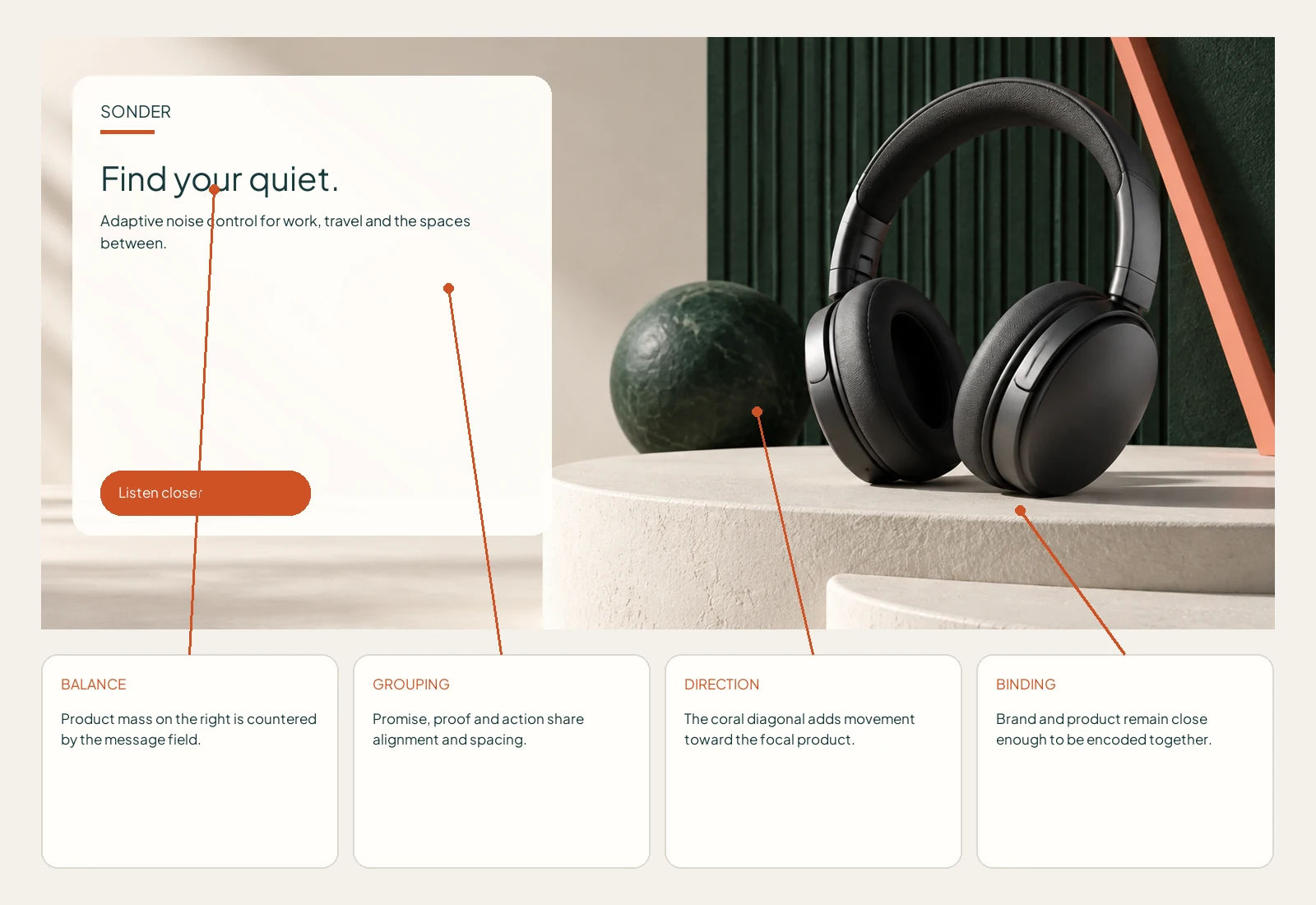
Asymmetrical balance
The headphone mass is countered by a compact headline block. The product remains dominant without making the left half feel abandoned.
Grouping
The promise and supporting proof share alignment and spacing. The action sits directly below, so it reads as the next step in the same argument.
Directional flow
The coral diagonal points from the upper right toward the product and action area. It adds movement without becoming a competing focal object.
Brand binding
The name sits close enough to the product to be encoded with it. A logo in the far corner would preserve tidiness but weaken attribution.
How to measure a composition
- Grouping test: ask which caption, price or qualifier belongs to each object without allowing prolonged study.
- Blur test: reduce detail to inspect mass, contrast and balance before reading copy.
- Sequence test: measure the order in which meaningful regions are noticed and understood.
- Attribution test: determine whether the focal image, claim and advertiser are remembered together.
- Format test: review crops, aspect ratios, safe areas and responsive rearrangement.
- Distance test: inspect the layout at intended physical or angular size.
- Behavior test: compare finding and comprehension against an alternative arrangement using the same assets.
What eye tracking can and cannot show
Eye tracking can reveal fixations, transitions and neglected regions. It can test whether a proposed path occurs often enough to matter. It cannot prove that a layout is balanced, understood or persuasive. A fixation may represent interest, confusion or task demands. Pair gaze data with comprehension, memory and choice.
Computational saliency can provide a fast estimate of contrast-driven competition before testing. It is less reliable when meaning, faces, text or task goals dominate selection. Use it to identify candidate problems, then test whether people find and interpret the required regions under realistic exposure.
A research-informed composition review
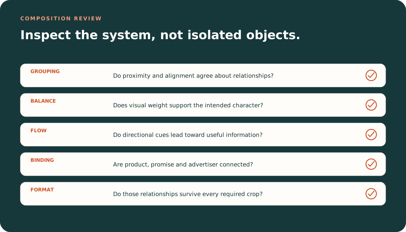
- List the required relationships. Define which product, claim, qualifier, brand and action must be read together.
- Map visual weight. Review size, contrast, detail, color and edge position.
- Check grouping cues. Use proximity, alignment and common regions consistently.
- Trace directional forces. Follow faces, gaze, diagonals, perspective and implied motion.
- Audit negative space. Confirm that separation clarifies rather than disconnects.
- Protect attribution. Bind the advertiser to the moment of product and message encoding.
- Test format changes. Recompose rather than mechanically crop when relationships break.
- Measure understanding. Validate grouping, sequence, memory and action with people.
Common questions about composition
Is symmetry always more attractive?
No. Symmetry can support fluency and stability, but preference depends on content, evaluation method and intended character. Asymmetry can create balance and movement.
Does the rule of thirds improve advertising?
It can be a useful scaffold for placement, but it is not a psychological law. Grouping, hierarchy, attribution and context matter more than compliance with a grid rule.
Should every layout have a clear eye path?
It should provide a reliable route through essential information. Actual viewing varies, so critical meaning should not depend on one exact sequence.
Can AI score composition?
AI can inspect balance, grouping, alignment, density, focal competition and format risks. Human testing remains necessary to establish interpretation, memory and behavior.
Research referenced
- Wagemans, J., et al. (2012). A century of Gestalt psychology in visual perception: perceptual grouping and figure-ground organization. Psychological Bulletin, 138(6), 1172-1217.
- Reber, R., Schwarz, N., and Winkielman, P. (2004). Processing fluency and aesthetic pleasure: is beauty in the perceiver's processing experience? Personality and Social Psychology Review, 8(4), 364-382.
- Storme, M., Myszkowski, N., Davila, A., and Bournois, F. (2015). How subjective processing fluency predicts attitudes toward visual advertisements and purchase intention. Journal of Consumer Marketing, 32(6), 432-440.
- Pieters, R., Warlop, L., and Wedel, M. (2002). Breaking through the clutter: benefits of advertisement originality and familiarity for brand attention and memory. Management Science, 48(6), 765-781.
- Orth, U. R., and Malkewitz, K. (2008). Holistic package design and consumer brand impressions. Journal of Marketing Research, 45(1), 64-81.