Color in advertising: how perception, learned meaning and contrast shape response
Color reaches the visual system before a viewer has read a claim, but it does not carry a fixed emotional dictionary. Its effect depends on contrast, learned associations, category conventions, brand memory, surrounding colors and the task facing the viewer. A useful color review therefore asks what the palette helps people detect, distinguish, interpret and remember.
Marketing shorthand often assigns a personality to each hue: blue means trust, red means urgency, green means nature. The scientific record is less tidy. Color can alter attention, expectation and evaluation, but the same hue can acquire different meanings across products, cultures and situations. A red field can signal a discount, danger, sweetness, heat or an established brand. The design question is not what red means in general. It is what this red is likely to mean here. This is also why color should be reviewed alongside attention, rather than treated as an isolated palette choice.
Color begins as a perceptual signal
The visual system does not recover a stable color value directly from an object. It estimates surface color from reflected light while adapting to illumination and surrounding fields. This is why the same specification can appear different on a phone, a backlit screen, coated paper or a sunlit poster. Hue, lightness and chroma also have different functional roles. Lightness contrast often carries legibility. Chroma can increase separation and apparent intensity. Hue can support grouping and recognition when the viewing conditions preserve it.
Color can help preattentive selection when it makes an element different from its neighbors. A single orange button within a quiet blue interface is easy to locate. If every badge, illustration and price uses a different saturated hue, color stops defining priority and becomes another source of competition. The mechanism is relational: salience comes from difference within a field, not from a color in isolation.
Perception is an interaction, not a stored swatch
Simultaneous contrast demonstrates the problem for brand systems. Identical color values can appear lighter, darker, warmer or cooler when the surround changes. Adaptation also shifts sensitivity after prolonged exposure to a color or illumination. The perceptual result is constructed from relationships across the scene, not retrieved from the hex value in a guideline.
For creative review, this means color should be assessed on the final substrate and in the expected environment. A proof viewed on a calibrated monitor does not reproduce a menu board under warm lights, a phone in sunlight or a package surrounded by competitors. Teams should define the contrast relationship that must survive, then establish production tolerances that protect it.
"Color can carry important meaning and can have an important impact on people's affect, cognition, and behavior."
Andrew Elliot and Markus Maier, Color psychology: effects of perceiving color on psychological functioning in humans, 2014
Elliot and Maier also stress the limits of the evidence: many findings depend on task and context, and stronger claims require better boundary conditions and real-world testing. That caution matters for advertising. A laboratory effect involving a colored screen or task cue is not automatically a rule for packaging, outdoor media or brand identity.

Color meaning is learned, situated and cultural
Palmer and Schloss proposed ecological valence theory: people tend to prefer colors associated with objects and experiences they value. Their experiments found that affect toward color-associated objects predicted average color preference better than several appearance-based alternatives. The implication is important. Preference is partly learned from the world, so it can vary with experience, group identity and culture.
Labrecque and Milne showed that hue, saturation and value can influence perceived brand personality. Their work supports relationships between color and traits, but it does not justify a universal lookup table. Meaning emerges through associative learning and through the fit between a palette, a category and an intended position. A muted blue on a medical service, a saturated blue on an energy drink and the same blue on children's packaging are not psychologically identical stimuli.
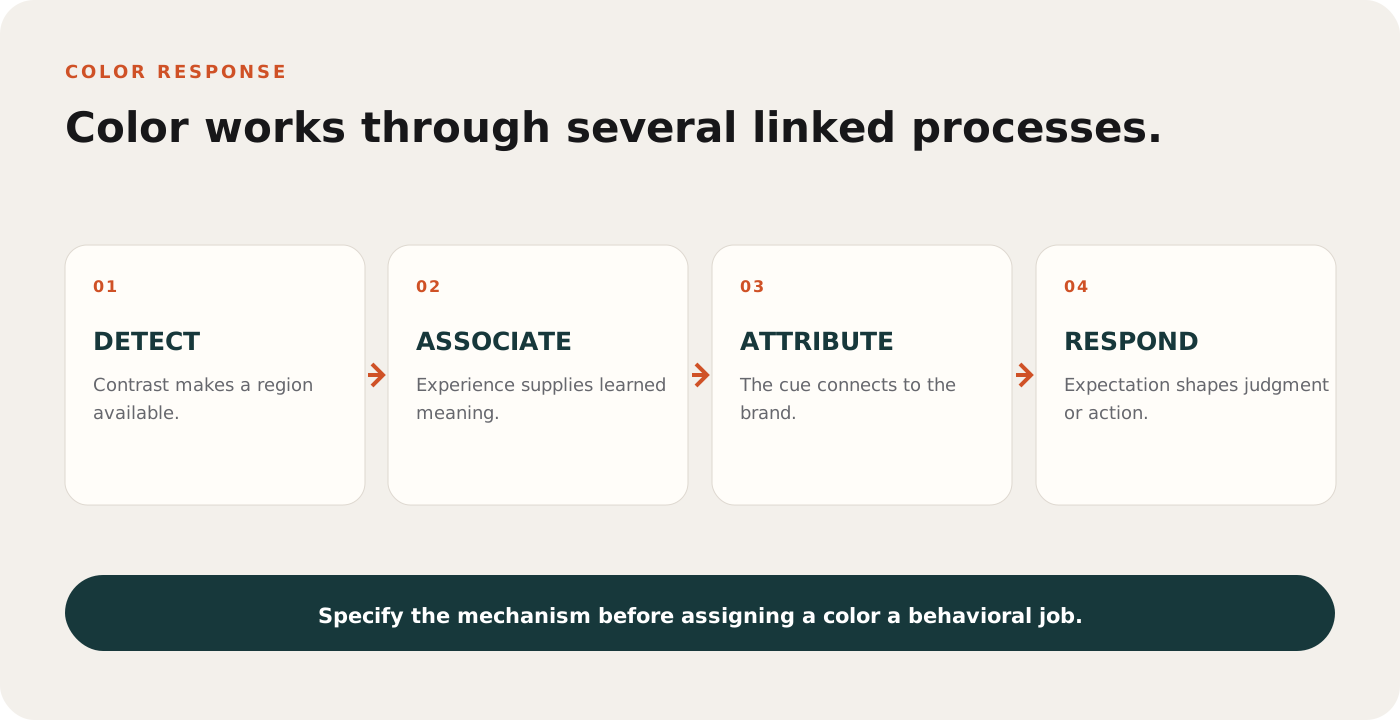
Congruence creates fluency, while deviation can create attention
Expected colors can make recognition easier. Consumers use package color to infer flavor, category and product variant. When color contradicts those expectations, visual search may increase and the product may appear more innovative, but liking or identification can fall. The choice is a tradeoff. Congruence supports rapid interpretation; controlled incongruence can create notice or signal novelty.
Cross-national work by Madden, Hewett and Roth found both commonalities and differences in color meanings and preferences across countries. That argues against exporting a palette without testing. It also argues against treating culture as a set of stereotypes. Measure the intended market, category and usage situation rather than assuming a national response.
Color changes sensory expectation before consumption
Food and beverage research shows that visual color can shape expected flavor, sweetness and intensity. When appearance and flavor are congruent, identification can become easier. When they conflict, the consumer may misidentify the flavor or judge the experience against the wrong expectation. Color is therefore part of the product promise, not merely the package mood.
The same logic extends beyond taste. Warm or cool palettes can alter expectations about temperature; surface color can affect perceived material and weight; medical color conventions can influence strength or function expectations. These are learned predictions with boundary conditions. A marketer should test the inference created for the specific product rather than borrow a generalized color association.
Color becomes valuable when it retrieves the brand
A consistent palette can become part of a brand's memory structure. Its practical value depends on two conditions: people must know the cue, and they must attribute it to the correct brand. Romaniuk and Nenycz-Thiel showed that color-brand links can be measured in different cueing directions. Recognition of a brand color when the name is shown is easier than retrieving the brand from color alone. Creative teams often confuse the first task with the second.
Color rarely works alone. Combinations of hue, proportion, shape, typography and product form are more diagnostic. A large field color may establish recognition at distance, while a smaller accent supports navigation or action. Repetition should preserve the relationship between colors, not merely reproduce hexadecimal values in every context.
Color must also survive production. Screen brightness, print stock, ambient light, compression and dark mode can alter the cue. A brand system needs perceptual tolerances and contrast rules alongside master values.
Distinctiveness is different from preference
A palette can be attractive without helping people identify the advertiser. It can also be distinctive without being liked in isolation. Brand value comes from a reliable cue-to-brand link, which is built through exposure and protected from competitor confusion. Asking whether people like a color therefore answers a different question from asking whether the color retrieves the brand.
A useful test separates recognition, retrieval and preference. Recognition asks whether the palette looks correct when the brand name is present. Retrieval asks which brand comes to mind when the palette appears alone. Preference asks how much the viewer likes it. Strong recognition with weak retrieval often means the system is familiar inside brand guidelines but not distinctive in memory.
Contrast is a behavioral requirement
Color supports action only when viewers can distinguish the elements carrying meaning. Contrast is therefore more consequential than mood language. Text that meets a numerical contrast threshold can still fail at distance if it is too small, thin or placed on a changing photograph. Conversely, a palette can remain restrained while creating strong separation through lightness, scale and negative space.
Accessibility should include color-vision variation and the instruction not to use color as the only signal. A red error state needs an icon or text label. A chart needs direct labels, patterns or shapes. A promotional price cannot depend on a subtle hue distinction that disappears under glare.
A worked example: VELA sparkling water
VELA is a fictional sparkling water brand. Its blood-orange variant uses a deep cobalt field, an unprinted silver can and a restrained orange accent. The color system has four jobs: create cold refreshment cues, make the citrus flavor identifiable, separate the can from the background and locate the response.
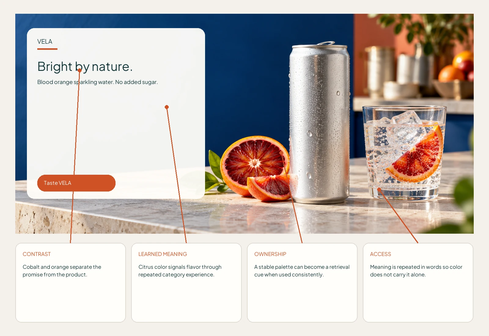
Field color
The cobalt field provides a stable, ownable background and enough lightness contrast for an off-white headline. It also makes the silver can and orange fruit easy to segment.
Flavor evidence
Blood orange supplies a learned product cue. The fruit image does the semantic work; the orange accent reinforces it without asking hue alone to identify flavor.
Priority
The palette is deliberately unequal. Blue dominates, neutral metal carries the product, and orange appears only where flavor and action need emphasis. This prevents the accent from becoming visual noise.
Adaptation
On a dark retail screen, the off-white type and orange action require measured contrast. On uncoated print, cobalt and orange need proofing because gamut and ink gain can collapse separation.
How to measure color rather than debate it
- Detection: measure how quickly viewers locate the brand, product, price or action within the real visual field.
- Discrimination: test whether variants, flavors, tiers or states remain distinguishable under realistic size and lighting.
- Association: ask what qualities and categories the palette suggests without revealing the intended answer.
- Attribution: show the palette without the name and record correct brand identification and competitor confusion.
- Legibility: combine contrast calculations with distance, motion, glare, type size and background variation.
- Accessibility: review color-vision simulations and verify that information survives without hue.
- Behavior: compare finding, comprehension and choice against an alternative palette while holding layout and copy constant.
What neuromarketing can add
Eye tracking can show whether a contrasting region attracts gaze and whether that attention reaches the brand or action. EEG or autonomic measures may detect arousal differences, but they cannot tell a team that blue means trust or that a palette is strategically correct. Neuroscience measures response; it does not supply universal symbolism.
Color studies also need disciplined controls. Changing hue can inadvertently change luminance, saturation, local contrast or perceived figure-ground structure. If those variables move together, a response cannot be attributed to hue alone. Strong experiments use calibrated displays or measured physical samples and report the color space, illumination and viewing conditions.
A research-informed color review
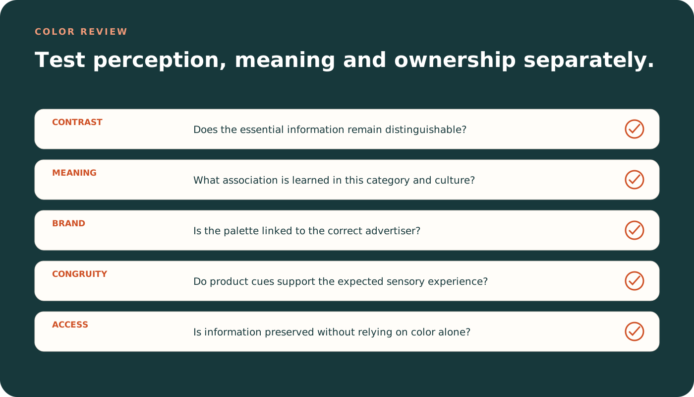
- Assign functional roles. Identify the field, content, emphasis, action and status colors.
- Check relational contrast. Test the element against its actual surroundings rather than a white artboard.
- Test learned meaning. Ask what the palette suggests in this category, market and moment.
- Separate preference from performance. A liked palette may still fail to identify the brand or communicate the offer.
- Measure ownership. Determine whether people connect the color system with the advertiser rather than the category.
- Review accessibility. Ensure that no essential distinction relies on hue alone.
- Simulate production. Check common devices, print processes, lighting and motion.
- Test behavior. Measure finding, comprehension and response, not only aesthetic ratings.
Common questions about color in advertising
Does red always create urgency?
No. Red can become salient and may carry learned urgency cues in some environments, but it can also suggest a brand, flavor, danger, celebration or category convention. Context determines the inference.
Is blue always the safest corporate color?
No. Blue may support competence associations in some studies, yet widespread use can make it generic. Fit, ownership and competitive separation matter.
Should a campaign use more color to gain attention?
Usually the better question is where contrast should occur. One controlled deviation often creates clearer priority than several saturated elements.
Can AI evaluate color?
AI can estimate contrast, palette relationships, hierarchy, brand consistency and likely category associations. Market meaning and behavioral effects still require audience and context evidence.
Research referenced
- Elliot, A. J., and Maier, M. A. (2014). Color psychology: effects of perceiving color on psychological functioning in humans. Annual Review of Psychology, 65, 95-120.
- Labrecque, L. I., and Milne, G. R. (2012). Exciting red and competent blue: the importance of color in marketing. Journal of the Academy of Marketing Science, 40, 711-727.
- Palmer, S. E., and Schloss, K. B. (2010). An ecological valence theory of human color preference. PNAS, 107(19), 8877-8882.
- Madden, T. J., Hewett, K., and Roth, M. S. (2000). Managing images in different cultures: a cross-national study of color meanings and preferences. Journal of International Marketing, 8(4), 90-107.
- Romaniuk, J., and Nenycz-Thiel, M. (2014). Measuring the strength of color brand-name links. Journal of Advertising Research, 54(3), 313-319.
- Huang, L., and Wan, X. (2020). The color-flavor incongruency effect in visual search for food labels. Food Quality and Preference, 86, 104078.