How to evaluate advertising creative before launch: an 11-domain checklist
To evaluate advertising creative before launch, define the audience, objective and placement, then review attention, hierarchy, readability, cognitive load, message, emotion, brand, color, composition, persuasion and context fit. Record specific evidence, prioritize the problems that could prevent the ad from doing its job, and test the revised work under realistic viewing conditions.
The most useful creative reviews begin before anyone explains the concept. Put the work on screen, leave it there briefly, then ask what people understood. The explanation can come later. Your audience will encounter the ad without it.
A beautifully finished execution can still leave the product unclear. A compelling headline can direct attention away from the brand. A campaign that works on a presentation screen can become unreadable on a phone. These are different problems, and they need different corrections.
This guide uses the 11 domains assessed by Optiks.ai to organize a practical pre-launch review. The framework draws on research in visual attention, consumer psychology and working memory, alongside established design practice. It is a review method, not a universally validated psychological scale. The examples are fictional; the proposed improvements are hypotheses to check, not measured performance gains.
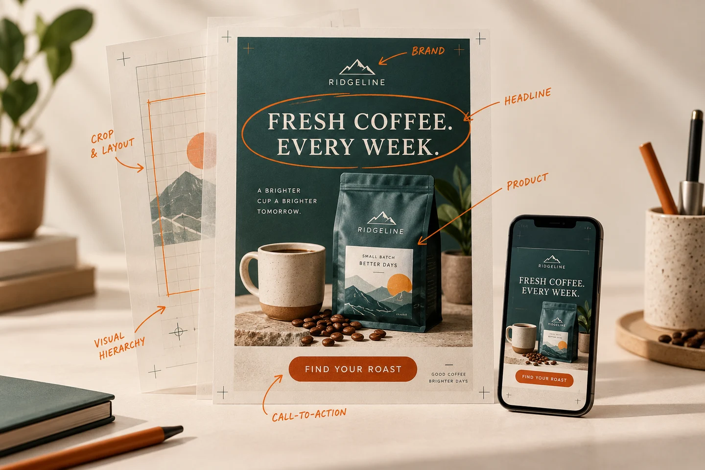
Illustrative creative review. The same campaign needs to communicate across formats, sizes and viewing conditions.
What is pre-launch creative evaluation?
Pre-launch creative evaluation is a structured assessment of whether an advertisement is likely to communicate its intended message to its intended audience in its intended setting. It identifies weaknesses while changes are still practical.
It can include expert review, AI-assisted analysis, technical checks and audience research. These provide different kinds of evidence. An expert can identify a misleading visual hierarchy; a contrast tool can measure a color pairing; an audience test can reveal what people actually understood.
The central question is: what could stop this creative from achieving its objective, and what evidence would help us decide?
Start with the brief, not the score
Write a short review brief before assessing the artwork:
- Objective: What should the campaign change: awareness, consideration, trial, purchase or something else?
- Audience: Who is it for, what do they already know, and what need or hesitation matters?
- Placement: Where will it appear, at what size, and with what surrounding distractions?
- Promise: What is the main benefit or idea the audience should take away?
- Brand requirements: Which identity elements, tone and supplied rules must the execution respect?
- Measurement: Which outcome will indicate progress, and how will it be measured?
A recruitment poster and an ecommerce retargeting ad should not be judged by the same response criteria. One may need to make an unfamiliar employer interesting; the other may need to resolve a specific hesitation before purchase.
For the examples below, imagine Ridgeline Roasters, a fictional coffee subscription. Its mobile campaign introduces weekly coffee delivery to people unfamiliar with the brand and invites them to find a suitable roast. That context determines the review.
The 11-domain creative evaluation checklist
Download the blank creative-review worksheet to record findings, owners and verification steps.
Use this table for a first pass, then work through the detailed questions. The domains overlap: changing the headline can affect readability, hierarchy, message and cognitive load at the same time.
| Domain | Core question | Evidence to collect |
|---|---|---|
| 1. Attention | Does something relevant draw the eye? | First-noticed element in an unprompted viewing |
| 2. Hierarchy | Is the order of importance clear? | What viewers notice first and recall afterwards |
| 3. Readability | Can essential words be read? | Actual-size checks, contrast measurements and audience feedback |
| 4. Cognitive load | How much effort does understanding require? | Competing messages, choices and interpretive steps |
| 5. Message | Is the intended takeaway understood? | The audience's own description of the offer |
| 6. Emotion | Does the creative evoke a useful response? | Described feelings and their connection to the product |
| 7. Brand | Is the advertiser identifiable and consistent? | Brand attribution and a supplied-guidelines check |
| 8. Color | Does color support meaning and visibility? | Contrast, reproduction and category context |
| 9. Composition | Do the elements form a coherent whole? | Crop checks, spacing, alignment and visual relationships |
| 10. Persuasion | Is there a credible reason to respond? | Benefit, supporting evidence and next-step clarity |
| 11. Context fit | Does the execution work in its placement? | Device, distance, timing, environment and destination checks |
1. Attention: earn a relevant first look
Attention is the opportunity to communicate. Assess what attracts it and whether that element helps the audience understand the product or brand.
Pieters and Wedel's study of 1,363 print advertisements found that pictorial, text and brand elements played different roles in capturing and transferring attention. The work supports reviewing these elements together; it does not establish a single ideal logo size or layout for every channel. Attention Capture and Transfer in Advertising, 2004
Check: What stands out when the ad appears among neighboring content? Does the first impression relate to what is being sold? Is an attention-grabbing device taking interest away from the offer?
Example: Ridgeline uses a large landscape photograph while the coffee pack is barely visible. Test a version that gives the coffee more presence while retaining the landscape as a distinctive supporting element.
2. Hierarchy: make the priorities visible
Visual hierarchy is the relative prominence of the elements. It should help viewers find their way through the creative without needing to study it.
Write down the intended priorities before adjusting the design. For Ridgeline, they might be the weekly-delivery promise, the coffee and brand, then the roast-finding invitation. This is an intended structure, not a claim that every eye follows an identical path.
Check: Are two headlines equally dominant? Does the price overshadow a qualification? Is a decorative badge louder than the product benefit?
Example: “Wake Up to Better Coffee” competes with “Freshly Roasted. Delivered Weekly.” Try one main headline, such as “Freshly roasted coffee, delivered every week,” and give any supporting line a clearly secondary role. Compare what people understand, not just which version the team prefers.
3. Readability: judge the words at their real size
Readability depends on type size, weight, spacing, contrast, background detail and viewing conditions. A high-resolution file can still contain unreadable text.
For applicable web text and images of text, WCAG's minimum contrast criterion specifies 4.5:1 for normal text and 3:1 for large text, with defined exceptions. These are accessibility thresholds, not a promise of outdoor legibility or campaign performance. Check the standard's size definitions rather than assuming a headline counts as large. W3C: Contrast (Minimum)
Check: Can the offer and essential conditions be read on the intended device? Does compression weaken fine lettering? Does the background vary behind the words?
Example: Ridgeline's cream descriptor disappears over pale steam. Place it on a stable background, strengthen contrast and reassess the exported ad on a phone.
4. Cognitive load: reduce unnecessary interpretation
Cognitive load is the mental effort required to process the work. Count the tasks the viewer must perform: interpret a visual metaphor, identify the category, compare claims, work out an offer and choose an action.
Working-memory research supports the importance of limited processing capacity. It does not justify converting a laboratory estimate into a rule that every ad must contain no more than four objects. Cowan, 2010
Nor should every complex execution become minimalist. Pieters, Wedel and Batra distinguished dense visual features from elaboration in the creative design; their study found different effects for those forms of complexity. The Stopping Power of Advertising, 2010
Check: Which elements introduce genuinely useful information? Which repeat a claim or demand a separate decision?
Example: Ridgeline lists five benefits and three actions. Keep the benefit most relevant to the brief, establish one primary action and move secondary explanations to the destination.
5. Message: test the takeaway, not the wording
Message clarity concerns what the audience understands the ad to mean. A sentence can be easy to read and still fail to explain the product or offer.
Ask someone to describe the ad without repeating its headline. Their answer often exposes the gap between what the team intended and what the execution communicates.
Check: Is the product category clear? Can people explain the benefit? Do the image and copy support the same promise? Are any qualifications changing the apparent offer?
Example: “Make mornings yours” establishes a tone but does not explain Ridgeline's subscription. A delivery statement or a short category descriptor can supply that missing information. Preserve the campaign's character while making the proposition understandable.
Avoid resolving every misunderstanding by adding more copy. Sometimes the image, a misleading emphasis or an unfamiliar term is the cause.
6. Emotion: connect the feeling to the product
Emotion gives a review a question beyond “does this look attractive?” Ask what people might feel and how that response serves the idea: anticipation, relief, confidence, belonging or another relevant reaction.
Elder and Krishna's experiments showed that product orientation could affect mental simulation and purchase intentions under particular conditions. That provides a reason to consider how imagery helps people imagine using a product. It does not mean a hand, face or lifestyle scene will automatically improve an ad. The Visual Depiction Effect, 2012
Check: Does the emotional tone fit the audience and promise? Is the product part of the experience, or could the scene advertise almost anything?
Example: For Ridgeline, compare a pack-only image with a credible coffee-making moment. Ask what each communicates. Keep any human detail connected to the coffee and preserve brand visibility.
7. Brand: make the memory attributable
Brand evaluation asks whether people can identify the advertiser and whether the work reflects its identity. A logo can be present without being easy to notice or remember.
Review the wordmark, packaging, colors, typography, distinctive assets and tone as a system. Check supplied rules for approved artwork, clear space, proportions and usage. A generic category aesthetic may look appropriate while doing little to distinguish this advertiser.
Check: After viewing, can people name the brand? Could the execution plausibly belong to a competitor? Have brand requirements been applied consistently across the ad and destination?
Example: Ridgeline's mountain icon is prominent but unfamiliar; its name is small. Test a clearer relationship between icon and wordmark. Record the recognition problem instead of issuing an unexplained instruction to “make the logo bigger.”
8. Color: give the palette a functional role
Color should help organize the creative, maintain recognition and keep important information visible. Its role depends on neighboring colors, reproduction, category conventions and audience context.
Avoid treating a color as a universal emotional switch. “Blue creates trust” is too broad to settle a design decision. Ask what this color is doing in this execution.
Check: Does the primary action stand apart from its surroundings? Is meaning conveyed through labels or shape as well as color? Does the palette survive the intended screen or print process? Does it remain recognizably on-brand?
Example: Ridgeline uses the same orange for its call to action, award badge and decorative marks. Reserve the strongest emphasis for the action and reduce competition elsewhere. Recheck readability after making the change.
9. Composition: check how the parts work together
Composition is the arrangement of the creative's elements. Hierarchy establishes importance; composition concerns relationships, spacing, alignment, balance and framing.
Inspect each planned crop. A layout that feels resolved in a tall poster may lose its brand or supporting line in a square feed placement. Avoid evaluating a set of adaptations from a single master file.
Check: Do image and copy appear connected? Is negative space protecting important elements? Are awkward overlaps or tangents creating distractions? Are faces, products and qualifications safely positioned in each format?
Example: Ridgeline's cup handle points into the descriptor, making the two elements appear crowded. Adjusting the image position can give both room without shrinking the product. Compare the complete composition after the change; a local correction can create a new imbalance elsewhere.
10. Persuasion: give interest somewhere to go
Persuasion combines a relevant benefit, a credible reason to believe it and an appropriate response. A forceful button cannot compensate for an offer the audience does not understand or value.
Match the next step to the objective and the audience's readiness. An awareness execution may prioritize brand and category memory. A response campaign needs an intelligible route forward.
Check: Why should this audience care? What supports the promise? Is the requested action clear? Does the destination deliver what the ad suggests?
Example: If Ridgeline's “Find your roast” button leads to a quiz, the destination should start that experience. Sending people to a general product catalog introduces a mismatch. If the ad makes a freshness claim, confirm that the operation can support it and explain the relevant detail where readers need it.
11. Context fit: put the work where it will be encountered
Context fit asks whether the execution suits its channel and environment. Bring the brief back into view: audience, distance, timing, distractions, device and conditions of use.
A shelf is not a street. Someone comparing packs can inspect details that a passing commuter will miss. A video understood with sound may become confusing when muted. A photograph of a poster on a laptop is only an approximation of the actual placement.
Check: Does the creative survive the real crop and interface overlays? Does the message arrive within the available sequence? Is the next step practical in that setting? Are important words visible at the intended distance?
Example: Ridgeline's mobile ad can link directly to a quiz. A roadside adaptation needs a different response mechanism and far less reading. Changing the dimensions alone does not create a suitable outdoor execution.
Turn the checklist into a review process
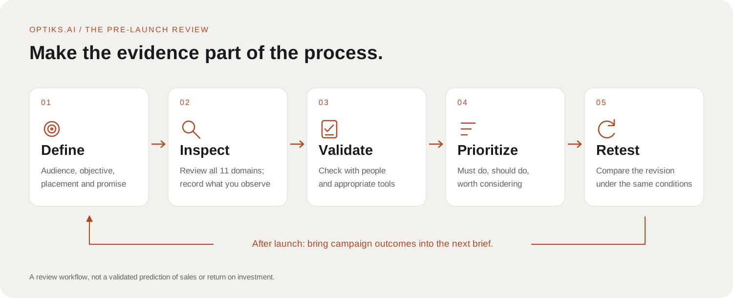
The domains organize the assessment. Audience evidence, technical checks and campaign results help establish whether its conclusions hold.
First, review without the presentation
Show the creative before discussing the thinking behind it. Ask open questions: “What is being advertised?”, “Who is it from?”, “What is the main offer?” and, where relevant, “What would you do next?”
A brief exposure, such as five seconds, can reveal obvious communication problems. It is an informal diagnostic, not a universal attention benchmark. Choose conditions that reflect the placement and follow up with enough viewing time to distinguish initial recognition from fuller comprehension.
Record answers before offering explanations. A handful of informal responses can expose a problem; it cannot estimate how common that problem is across the market.
Then, separate observations from interpretations
“The descriptor occupies a small area and sits over a pale background” is an observation. “People may miss the category” is an interpretation. “Test a larger descriptor on a solid background” is a recommendation.
Keeping these separate makes feedback easier to discuss and act on. It also makes uncertainty visible. If the recommendation rests on a hypothesis, say what would help confirm it.
Use this format:
| Observation | Domain | Potential consequence | Proposed change | Verification |
|---|---|---|---|---|
| Two headlines have equal prominence | Hierarchy / Message | The main offer may be unclear | Establish one lead headline | Ask viewers to describe the offer |
| Descriptor sits over pale steam | Readability | Category information may be missed | Strengthen contrast on a stable background | Measure contrast and check on a phone |
| Small, unfamiliar brand name | Brand | Product interest may not be attributed | Give the wordmark clearer presence | Ask who the ad is from |
| Quiz CTA opens a general catalog | Persuasion / Context fit | The destination breaks the expected journey | Link to the relevant experience | Follow the complete route on-device |
Prioritize by consequence
Use three practical categories:
- Must do: Resolve an issue that prevents correct understanding, breaks the intended journey or fails a mandatory check.
- Should do: Address an important weakness in communication, recognition or response.
- Worth considering: Explore a plausible improvement whose value still needs testing.
Mandatory checks sit alongside the 11-domain review. Incorrect offer details, missing required information or an unapproved claim do not become acceptable because the composition is strong. Assign the appropriate internal owner to verify claims, rights, specifications and applicable requirements before release.
A useful action has an owner and an acceptance criterion. “Improve readability” is vague. “Place the descriptor on a stable background, verify the applicable contrast threshold and review the export at its intended display size” is actionable.
Worked example: Ridgeline before and after the review
The original concept is an attractive, plausible coffee ad: a mountain setting, a recognizable pack and the line “A brighter cup. A better morning.” Its weakness depends on the brief. If the task is to introduce a weekly coffee subscription, the scenic setting and mood-led headline do more work than the delivery proposition. The smaller subhead explains the service, while “Explore the collection” gives little indication of the next step.

An appealing brand story, but the weekly delivery offer is secondary and the invitation is broad.
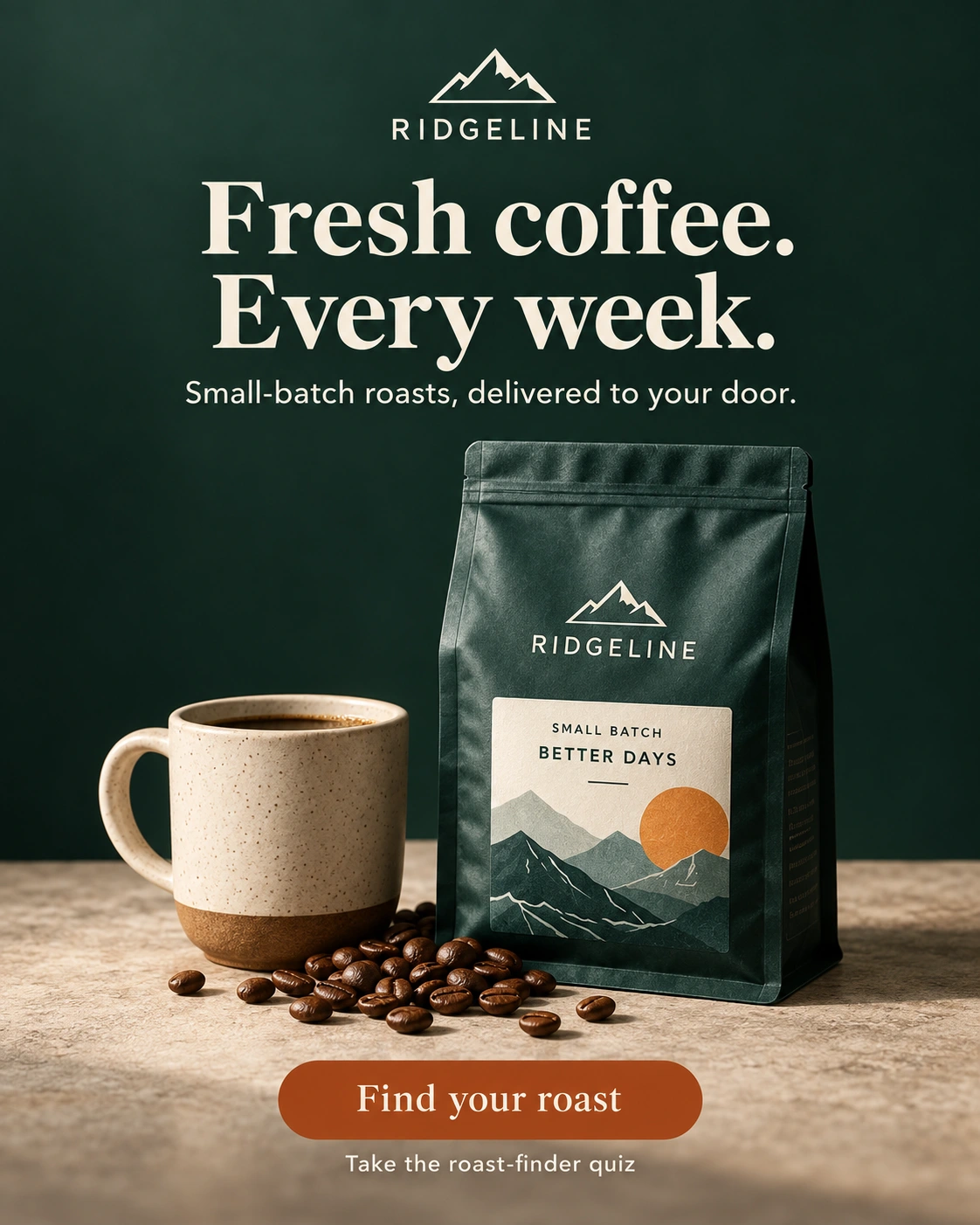
A direct weekly delivery promise, a quieter background and a specific invitation to find a roast.
The proposed revision makes four changes:
- Brings the delivery frequency into the headline: “Fresh coffee. Every week.” Two deliberate lines make the proposition easier to scan.
- Uses “Small-batch roasts, delivered to your door” to connect the product claim with the service, rather than leaving delivery as a minor detail.
- Replaces the scenic background with a plain deep green and gives the pack more presence. The same mountain logo and packaging keep the brand recognizable.
- Changes “Explore the collection” to “Find your roast”, with “Take the roast-finder quiz” explaining the destination. The compact CTA has a clear place in the layout.
The original may suit an awareness brief better than a subscription acquisition brief. The revision makes the offer and next step more explicit; it does not establish a higher conversion rate.
Compare both versions under the same conditions. Ask whether people identify the brand, understand the delivery proposition and know what the invitation leads to. If the revision improves one measure but weakens another, review that trade-off before declaring it better.
How should you score advertising creative?
Scores help organize a review when their meaning is clear. For a manual checklist, use clear, needs work and not yet verified for each domain, supported by observations. This simple worksheet status is separate from Optiks.ai's Effectiveness Score.
If you use a numerical system, document the criteria, weights, scale and assessment conditions. Compare revisions using the same brief and method. Keep unresolved critical issues visible rather than hiding them in an average.
An overall creative score is an assessment output. It is not a percentage probability of success, a forecast of ROI or a claim that an ad will outperform a given share of competitors. A benchmark needs an identified comparison set and a clear explanation of what is being compared.
Where AI creative analysis helps, and where it needs support
AI can help apply a consistent review structure, identify possible weaknesses and turn findings into an initial revision list. Optiks.ai organizes this work across the 11 domains, alongside the audience, objective, environment and brand information supplied for the review.
Check consequential recommendations against the actual brief and artwork. Ask which observable feature supports each finding. Use technical tools for measurable properties and audience research for questions about people's understanding or response.
Research-informed analysis should also be distinguished from direct measurement. An AI description of likely attention or emotion is not itself an eye-tracking study, biometric test or measurement of this audience's feelings.
After launch, record the version that ran, objectives, audience, placement, spend and outcomes. Distinguish observed performance from causal impact. Gordon and colleagues' comparison of advertising measurement methods found that observational estimates often differed from randomized experiments. That is a reason to treat attribution and causal claims carefully, even when considerable data is available. Gordon et al., 2019
Frequently asked questions
What should be checked before an advertising campaign launches?
Check that the audience, objective and placement are defined; that the creative communicates clearly across the 11 domains; and that the claims, brand requirements, technical specifications and destination have been verified. Record unresolved issues and assign owners before approval.
What is the difference between creative evaluation and creative testing?
Creative evaluation is the broader assessment process. Creative testing collects evidence under specified conditions, often from an audience or experiment. An expert or AI review can identify a hypothesis; testing helps establish whether it holds for the intended audience.
Can a five-second test tell me whether an ad will work?
It can reveal problems with immediate recognition or understanding. It cannot establish sales impact, long-term memory or effectiveness across an entire audience. Treat it as one diagnostic within a broader review.
Should every advertisement have a large call to action?
No. The appropriate prominence depends on the objective and placement. A response ad needs a clear next step; an awareness execution may place more emphasis on brand identification and the intended association. Review the action in context.
Can an AI Effectiveness Score predict campaign ROI?
A score alone does not establish ROI. Predictive claims require validation against relevant outcomes under defined conditions. Distribution, audience selection, price, availability and the wider customer experience also influence results.
Make the next revision specific
A productive review ends with decisions: what to preserve, what to change, who owns the change and how it will be checked. Keep the brief and assessment conditions consistent so the team can see whether the revision resolves the original issue.
Use the checklist on the final exported assets, not only the presentation version. The goal is creative that communicates when the explanation is no longer in the room.
Review your creative with Optiks.ai to organize an assessment across the 11 domains and develop practical next steps for your team or agency.
Research and references
This article combines selected published research with an applied review framework. It is not a systematic literature review or a report of a new experiment. Foundational studies are identified by date and their limits are stated where used; the fictional examples illustrate the method.
- Pieters, R., & Wedel, M. (2004). Attention Capture and Transfer in Advertising: Brand, Pictorial, and Text-Size Effects. Journal of Marketing, 68(2), 36–50. Full paper.
- Pieters, R., Wedel, M., & Batra, R. (2010). The Stopping Power of Advertising: Measures and Effects of Visual Complexity. Journal of Marketing, 74(5), 48–60. Publisher abstract.
- Cowan, N. (2010). The Magical Mystery Four: How Is Working Memory Capacity Limited, and Why? Current Directions in Psychological Science, 19(1), 51–57. PubMed record and abstract.
- Elder, R. S., & Krishna, A. (2012). The “Visual Depiction Effect” in Advertising: Facilitating Embodied Mental Simulation through Product Orientation. Journal of Consumer Research, 38(6), 988–1003. DOI.
- W3C. Understanding Success Criterion 1.4.3: Contrast (Minimum). Guidance and definitions.
- Gordon, B. R., Zettelmeyer, F., Bhargava, N., & Chapsky, D. (2019). A Comparison of Approaches to Advertising Measurement: Evidence from Big Field Experiments at Facebook. Marketing Science, 38(2), 193–225. Publisher abstract.