Foodservice path to purchase: what your promotion should say at every stage
A foodservice promotion should change its message as the customer moves closer to ordering. Outside, earn attention with a short headline and recognizable food. On the approach, explain the proposition. At the menu board, make the item, price, inclusions and choices easy to understand. At the counter, help complete the decision. After purchase, use the table tent to introduce a reason to return. Keep the campaign recognizable throughout, but give each placement a different job.
A restaurant campaign often begins with one approved poster. Then the poster is resized for a window, a drive-thru board, a counter card, a menu screen and a table tent.
The brand looks consistent. The customer journey does not necessarily work.
Someone passing the restaurant needs a reason to notice it. Someone at the menu board needs to decide what to order. Someone eating at a table has probably already made that decision. Giving all three people the same message wastes the differences between those moments.
This guide sets out a practical messaging sequence for a promotion across the restaurant. It includes example copy for each placement, a planning matrix and checks to make before the campaign goes live.
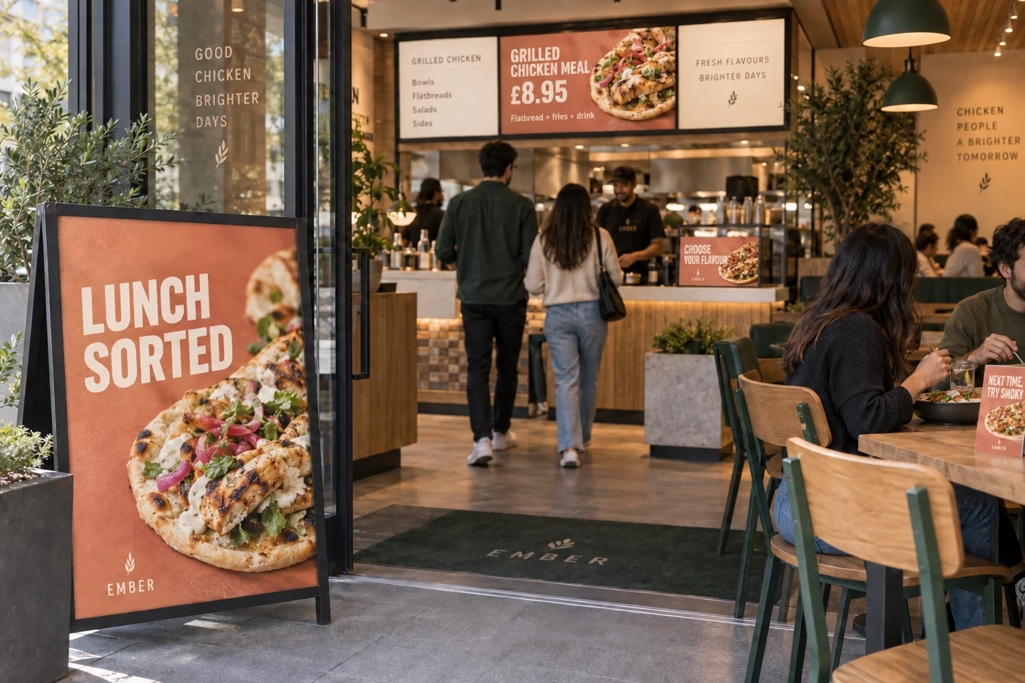
One campaign can do several jobs. The message should change with the customer’s task and opportunity to read.
What is the foodservice path to purchase?
The foodservice path to purchase is the sequence of encounters and decisions that takes someone from noticing a restaurant or offer to choosing, ordering and receiving it. The experience after purchase can also influence the next visit.
It is not always a straight line. A drive-thru customer follows a different route from a dine-in customer. A regular may arrive knowing the order. An app customer may have paid before entering. A delivery customer may never see the building.
Plan the route that the promotion must serve, then ask at every point: What does this customer need to understand or do now?
For an on-site campaign, a useful starting structure is:
- Notice: a distant sign, roadside panel or exterior window.
- Understand: the entrance, queue or drive-thru approach.
- Choose: the menu board, kiosk or ordering screen.
- Complete: the counter, order confirmation or handover.
- Learn for next time: a table tent, tray liner or relevant post-purchase message.
Treat these as communication jobs, rather than a requirement to install five signs. Fewer, well-placed messages may do the job better than a restaurant full of competing material.
Start with one offer and a stable name
Before writing the campaign, settle the product name, offer, price, inclusions, available choices and any conditions. The name on the poster should be recognizable on the menu and usable when speaking to the team.
For the examples in this article, imagine Ember, a fictional grilled-chicken restaurant, promoting its Grilled Chicken Meal:
- A grilled-chicken flatbread, fries and a regular drink.
- A choice of Lemon & Herb or Smoky Chili flavor.
- An illustrative price of £8.95, with the same price in both ordering channels.
These are invented campaign details for explaining the method, not a live offer or a pricing recommendation. Assume the photography accurately represents the standard meal. Production artwork would also need the operator’s verified product information and applicable disclosures.
The central proposition stays the same across every asset. What changes is how much of it the customer needs at that moment.
Outside the restaurant: earn a glance with three words or fewer
Job: attract attention and make the food category recognizable.
For a distant exterior headline, set a working maximum of three words. That is a useful discipline for this kind of placement, not a universal scientific limit on reading. The point is to force a clear priority when viewers are moving and competing signs, vehicles, people and wayfinding already occupy their attention.
For Ember, the headline could be:
LUNCH SORTED
Two words establish the occasion and promise. A strong image of the flatbread, fries and drink does the product explanation; the Ember identity tells people where to get it.
Alternative headlines might be “BIG LUNCH ENERGY” or “FIRE UP LUNCH.” They should not all appear together. Choose one that fits the brand, the food and the offer.
At this distance, do not ask the headline to carry the ingredients, flavor choices, subscription language, loyalty scheme and ordering instructions. A clever line that needs a second sentence to explain the category has probably taken the wrong job.
If price is the central attraction, give it a clear role alongside the food and short headline. Ensure the offer can be presented accurately, including any qualifications that must accompany it. A three-word headline is a copy constraint, not permission to hide material terms.
OAAA’s creative guidance is a useful industry reference for out-of-home design. The three-word limit here is a deliberately stricter recommendation for a distant restaurant promotion, which still needs checking in its actual location. Source: OAAA, creative best-practice resources.
Check it from where the customer will actually see it
Stand at the likely approach point. View the installation at the relevant angle, not only straight on. Check whether the food reads as food, the brand remains identifiable and the headline survives reflections, clutter and partial obstruction.
Do the exercise during a normal service period as well as when the site is quiet. The question is not whether someone can read every word if asked to stop. It is whether the intended first message is available in a passing glance.
Entrance and approach: turn appetite into an understandable offer
Job: explain what the attractive thing actually is.
As people get closer, the campaign can become more specific:
YOUR GRILLED CHICKEN MEAL
Flatbread, fries and a regular drink.
£8.95
The image and campaign colors connect this message to the exterior. The copy supplies the information that the distant headline left out.
This is a good place to make a bundle understandable. Show the actual included items together. Avoid a beautiful product photograph that leaves people guessing whether the drink is part of the price or a serving suggestion.
The entrance panel should not depend on the customer remembering the outside line. Some people enter from a different direction. Others walk in while talking and miss the window entirely. Each asset must work on its own, even when the sequence makes it stronger.
Drive-thru: separate the approach from the ordering point
A drive-thru is its own purchase route. Customers do not necessarily see the entrance poster or counter card, and they are managing a vehicle as well as an order. Design for the actual sightlines and stopping points.
The approach or pre-sell board
Job: put one relevant option into consideration before the customer has to speak.
For Ember:
LUNCH SORTED
Grilled Chicken Meal
Flatbread + fries + regular drink · £8.95
Use the established product image and name. If the board is only visible briefly, simplify further. Do not assume that a slowly moving queue guarantees a long, uninterrupted read: the vehicle ahead, passengers and lane instructions all compete for attention.
Avoid making a QR scan part of the moving approach. If a digital interaction is useful, place it where a customer can engage while safely stationary, and ensure it does not obstruct ordering.
The drive-thru menu board and speaker point
Job: let the customer choose and order without reconstructing the offer.
At the ordering point, show the complete decision information again. The customer should not have to recall a price from a board that is now behind the car.
GRILLED CHICKEN MEAL: £8.95
Grilled-chicken flatbread, fries and a regular drink.
Choose your flavor: Lemon & Herb or Smoky Chili.
Order the Grilled Chicken Meal.
The staff prompt should use the same terms: “Lemon & Herb or Smoky Chili?” Introducing a third name at the speaker turns a resolved visual choice into a verbal puzzle.
Check the full journey from a realistic driver’s position. A board can be excellent at pedestrian eye level and poorly placed for someone seated in a car.
The menu board: make the decision easy
Job: answer the questions that determine the order.
The menu board is usually the decision moment for customers who have not already ordered. Its priority is not to repeat the campaign’s most evocative line at the largest size. Its priority is to turn interest into a usable choice.
For the promoted item, the customer should be able to establish:
- What is it called?
- What is included?
- What does it cost?
- Which choices must I make?
- How do I select or ask for it?
Group those answers together. Do not place the product photograph on one screen, its bundle description on another and its price in an unrelated strip.
For Ember, “Grilled Chicken Meal” should sit with the image, £8.95, the three inclusions and the two flavor options. “Lunch sorted” can remain a supporting campaign cue, but it should not displace the ordering information.
Separate required choices from optional additions
A flavor selection is a required choice in this example. A dessert is an optional addition. Giving both equal weight makes the order seem more complicated than it is.
Use a clear sequence: choose the meal, choose the flavor, then consider an optional extra if appropriate. If an upgrade costs more, state the added price clearly and ensure the standard offer remains understandable without it.
Keep essential information available
For digital menus, check the rotation. If the price disappears while someone searches for the inclusions, the screen is making them wait or remember. Keep the information needed to order together and available during the decision.
The broader principle of recognition rather than recall is established in interface design: visible options reduce the need to remember information from elsewhere. Applying that principle to menu organization is a design recommendation, not a claim that one particular layout has been experimentally validated for Ember. Source: Nielsen Norman Group, “Recognition and Recall.”
Counter cards: clarify or complete the choice
Job: support the decision available at that specific counter position.
A counter card before payment can resolve a final question. One positioned beside collection may arrive too late to change the current order. Inspect where people actually stand before choosing its message.
For a card visible while ordering:
WHICH FLAVOR?
Lemon & Herb: bright and zesty.
Smoky Chili: smoky with a chili kick.
Choose yours with the Grilled Chicken Meal.
This adds useful information rather than repeating a miniature version of the exterior poster. The flavor descriptions must reflect the actual product; do not imply a heat level or ingredient the operator cannot support.
If the card’s role is to promote the whole meal to people who bypassed other assets, use the meal name, inclusions and price instead. A compact footprint is not a reason to omit the facts needed to understand an offer.
An add-on card can work where another purchase is genuinely available, but it needs a clear incremental proposition: the product, the added cost and the action. Do not let multiple cards compete with the payment terminal, collection instructions and main menu.
Table tents: educate for the next visit
Job: give someone who has already bought a useful reason to consider another visit.
In a counter-service restaurant, a seated customer usually encounters the table tent after ordering. “Buy this meal now” can therefore be badly timed. The richer opportunity is to explain something they did not choose or did not yet know.
For Ember:
NEXT TIME, TRY SMOKY.
Smoky Chili brings a different flavor to our Grilled Chicken Meal. Prefer something brighter? Choose Lemon & Herb.
Explore both flavors for your next visit.
A small image can distinguish the flavors. If a QR code is included, label its destination, “See the flavors,” and send it to that content, not an unexplained general homepage. Provide a readable alternative where practical.
The table tent has more room for explanation than the exterior sign, but it still has to earn attention. People may be eating, talking or looking after children. Put the reason to read first, then supply a short, useful explanation.
There are exceptions to the post-purchase role
A table-service restaurant may use a table tent before ordering. In a counter-service venue, dessert or a second drink may still be relevant after the meal. Match the message to the actual service model and opportunity.
For a promotion intended to build the next visit, measure interest in the next visit. Immediate sales of the advertised meal would be a poor sole measure if most viewers had already paid before seeing the message.
The complete messaging plan, side by side
| Placement | Customer’s question | Main job | Example message |
|---|---|---|---|
| Distant exterior | Is there something here for me? | Attract attention. | LUNCH SORTED with one appetizing meal image and clear brand. |
| Entrance / close approach | What is the offer? | Explain the meal. | Your Grilled Chicken Meal. Flatbread, fries and regular drink. £8.95. |
| Drive-thru pre-sell | Should I consider this? | Introduce one option before ordering. | Lunch sorted. Grilled Chicken Meal, inclusions and £8.95. |
| Menu board / ordering screen | What do I choose, and what will I pay? | Resolve the order. | Grilled Chicken Meal: £8.95. Inclusions, flavor choices and ordering name together. |
| Counter card before payment | Which option suits me? | Clarify a remaining choice. | Which flavor? Brief descriptions of Lemon & Herb and Smoky Chili. |
| Table tent after purchase | What could I try next time? | Build product knowledge and return interest. | Next time, try smoky. Explain the alternative and where to learn more. |
Example copy is illustrative. Check prices, claims, availability and required information before producing a real campaign.
Consistency means recognition, not identical copy
Keep the product name, brand identity, photography style and offer mechanics consistent. Change the message hierarchy to suit the placement.
The exterior should not introduce “The Fire Feast” if the menu calls it “Grilled Chicken Meal” and the team knows it as “Combo 4.” Customers should be able to point, name and recognize the same thing throughout the journey.
The same principle applies to images. A hero photograph showing a larger portion, different drink or optional side can create an expectation the menu or serving cannot fulfil. Attractive food photography should clarify what is being sold.
Maintain a simple campaign sheet with one approved product name, one verified offer description, the price for each channel and the claims that can be used. Give both the design team and restaurant staff access to it.
Audit the journey before launch
Walk the dine-in route and assess the drive-thru separately. Start outside the site rather than beside the finished sign. Use these checks:
- First glance: can you identify the food, brand and main invitation from the relevant approach?
- Visibility: are messages obscured by parked vehicles, queueing customers, doors or temporary notices?
- Legibility: do reflections, low light, viewing angle or screen brightness change what can be read?
- Offer clarity: can someone state the item, price and inclusions at the ordering point without help?
- Naming: do the artwork, menu, till and staff use compatible names?
- Timing: does each message arrive before the decision it is meant to influence?
- Destination: do a QR code, menu button or staff invitation lead to the promised next step?
- Accuracy: do photography, claims and price match what the customer receives?
Mandatory information is part of the design brief. For example, the US FDA’s menu-labeling requirements cover certain restaurant chains and include relevant menu boards; requirements depend on the operator and jurisdiction. Confirm what applies before layout approval rather than trying to squeeze it in afterwards. Source: FDA, Menu and Vending Machine Labeling.
Measure each placement against its job
An exterior sign can be checked for noticeability and offer recognition. A menu board can be tested for item identification, price comprehension and ordering errors. A table tent might be evaluated for understanding of another flavor, visits to the linked content or a suitable measure of return interest.
Do not assume every touchpoint deserves the same metric. Nor does an increase in meal sales prove that one counter card caused it: price, availability, staff recommendations, media and trading conditions may also have changed.
Where practical, compare changes under similar conditions and use an appropriate controlled test for causal questions. Record the version, location, daypart and other changes so the result has context.
AI creative analysis can help review individual assets for hierarchy, readability, message and context fit. It should be supported by checking the installed environment and, where needed, research with customers. See AI Creative Analysis vs. Consumer Testing for how those methods differ.
Frequently asked questions
How many words should an exterior restaurant headline contain?
For the distant promotional headline discussed here, use a maximum of three words as a working design constraint. The food image and brand should do much of the communication. This is not a universal word limit for all signage, and it does not override the need to present an offer accurately.
Should the same promotion appear everywhere in the restaurant?
It can, if each appearance adds value at that point in the journey. Keep recognition cues consistent, but change the message from attention to explanation, choice and post-purchase learning. Repeating the same full poster everywhere is not a messaging strategy.
What is the most important information on the menu board?
For a promoted meal, make the product name, price, inclusions and required choices easy to find together. Ensure the customer can identify how to order it and see applicable information without remembering an earlier sign.
What should a table tent say after the customer has ordered?
Give it a post-purchase job: explain another product or flavor, introduce an occasion for the next visit, or support a genuinely available additional order. In counter service, next-visit education is often more appropriate than repeating the meal the customer has already passed up.
Give the campaign a sequence
Outside, make the food worth noticing. On the approach, make the offer understandable. At the menu, make the order clear. At the counter, resolve what is left. At the table, give the next visit a reason to happen.
The campaign can feel like one idea without asking every surface to say the same thing.
Sources and practical scope
This article is a practitioner framework with an illustrative campaign, not a measured study of Ember or a promise of sales uplift. The placement recommendations should be checked against the restaurant’s service model, customer routes and operating conditions.
- OAAA: Business Guidelines and OOH Creative Best Practices. Industry resources for outdoor creative; not a source for a universal three-word rule.
- Nielsen Norman Group: Recognition and Recall. Interface-design guidance used here as a stated analogy for keeping ordering information visible.
- FDA: Menu and Vending Machine Labeling. A US example of requirements that must inform menu production; check applicable local rules.