Billboard design best practices: readability, viewing distance and message length
A billboard works under constraints that are easy to hide on a laptop: distance makes type appear smaller, movement shortens the encounter, the street competes for attention and the viewer may be doing something else. Effective OOH design begins with the real viewing condition, then gives the audience the fewest necessary elements to recognize the advertiser and understand one useful message.
The familiar advice to use big type and short copy is directionally useful, but it is incomplete. A six-word headline can still fail when the type is too narrow, the contrast changes across a photograph or the brand is disconnected from the message. A longer message can sometimes work at a pedestrian shelter where people wait nearby. The design decision depends on the placement.
This guide turns readability, distance, hierarchy and message length into a practical review. It also distinguishes industry rules of thumb from research findings so that a convenient guideline does not become a false universal law.
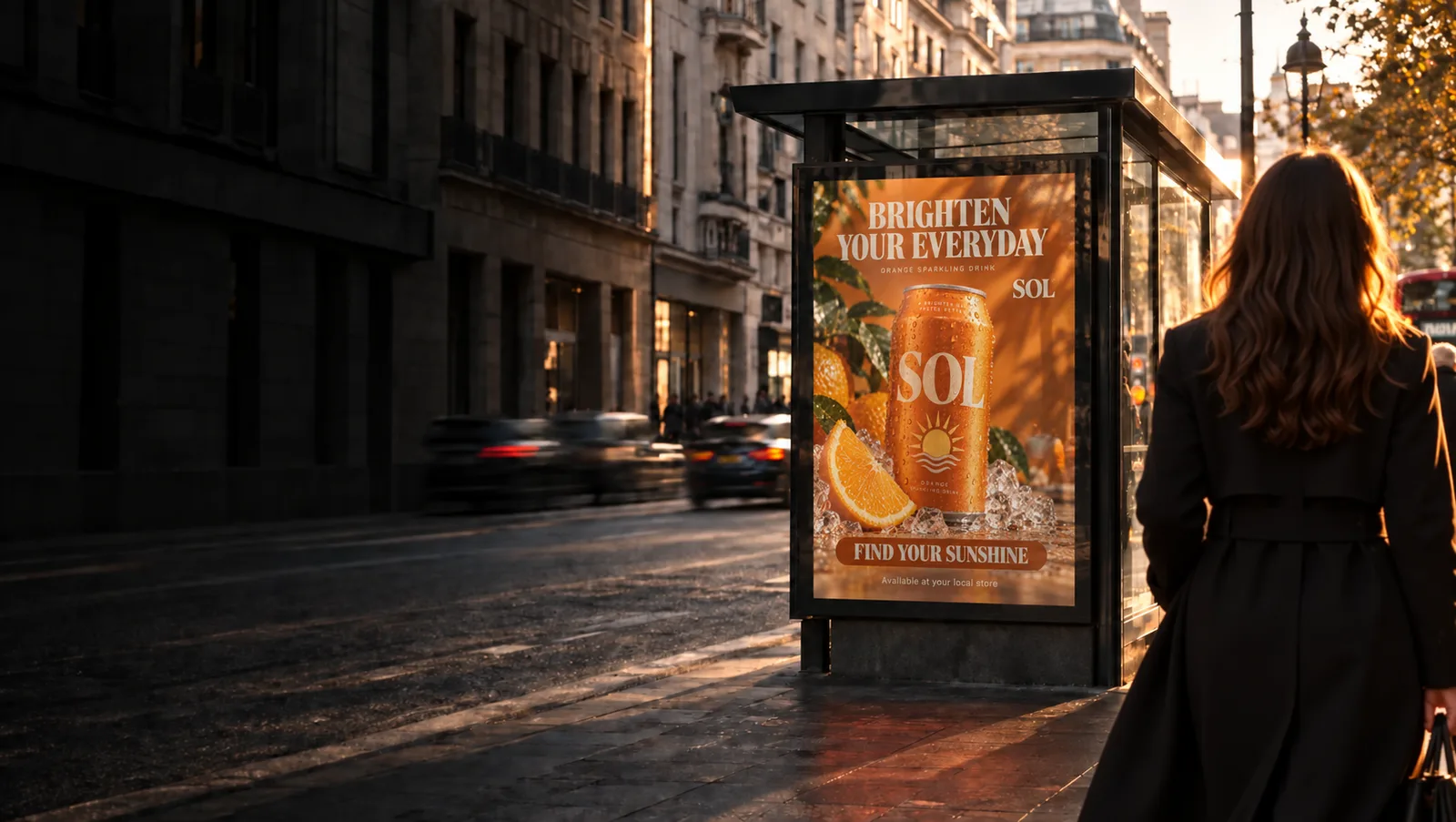
Start with the placement, not the finished artwork
“Outdoor” is not one viewing condition. A highway spectacular, roadside poster, transit shelter, mall screen and store entrance display create different distances, speeds, sightlines and opportunities to pause. The media plan should therefore become part of the creative brief.
Record the unit dimensions, likely viewing distance, approach direction, audience speed, obstructions, illumination, competing signs and expected time in view. For a rotating digital screen, add spot duration, loop length and whether the message must work from a single frame. These facts define the communication problem.
A useful design specification names the required takeaway. For example: “A driver approaching from the left should connect the folded lamp shape with the Fold brand,” or “A pedestrian waiting nearby should understand the two-for-one offer and the end date.” This is more actionable than asking the creative to be “impactful.”
Context also changes what earns attention. People navigating traffic, searching for a platform or comparing products allocate attention differently. The behavioral science of context fit helps explain why the same execution can work in one environment and disappear in another.
Design for viewing distance and visual angle
A letter has a physical height on the billboard and an apparent size at the viewer’s eye. As distance increases, its visual angle decreases. That relationship is why a headline that fills a laptop screen can become unreadable on the installed unit.
Research on reading shows that angular print size affects reading performance. Legge and Bigelow describe a broad “fluent range” for reading continuous text, approximately 0.2 to 2 degrees of x-height under the conditions reviewed. That is not a billboard formula, but it establishes the underlying point: distance and apparent size belong in the same specification. Legge and Bigelow, 2011.
OAAA’s Creative Best Practices provides approximate letter-height ranges by viewing distance. Its guide moves from 1–2 inch letters at 5–50 feet to 24–40 inch letters beyond 600 feet. Treat these as planning guidance from an industry body, then check the actual typeface, weight, spacing, contrast, mounting height and approach angle.
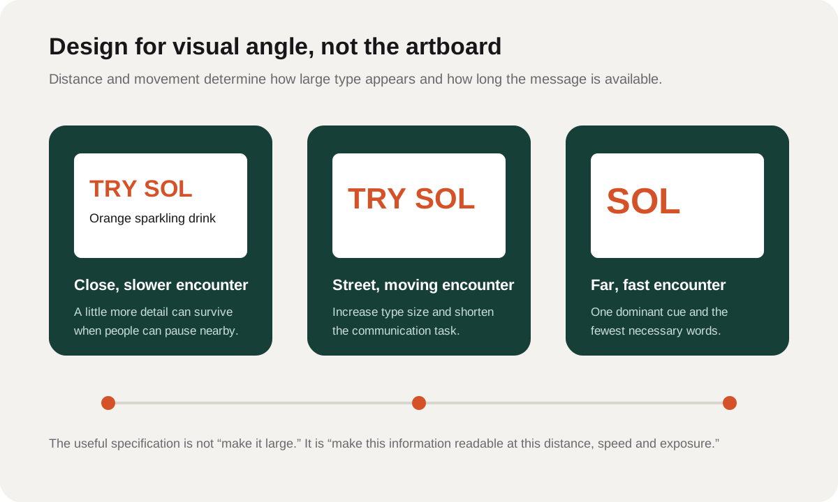
Viewing distance is rarely one fixed number. People approach, pass and leave. Identify a primary recognition zone: the part of the approach where the asset is visible, large enough and present long enough to do its intended job. Then test the creative at the beginning, middle and end of that zone.
Choose type that survives the encounter
Typeface categories are less informative than the properties of the actual font. Open counters, clear distinctions between similar letters, adequate stroke width and stable spacing help characters survive distance and imperfect conditions. Extremely condensed, very light and elaborate script faces have less reserve when the message becomes small.
Research does not support a simple claim that sans serif type is always superior. A laboratory study by Arditi and Cho found no meaningful reading-speed advantage from serifs and only a small threshold effect that may relate to spacing. Arditi and Cho, 2005. For OOH, select a specific face for its construction and brand role, then test it at the intended scale.
Case also needs context. OAAA’s Planning for OOH Media guidance recommends large legible fonts, adequate spacing and mixed case for easier reading. All caps can still work for a short wordmark or compact headline, but long uppercase lines reduce distinctive word shapes and can feel crowded.
Review these details together:
- Letter height: sized for the recognition zone, not the artboard.
- Width and weight: substantial enough to survive distance without closing counters.
- Tracking and word spacing: enough separation to preserve word boundaries without fragmenting the line.
- Line count: preferably one compact unit for a fast encounter; more only where dwell supports it.
- Line length: short enough to take in without repeated search.
- Background stability: the whole word needs reliable contrast, not only the first letter.
For a deeper review of visual angle, contrast and type construction, see readability in advertising.
Use message length as a constraint, not a superstition
“Seven words or fewer” is a common OOH industry benchmark, and OAAA includes it in its creative guidance. It is a useful prompt to simplify, but it is not a cognitive law. The practical limit depends on word familiarity, syntax, type size, exposure, movement and the amount of other information competing for the same encounter.
Count communication tasks before counting words. “New,” “20% off,” “this weekend,” a product variant, a web address and a legal qualifier may form six separate jobs even when the headline itself is short. The viewer still has to find, connect and interpret them.
Start by writing the single sentence the audience should be able to recover after the encounter. Remove anything that does not help that takeaway or correct brand attribution. If a second message remains essential, decide whether it is support, qualification or action, then place it accordingly.
A short message can still create high cognitive load when it uses unfamiliar abbreviations, split phrases, ambiguous pricing or several competing focal points. Conversely, a pedestrian panel may support a clear secondary line when the audience has time to wait and inspect. Fit the copy to the task.
Build a billboard hierarchy that can be recovered quickly
Visual hierarchy is the order in which information becomes available. On a billboard, the useful hierarchy usually supports three questions: What is this? What does it mean for me? Who is responsible or what should I do?
Not every campaign needs a visible call to action. A brand-building execution may need a distinctive product, one promise and strong attribution. A directional poster may need destination and arrow before everything else. The hierarchy should follow the objective rather than a fixed template.
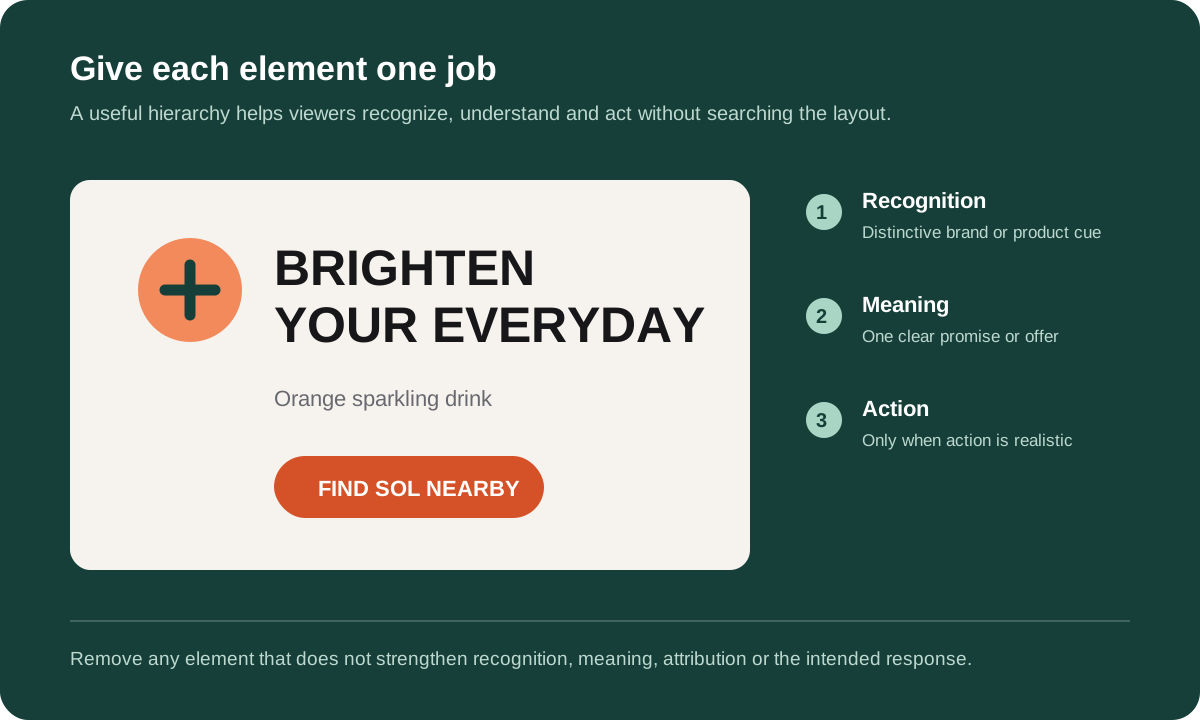
Size is only one hierarchy signal. Position, contrast, grouping, whitespace and alignment also determine what viewers find first and which elements they connect. The science of visual hierarchy explains how prominence and grouping work with viewer goals.
Check the connections between elements. A striking product image can earn attention while leaving the brand weakly attributed. A large price can dominate while the qualifying offer becomes unreadable. A call to action can be prominent but detached from the value proposition. Hierarchy must support meaning, not merely eye movement.
Protect contrast, image clarity and negative space
Billboard contrast is local. White type can be clear over a dark building and disappear over a bright sky within the same photograph. Inspect every part of every important word against the final image, including the parts most likely to be affected by reflections, sunlight, screen brightness or print variation.
Use simple backgrounds where copy must work. OAAA recommends bold, clear imagery and warns that too many elements compete for attention. This is industry guidance rather than a promise that minimalism always wins. The relevant test is whether the intended audience can extract the target information under realistic exposure.
Negative space gives the main elements a stable region and helps grouping. It should not be treated as empty real estate waiting to be filled. A cleaner composition can improve the separation of brand, message and action, but it still needs enough distinctive information to be recognized.
Image choice should also respect the viewing distance. Small product details, subtle facial expressions and fine textures may disappear even when the image remains technically visible. Review the composition and color system at placement scale.
Make the advertiser retrievable
A memorable scene does not automatically create brand memory. The viewer must connect the distinctive image, message or offer with the advertiser. Place the brand close enough to the relevant cue that the relationship can be recovered during the encounter.
Branding does not always require making a logo the largest element. A distinctive product shape, character, color combination, type treatment or verbal device can support recognition when the audience has learned it. New or weakly known brands usually need more explicit attribution than established brands.
Ask two separate questions in testing: “What was advertised?” and “Which brand was it for?” Correct category or offer recall with poor brand attribution is a communication loss. The behavioral science of brand cues explains how distinctive assets and memory structures support retrieval.
Adapt the rules for digital out-of-home
DOOH adds time and motion to the layout. A spot may be visible for several seconds within a longer loop, and viewers may arrive after it begins. The message should remain interpretable without requiring everyone to watch from the first frame.
Use motion to clarify a sequence or direct attention, not to make every element move. A driving-simulator study found that animated digital billboards drew attention away from the road and worsened driving performance relative to static designs under the conditions tested. Brome and colleagues, 2021. That finding does not establish one rule for every pedestrian or retail screen, but it supports caution near traffic.
For roadside DOOH, keep essential brand and message information available long enough to survive a partial encounter. Avoid placing a vital qualifier only in the final frame. Check transition frames as carefully as the key visual because they are part of the delivered creative.
A naturalistic driving study found that drivers looked at only a minority of roadside signs and that sign properties, including text count, influenced attention; the median fixation duration reported for attended signs was 297 milliseconds. Costa and colleagues, 2019. Treat the number as a result from that study, not a universal exposure time. Its practical lesson is that a sign may receive a brief glance rather than a complete reading.
A pre-launch billboard design checklist
- State the communication job. Write what the audience should recognize, understand or do.
- Document the placement. Include size, distance, speed, sightline, illumination, dwell and nearby competition.
- Identify the recognition zone. Test at the start, middle and end of the useful approach.
- Reduce the message. Remove words and elements that do not support the primary takeaway or attribution.
- Check type at scale. Review letter construction, height, weight, spacing and line length.
- Inspect local contrast. Test the whole word against the final background under plausible lighting.
- Verify hierarchy. Ensure prominence and grouping support the intended order.
- Test brand attribution. Confirm that viewers connect the communication to the advertiser.
- Review context and safety. Consider the viewer’s task and avoid distracting roadside motion.
- Measure the final export. Test the delivered file, screen sequence or printed proof rather than an editable master.
Optiks.ai’s AI creative analysis reviews OOH creative across eleven connected domains and includes viewing-distance analysis. It is a structured pre-launch diagnosis, not a replacement for audience research or in-market measurement. See a sample creative analysis report before deciding whether it fits the decision.
Frequently asked questions
How many words should a billboard contain?
There is no universal limit. Seven words or fewer is a common OOH heuristic, but the right limit depends on distance, speed, exposure, familiarity and type size. Count the total communication tasks and test the final asset in context.
How large should billboard text be?
Specify type from intended viewing distance and visual angle. OAAA publishes approximate letter-height ranges by distance, but typeface, weight, spacing, contrast and approach angle also affect the result. Use the guidance to begin a test, not to replace one.
Are sans serif fonts always best for billboards?
No. Clear letter construction, adequate stroke width, spacing and familiarity matter more than the category label alone. Test the specific typeface at the intended distance.
Should every billboard have a call to action?
No. A call to action should follow the objective and the behavior realistically available in the encounter. Brand-building creative may need recognition and attribution more than an instruction. A directional or promotional unit may need a clear action.
How should billboard creative be tested?
Recreate the viewing distance, size, approach, time and environmental competition. Measure whether people notice the relevant information, understand the message and attribute it to the correct brand. Use audience testing when the decision warrants it, then connect the result to in-market outcomes.
Research and references
This article combines peer-reviewed research with OOH industry guidance. The fictional SOL campaign and design diagrams are editorial illustrations, not reported experiments. Industry heuristics are labeled as guidance and should be tested for the placement.
- Outdoor Advertising Association of America. Creative Best Practices. Industry guidance on message length, type size and design simplicity.
- Outdoor Advertising Association of America. Planning for OOH Media. Industry guidance on typography, spacing and image clarity.
- Legge, G. E., & Bigelow, C. A. (2011). Does print size matter for reading? A review of findings from vision science and typography. Journal of Vision, 11(5), 8. DOI: 10.1167/11.5.8.
- Kong, Y.-K., Lee, I., Jung, M.-C., & Song, Y.-W. (2011). The effects of age, viewing distance, display type, font type, colour contrast and number of syllables on the legibility of Korean characters. Ergonomics, 54(5), 453–465. DOI: 10.1080/00140139.2011.568635. The study used Korean characters; it is cited for the effects of distance, age and font, not as a universal billboard specification.
- Arditi, A., & Cho, J. (2005). Serifs and font legibility. Vision Research, 45(23), 2926–2933. DOI: 10.1016/j.visres.2005.06.013.
- Brome, H., et al. (2021). Roadside digital billboard advertisements: effects of static, transitioning, and animated designs on drivers’ performance and attention. Transportation Research Part F: Traffic Psychology and Behaviour, 83, 226–237. DOI: 10.1016/j.trf.2021.10.013.
- Costa, M., Bonetti, L., Vignali, V., Bichicchi, A., Lantieri, C., & Simone, A. (2019). Driver's visual attention to different categories of roadside advertising signs. Applied Ergonomics, 78, 127–136. DOI: 10.1016/j.apergo.2019.03.001.
Design the billboard for the encounter it will actually have: one audience, one placement, one communication job and a realistic opportunity to process it.