Creative Effectiveness Audit
Inside Leroy Merlin: a nine-touchpoint creative effectiveness audit
A field audit of nine advertising touchpoints found a retail system that is consistently easy to notice but much less consistent at directing the next action. Large prices, percentages and promotional colors do the first job well. The handoff from attention to entry, navigation, service or purchase is where the journey loses force.
This independent audit follows one visit to the Leroy Merlin Sintra store on October 25, 2026. It covers the approach to the store, the facade and entrance, environmental media, offer displays, service prompts, finance communication and a brochure intended to travel home with the customer.
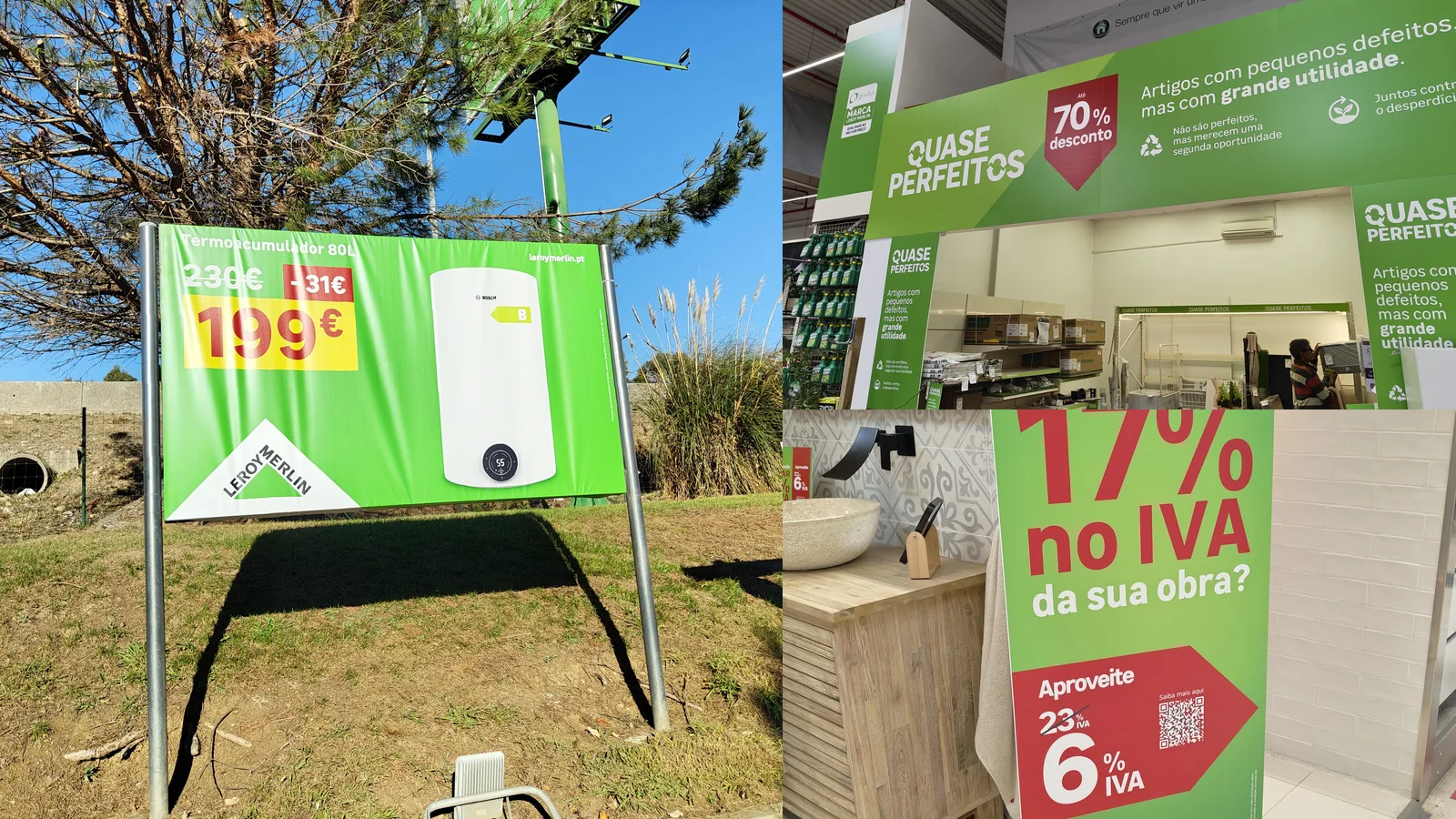
The audit is observational and was not commissioned, approved or supplied by Leroy Merlin or Oney. Brand and campaign names are used to identify the creative examined.
What we audited and how
The visit produced 28 photographs of customer-facing communication. Nine representative executions were selected to cover different jobs and stages rather than nine versions of the same format. Each was analyzed in Optiks.ai using its observed live environment, assigned objective and asset type.
The selected set includes a roadside product banner, facade banner, security-gate sleeve, promotional archway, shopping-trolley advertisement, kitchen-planning countertop sign, VAT discount standee, brochure cover and an Oney/Leroy Merlin finance standee. The individual reports assessed attention, hierarchy, readability, cognitive load, message, emotion, brand, color, composition, persuasion and context fit.
The Effectiveness Scores describe the sampled executions. They are not sales results, survey results or a judgment on every Leroy Merlin location. The store-level conclusions come from patterns repeated across the journey, supported by the photographed environment and nine report profiles.
What the nine reports say together
Range: 70 to 76
The profile is unusually consistent. Attention leads at 80.6, while persuasion trails at 61.4. Eight of the nine reports identify persuasion as their weakest domain. The kitchen-planning sign is the exception, where brand attribution is the lowest score.
The system-level finding
Based on the Optiks.ai report findings, the store communicates what is on offer more reliably than what the shopper should do next. That gap repeats from the roadside to the service desk. It is therefore more useful to treat it as a journey problem than as nine unrelated design issues.
The strongest recurring device is a large numerical anchor: €199, 40%, 17%, 6% or €40. These numbers work with red, green, white and yellow blocks to survive distance and movement. The weakness arrives immediately after recognition. A direction, service location, staff prompt, clear application route or simple offer condition is commonly absent or visually subordinate.
The customer journey in six stages
- 1. ApproachPrice captures attention.Weak store-direction handoff
- 2. StorefrontPromotion signals value.No explicit entry cue
- 3. EntranceOffer repeats at the threshold.Leaflet action is easy to miss
- 4. EnvironmentLarge formats work as beacons.Destination remains unclear
- 5. ConversionQR and offer details appear.Mechanics add friction
- 6. TakeawayBrochure extends the message.Ownership becomes less clear
Individually, most touchpoints are competent. Together, they do not yet form a deliberate sequence. Exterior communication has reason to visit but little explicit direction. Entrance and environmental formats repeat savings without consistently naming a department or service point. Near conversion, more information appears, yet the physical and digital routes remain under-specified.
The creative can change from stage to stage, but each execution should complete one job and prepare the next. The approach should create a reason to enter. The entrance should direct. Department media should locate the opportunity. The final prompt should make acting easier than postponing.
Approach and storefront: high visibility, weak handoff
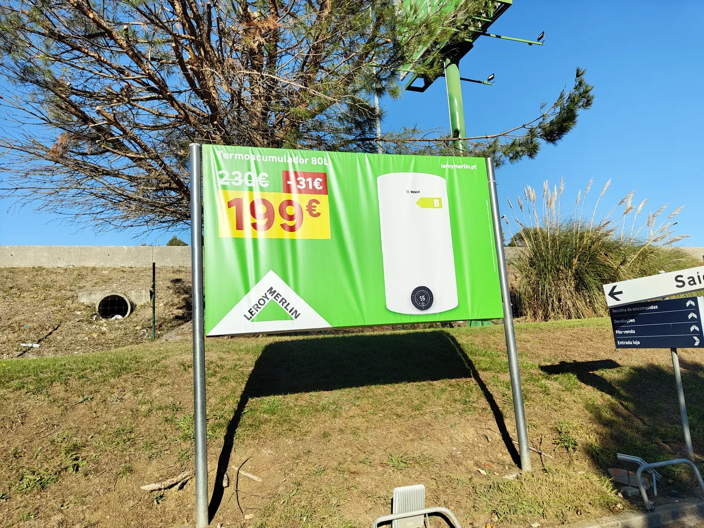
The €199 price block dominates at driving distance. The report found strong attention but no directional prompt or clear invitation to visit.
View full analysis
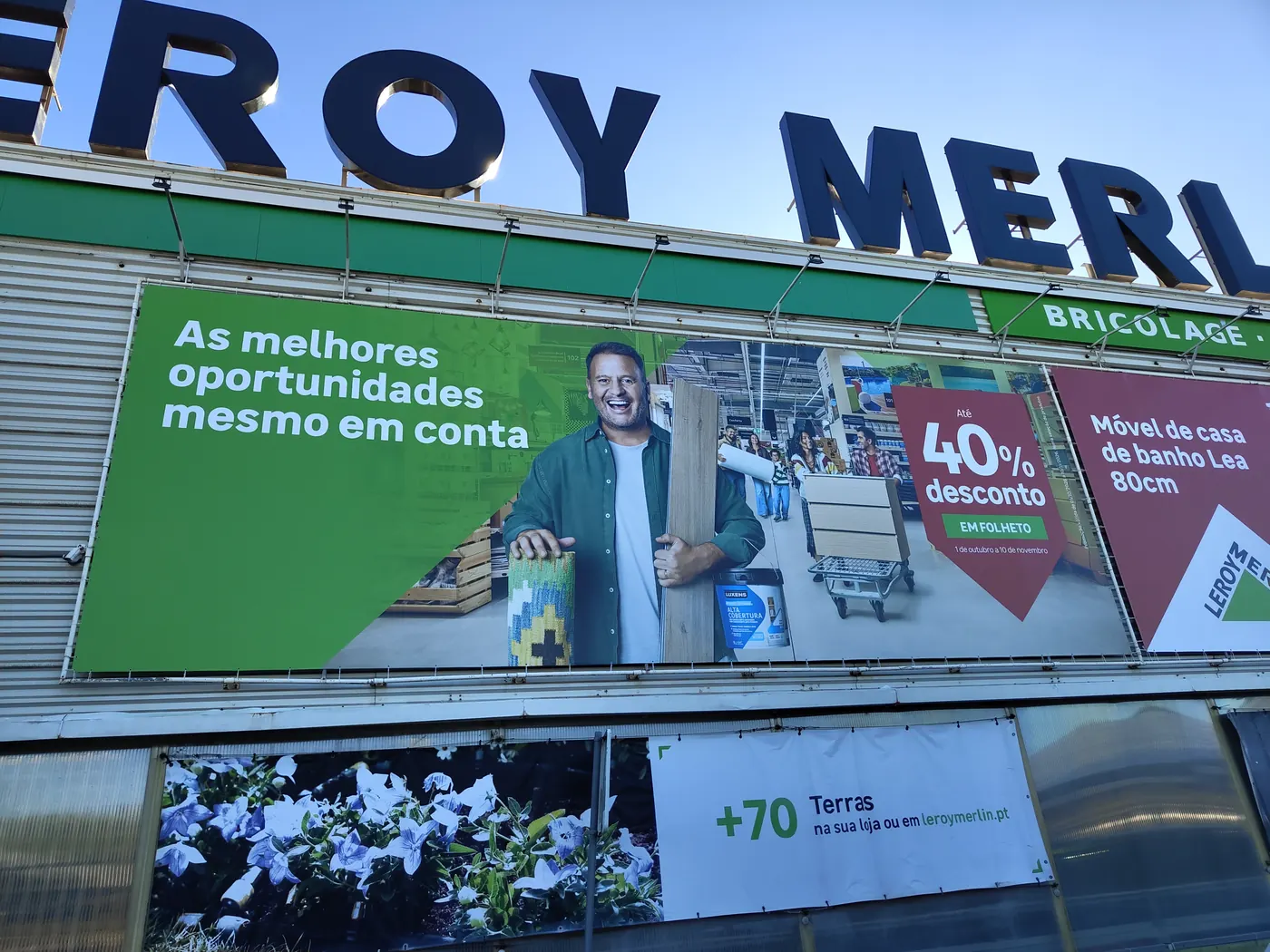
Scale and promotional color create visibility. The building supplies much of the brand context, while the creative itself offers no explicit entry instruction.
View full analysis
The roadside banner does the difficult first job: product, previous price, saving and current price can be understood quickly. The €199 device is the first fixation and the product is recognizable. Its lowest-scoring area is persuasion because the message stops at the offer. A short line such as “Available now in Sintra” with an entrance arrow would connect the roadside promise to the next physical action.
The facade system repeats the same pattern at greater scale. Red percentage devices and the green brand environment make the promotion hard to overlook. Yet the signs do not tell an arriving shopper whether the offers are inside, where the relevant entrance is, or which department to seek. Visibility is carrying a task that direction should finish.
Entrance and environment: the strongest beacon still ends early
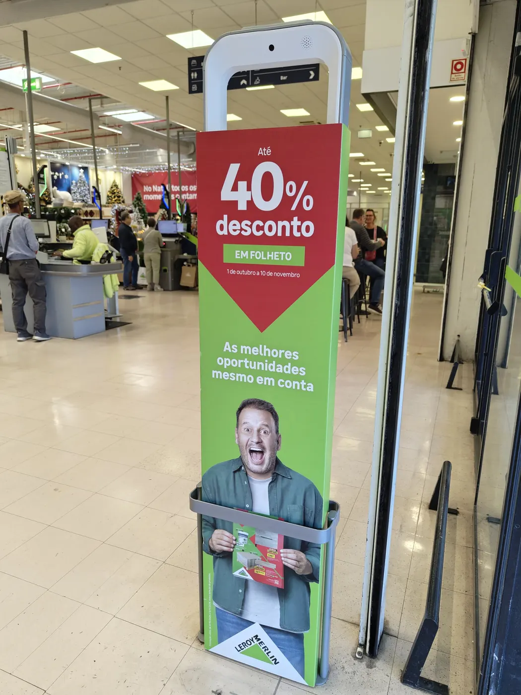
The red header and discount number are strong. “Em folheto” and the action of finding a leaflet are small and physically interrupted by the gate.
View full analysis
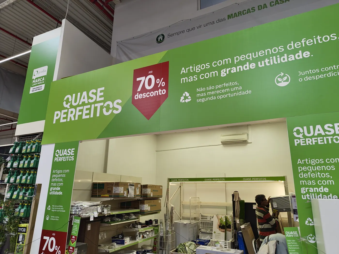
The highest score in the set. Its scale and placement make it an effective department beacon, but the execution lacks a final locator or action cue.
View full analysis
The threshold is valuable because customers have committed to entering and are deciding where to go. The gate sleeve presents a strong promotion, but its functional instruction is not part of the dominant visual cluster. At normal movement speed, shoppers can register the discount without registering where to find it.
The Quase Perfeitos archway is the best-performing execution in the sample. It suits the environment, creates a visible zone and explains the “small defects, great utility” proposition with strong color separation. Its context fit reaches 83 and its message score reaches 82. The missed opportunity is terminal: the archway does not clearly say whether to enter the bay, ask a colleague, check stock or follow a route.
The execution has strong context fit, yet it still leaves the customer’s next task unresolved.
Conversion touchpoints: good reasons, unclear routes
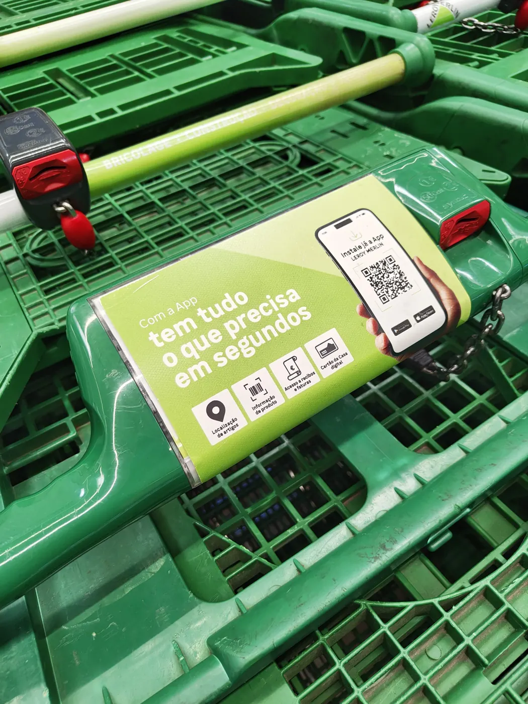
A mobile surface stays with the shopper, but movement, viewing angle and the requirement to scan reduce its ability to close the message.
View full analysis
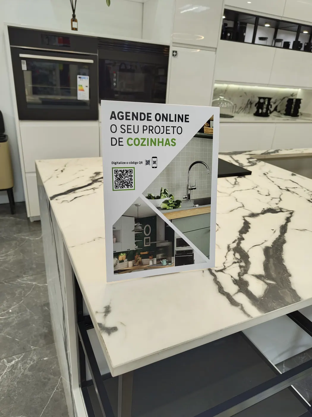
The placement matches strong category intent. The headline is clear, but visible brand ownership and an offline service route are weak.
View full analysis
The kitchen sign is well placed: it appears on a kitchen display where project consideration is already high. “Agende online o seu projeto de cozinhas” gives the sign a useful service job. The weak link is trust and fallback. The customer must infer who operates the booking and rely on a QR code. A visible Leroy Merlin lockup plus “Scan or ask at the kitchen desk” would preserve the online route and support shoppers who prefer human help.
The trolley placement offers repeated exposure, but it is not a stable poster frame. Handles, shopping behavior, angle and movement compete with the small scan target. QR codes can be useful, but they should not carry the entire action. For this placement, the code needs a stated destination, a physical alternative and a size that works from the distance created by the trolley.
View full analysis
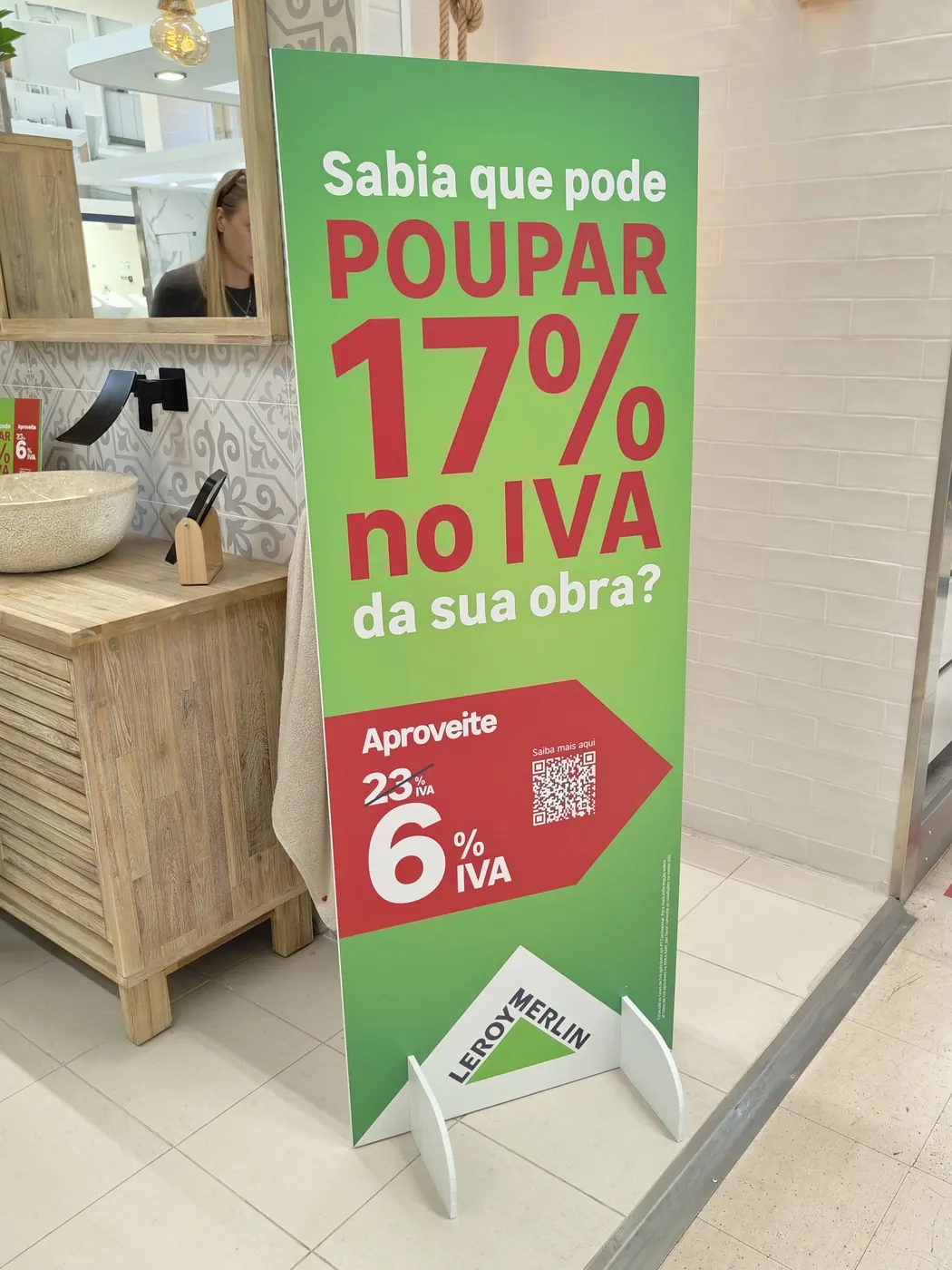
The VAT standee is a strong example of promotional recognition. Its large red numerals and direct question are legible in a visually busy aisle. The report gives it 84 for attention and 82 for context fit. Persuasion falls to 60 because the shopper sees the saving before understanding eligibility, process or destination. Promoting a clear instruction to the third position in the hierarchy would close much of that gap.
View full analysis
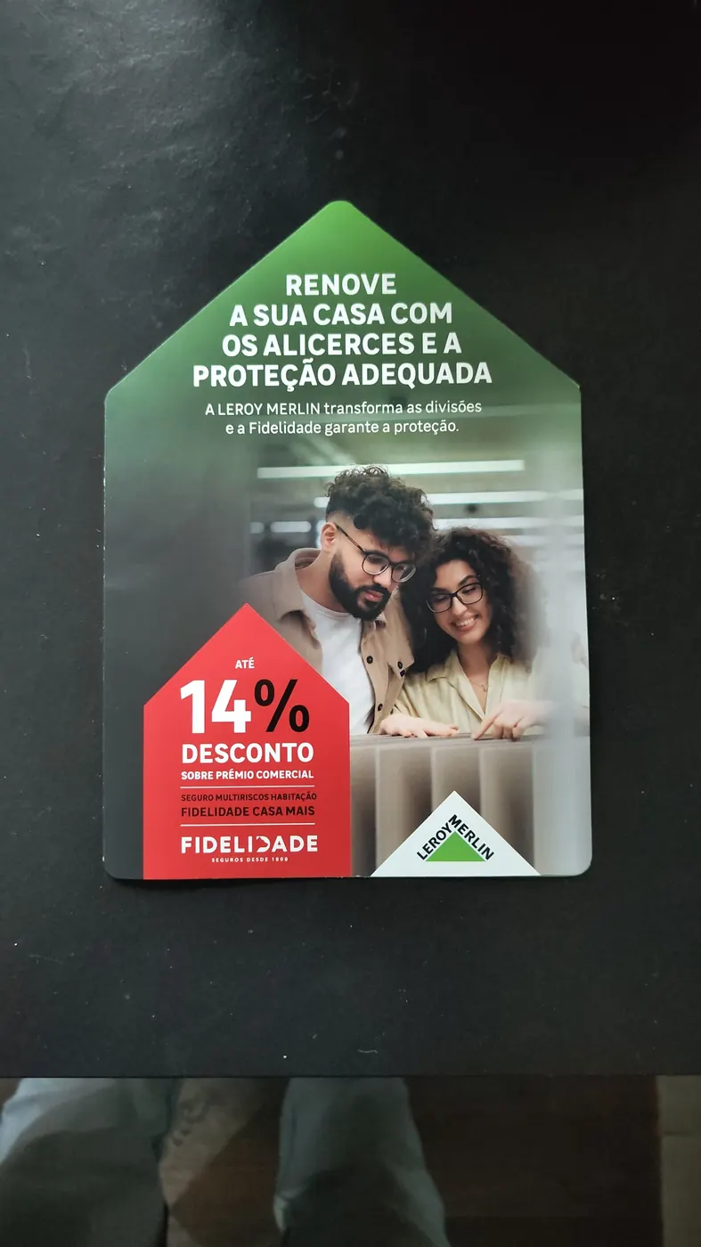
The brochure adds something the price-led store system often lacks: people and an outcome connected to home improvement. It is also the only format designed to leave with the shopper. That makes brand ownership and the next step especially important because the store environment will no longer supply context. The cover should identify who provides the service and what to do next before the reader opens it.
The finance case: a strong €40 hook with too much work beneath it
View full analysis
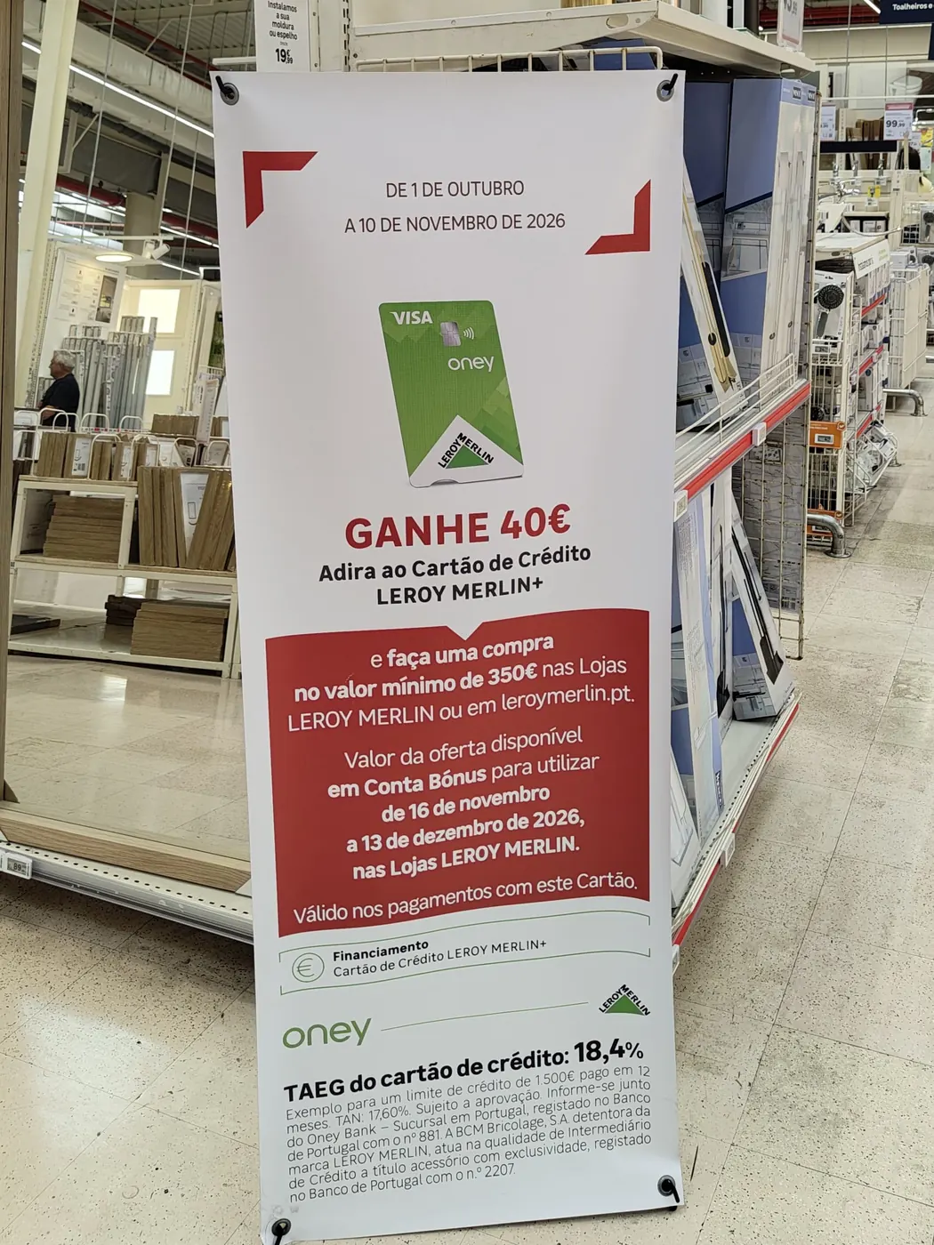
The standee's main promise is clear: join the Leroy Merlin+ credit card and receive €40 after a qualifying purchase. That produces an attention score of 78 and brand score of 76. The difficulty is moving from promise to eligibility and application.
The €350 purchase threshold, the later bonus-use period and the route to apply sit in a dense red paragraph. The call to action is not among the strongest visual elements, and there is no prominent service-desk, QR or online instruction. The legal information is necessary, but its presence does not require the core mechanics to remain a paragraph.
A more usable structure would separate the offer into three short steps: join the card, spend at least €350, then use the €40 bonus during the stated period. A clear “Apply here” or “Ask at the finance desk” instruction could sit immediately beneath those steps. The official Oney Leroy Merlin+ card page demonstrates that a direct online application route exists; the in-store execution should make the bridge to that route explicit.
Seven changes that would improve the whole system
- Create one action grammar. Use a consistent CTA block, arrow style and instruction pattern across roadside, facade, entrance, aisle and service media. Repetition should teach shoppers where action information appears.
- Give each stage one job. Approach creates a reason to visit. Storefront prompts entry. Entrance directs. Department media locates. Conversion media explains and closes.
- Make the next step a top-three element. After brand and offer, the action or locator should appear before secondary mechanics. This directly addresses the visual hierarchy gap found across the set.
- Pair every QR code with an offline route. State what the scan opens, add a short URL where practical and name the relevant desk or colleague.
- Turn conditions into scannable chunks. Limit the first layer to three mechanics before legal copy. People scan rather than read every word, a pattern documented in Nielsen Norman Group's research on how people read and scan information.
- Set a co-brand ownership rule. Partner promotions should make the provider, retailer and next action understandable without asking the shopper to resolve competing logos.
- Add the human benefit. Price and discount devices are effective but dominate the experience. A short outcome line can connect the saving to the project, room or service the customer wants.
Complete scorecard for the nine sampled executions
| Journey stage | Execution | Objective | Score | Main opportunity |
|---|---|---|---|---|
| Approach | Roadside product banner | Drive footfall | 73 | Add a store and direction handoff |
| Storefront | Facade promotional banner | Drive footfall | 71 | Turn visibility into an entry instruction |
| Entrance | Security-gate sleeve | Promote offer | 74 | Promote the leaflet and location cue |
| Environment | Promotional archway | Promote offer | 76 | Add a destination or action cue |
| Environment | Shopping-trolley ad | Drive purchase | 71 | Support the QR code with a stable route |
| Service | Kitchen-planning countertop sign | Drive consideration | 70 | Strengthen brand and human-service fallback |
| Conversion | VAT discount standee | Promote offer | 74 | Make eligibility and action easier to find |
| Takeaway | Home protection brochure | Drive consideration | 73 | Clarify ownership and next step |
| Partner case | Oney/Leroy Merlin finance standee | Drive purchase | 70 | Convert dense mechanics into steps |
How to read the scorecard: the scores help compare the sampled executions under their assigned objectives and contexts. They do not measure sales impact and should not be averaged into a grade for the store. For a broader measurement framework, see how to measure advertising effectiveness.
What this audit can and cannot show
This assessment records one store on one day. It does not show how the creative changes across the campaign period, how every customer moves through the store, whether staff actively explain the offers, or how the communications affect sales. Stock, media maintenance and placement can also change after the visit.
The analysis identifies communication patterns and design risks. It does not establish causality. The most valuable next step would be a controlled revision of one journey: for example, connect a roadside offer to a matching entrance cue, department locator and conversion prompt, then compare comprehension, scans, service-desk inquiries and purchases with the current system.
Final assessment
Leroy Merlin Sintra has the building blocks of an effective retail communication system. The campaign colors are visible, the price and discount devices are quickly understood, and several formats are well chosen for their location. The archway shows how powerful the system can be when message and placement work together.
The largest opportunity is to complete the handoff without making every element louder. Each touchpoint should make the next physical or digital action obvious, and each stage should prepare the one that follows. Doing that would turn a collection of noticeable promotions into a customer journey that is easier to follow and more likely to convert.
Frequently asked questions
What is a retail creative effectiveness audit?
It is a structured review of customer-facing advertising and promotional media across a real retail journey. It examines individual executions and the way they connect from approach to purchase or service.
Is 72.4 the score of the store?
No. It is the mean Effectiveness Score of nine sampled executions. The overall audit is a synthesis of recurring evidence, not a numerical store grade.
Was this audit commissioned by Leroy Merlin or Oney?
No. Optiks.ai conducted this independent observational audit. Neither company supplied the images, commissioned the analysis or approved the findings.
Attention is only the first handoff. Retail creative earns more value when every visible offer also makes the next action easy to understand and easy to complete.